Photography by Nathan Harmon
A well-known architect has taken a traditional Tulsa house built in the 1930s and transformed it into a picture perfect residence fit for a family.
Mark Nelson adapted this two-story home in the Bren-Rose neighborhood by increasing its size from 3,400 square feet to 3,900 square feet and creating subtle alterations that make a big impact.
Renovations seem as easy for Nelson as creating a structure from the ground up. Every project has a unique character, and he includes special features in anything new. His expert blend of traditional and contemporary themes makes this home pop.
Nelson, who listens to clients to understand how they live and what make their homes special, has moved to Palm Springs, California, but continues to maintain his Tulsa clientele.
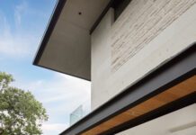
For the Bren-Rose project – a complete makeover from the front door to the master suite – Nelson wanted to keep the exterior of the gable-roofed house so it would fit the neighborhood’s upscale character and architectural features. The home, remodeled a decade ago, needed a fresh look.
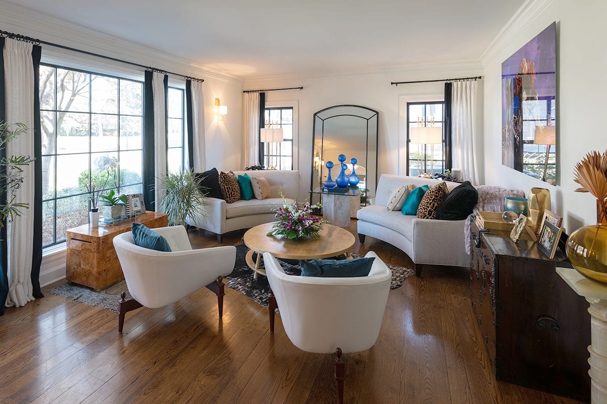
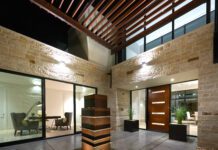
To update that all-important first impression of the home while maintaining its traditional character, he dressed the exterior with contemporary siding and enlarged the windows in the main living area for a better view of the expansive front lawn, which has numerous trees on an inviting corner lot.
Nelson increased the sizes of other windows, too, because one of his goals was to open the home to natural light – a goal that fell in line with the female homeowner’s vision.
“She had a lot of great design ideas on her dream list,” he says. “She wanted to brighten the home’s color palette, too. I just helped give her direction to bring her ideas to reality.”
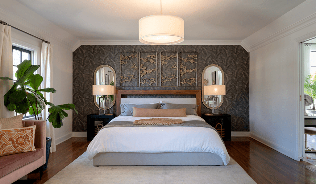
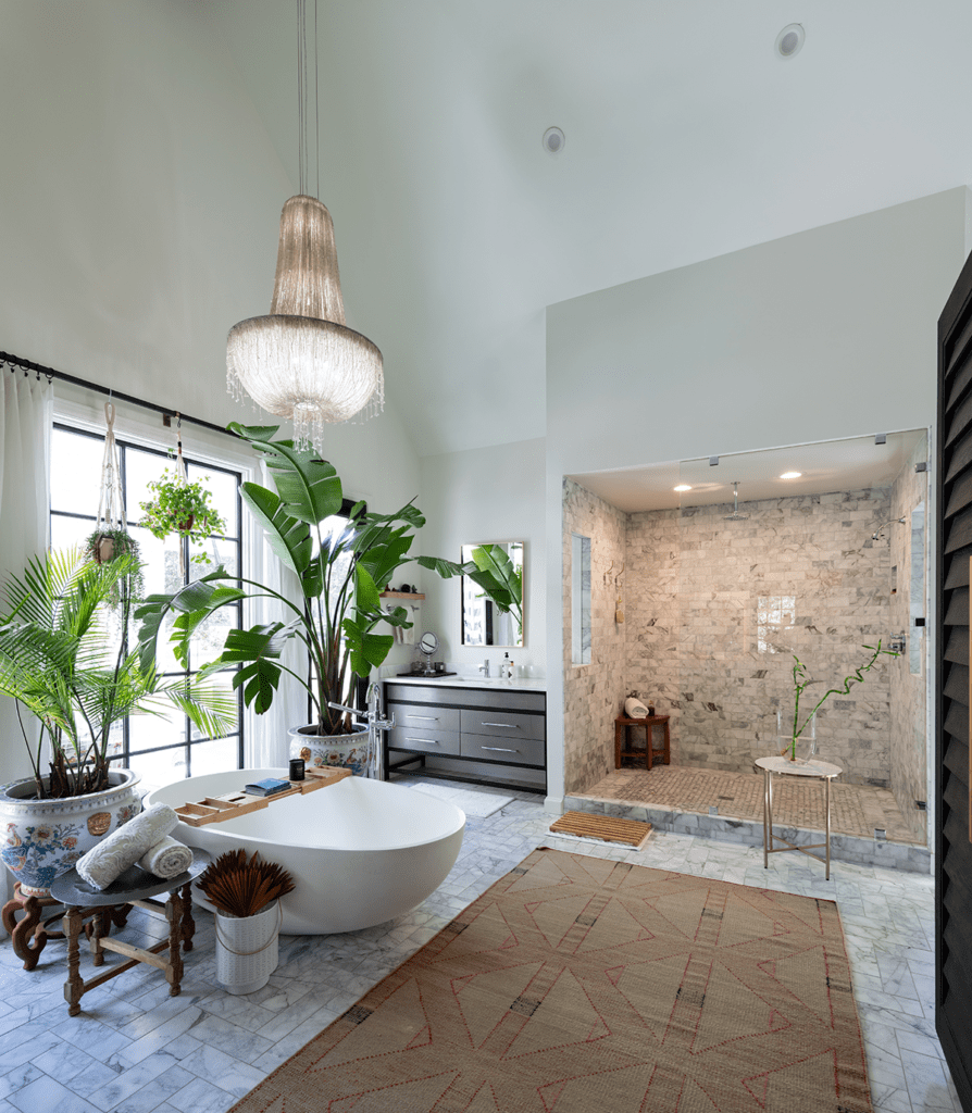
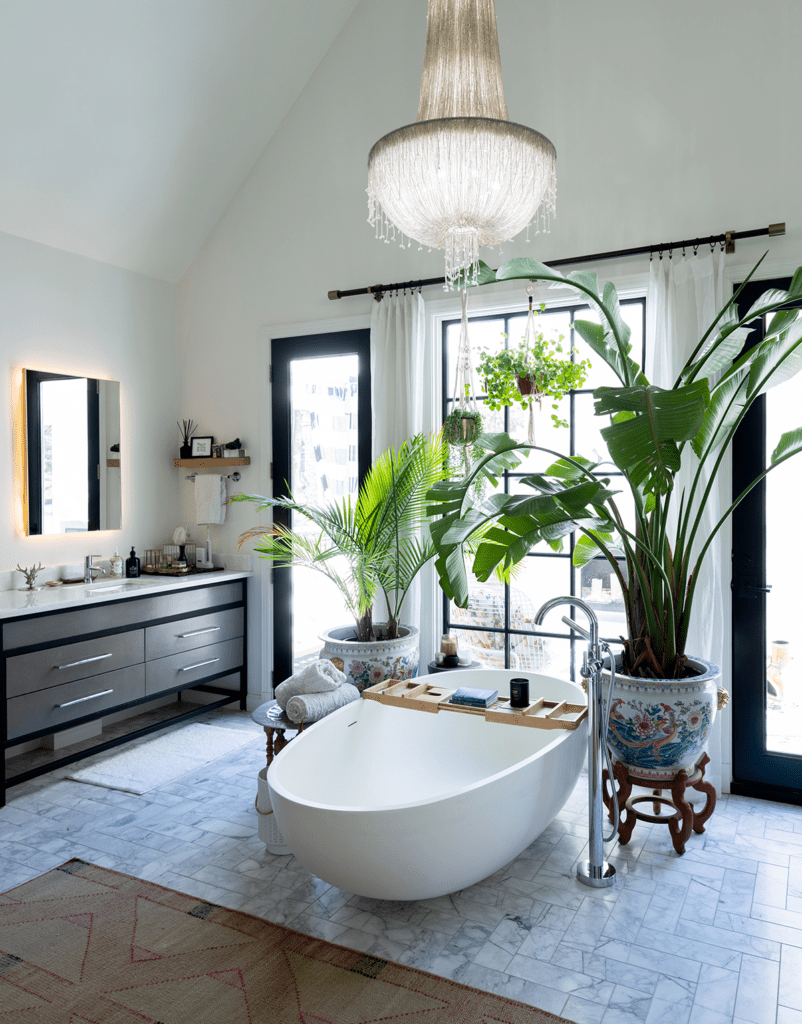
A major change was adding a second story to an existing, flat-roof addition on the ground floor. That upper-level space enlarged the master suite with the creation of a luxurious bathroom, which has a large, walk-in shower and grand views of the large back lawn.
Nelson, who went with a vaulted ceiling in the updated, modern suite, gabled the roof of that upper addition to match the rest of the house.
An outdoor balcony and pergola, both upstairs off the master suite, provide shade and include comfortable furnishings, a small fireplace and even a hammock – perfect for morning coffee or an evening drink.
Nelson made good use of the old master bath by connecting it to one daughter’s bedroom, so each sister can enjoy the privacy of her own bathroom.
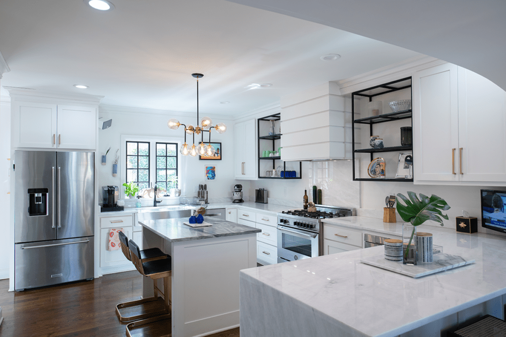
The kitchen got a brand new personality, too.
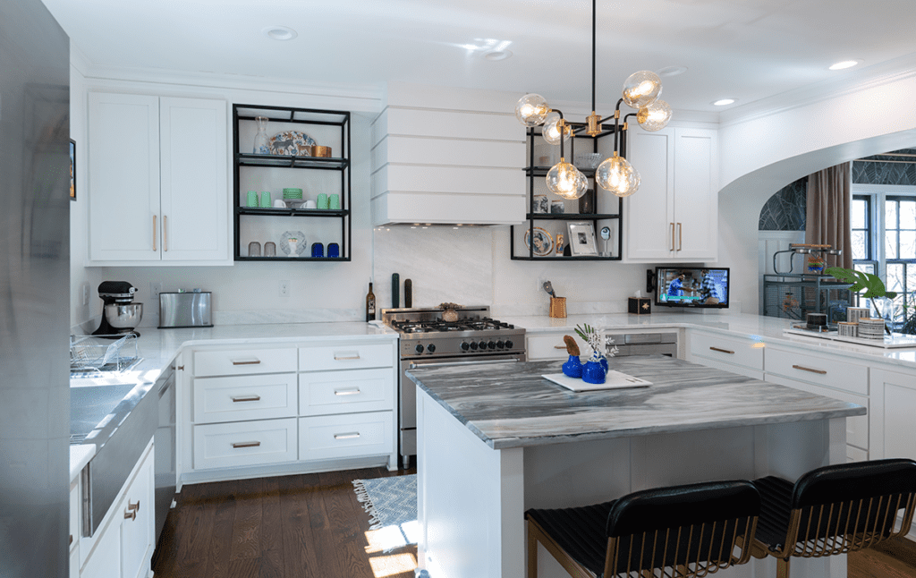
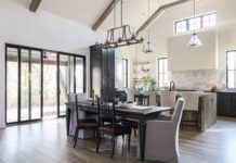
“We just started over in the kitchen,” says Nelson, who made it streamlined and functional. “By eliminating some needless closets, we were able to enlarge the kitchen and create a full-size, walk-in pantry.”
The work spaces are U-shaped – one of the easiest design styles for any kitchen. He gave the space an unusual flair with a half-oval opening into the formal dining area. The kitchen’s canned ceiling lighting enhances the space, which makes for easy food preparation and casual dining at the center island.
“It’s a great house. It was an easy, seamless transition,” says Nelson, who also enlarged a window in the dining area to add to its ambiance.
Nelson wanted the major living areas to flow together. This welcome, open feeling is evident when guests step across the front door’s new, modern, threshold.


