California casual was the style these homeowners wanted to create with the renovation of this 1980s south Tulsa home.
“They were moving from a home that had a dark interior,” says Tracy Huntington, owner of ELEMENT360 Design.
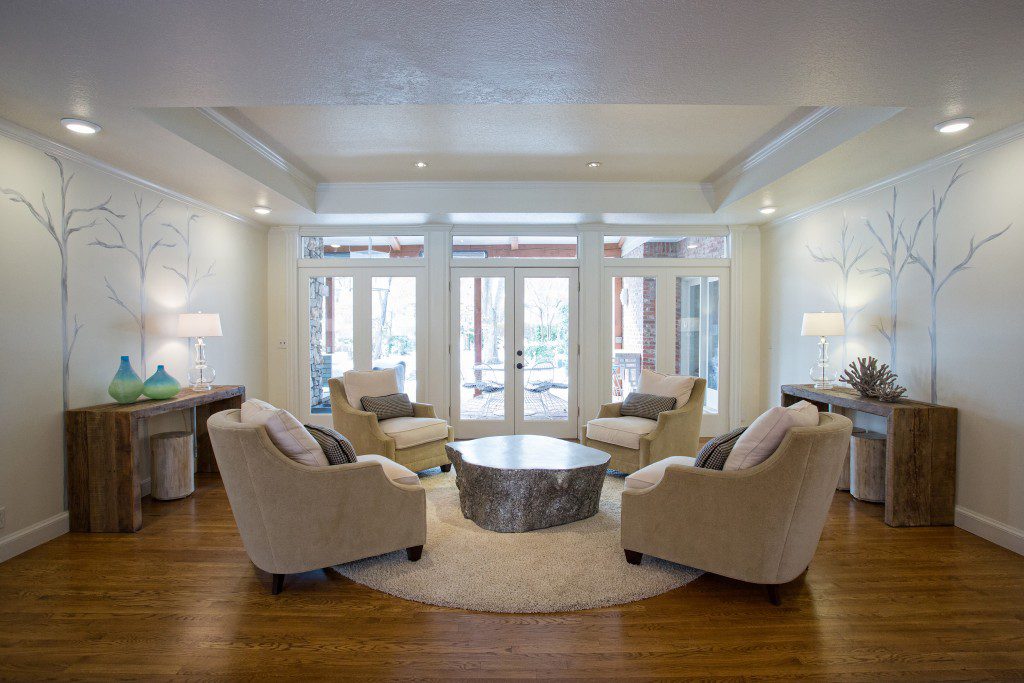
The house was in desperate need of an update, especially to create the light and bright space the homeowners desired. The oak wood flooring, which ran throughout the open spaces, was refinished. Huntington had the extensive amount of light oak crown molding and paneling painted white. By using the same color on the trim and walls, the space appears even larger.
“One of the goals was to bring the outside in,” says Huntington.
Since the expanse of living room windows face the back yard, they were left without window coverings. Local artist and family friend, Kelsey Newman, custom painted tree silhouettes on opposite walls. Matching distressed wood consoles were selected to simulate the feeling of tree bark. Wooden benches look like tree trunks and are tucked under the consoles to provide additional seating, if necessary.
“Creating a conversation area in the living area was a main goal,” says Huntington.
So instead of a traditional sofa, Huntington selected four custom chairs from Norwalk Furniture that are upholstered in tan velvet with a soft white Mohair used on the back and seat cushions. To add an accent, she had pillows made for each chair.
Centered on the round custom white shag rug is the clients’ favorite piece among the new furnishings. The oversized 45-by-40-inch resin cocktail table, fashioned as a tree trunk, is finished in silver leaf.

The white walls and trim continue in the adjacent dining room, and Huntington repurposed the existing brass chandelier, painting it white. The large wood table was fabricated in California and is surrounded by the homeowners’ existing white leather and chrome chairs.
The black-and-white geometric rug was selected for two reasons.
“Since the rooms are so light and open, I used some black in each room to help ground the space,” says Huntington. “Plus, it’s functional.”
With a family including four children, a dark rug in the dining room seemed practical. The two light wood consoles are from Noir Furniture, and the homeowners’ blue-and-black, round mirror is centered above.
Although the homeowners prefer no window coverings, because the dining room window faces the street, Huntington was able to keep the feeling of light but provide privacy by using cream silk linen for window coverings.
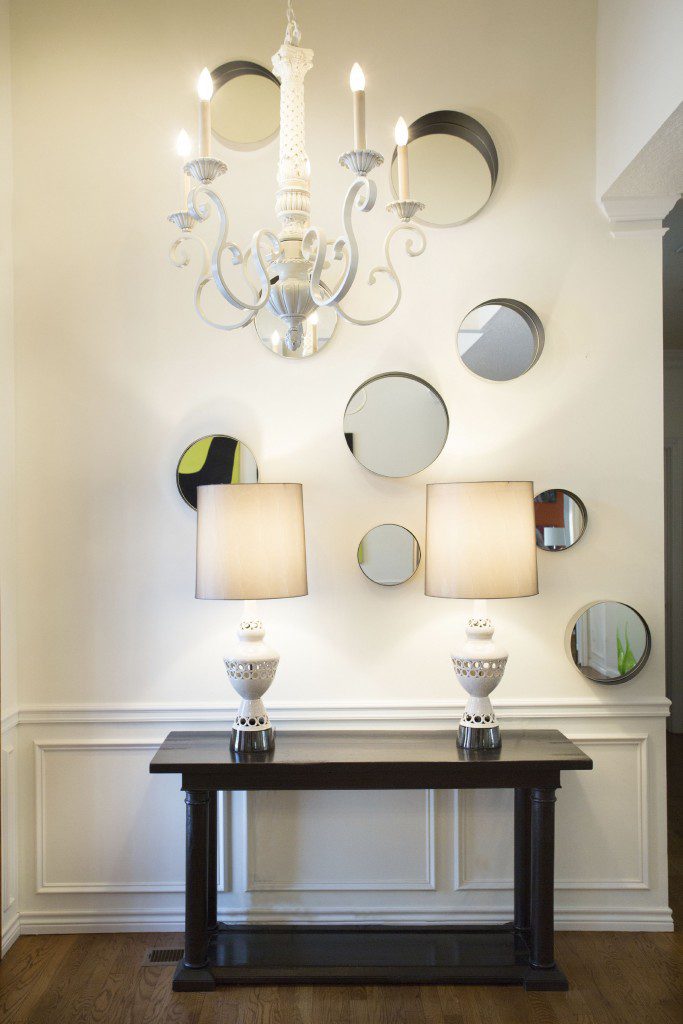
In the entry area that leads into the living room and dining areas, Huntington utilized the homeowners’ existing black console and painted the existing brass chandelier white. She selected a pair of ceramic lights for the console.
“The owner likes the feeling of symmetry, and there are several areas where I’ve used matching furnishings and accessories,” says Huntington.
One exception is the series of varying sized dimensional round mirrors that Huntington randomly placed all the way up to the 12-foot ceiling, adding to the feel of the light, open space. The circular motif is repeated in each room with the living room area rug and dining room mirror.
“We enjoyed working with Tracy and her team,” say the homeowners. “Their light and airy design has brought a relaxing feel to our home.”


