It’s no surprise that kitchens are truly the heart of any home. It’s where we start and end our days with breakfast and midnight snacks. What is a surprise? The way architects and interior designers embrace the latest trends to make the kitchen the perfect gathering place for friends and family.
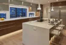
The center island has replaced the living room coffee table. It has assumed a more vital role than ever before, turning the kitchen into the family entertainment center. Kitchens are light-filled, ever so open, sleek and sophisticated. Appliances are high-tech with helpful robotic personalities. The color palette is hushed – crisp whites, soft creams, blues and grays, as gleaming as finely polished silver.
Bathrooms, where we also start and end our days, are more luxurious than ever before with tiles, marble and glass features, sometimes even crystal chandeliers. The quiet colors and
impressive accessories in these bathrooms show our readers how to create a perfect setting for ultimate relaxation.
A Crisp Construction
Photos by Nathan Harmon
A new home near Philbrook Museum in midtown Tulsa gave interior designer Carolyn Fielder Nierenberg the opportunity to create luxurious bathrooms and a stunning kitchen, all designed with special amenities.
“The family wanted the exterior of the two-story, stone-and-stucco home to look historic, as if it had been in the neighborhood for years,” Nierenberg says. “But they wanted the interior to have a more transitional feeling.”
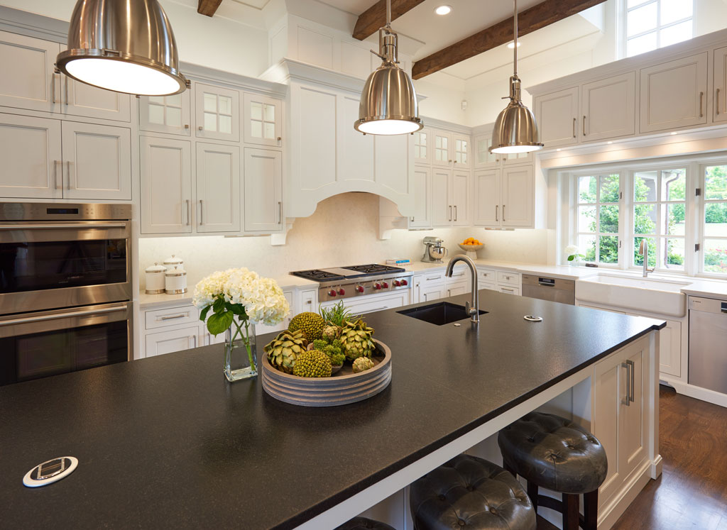
Since the family has two young children, the spacious kitchen needed to be user-friendly. The center island was designed as a perfect place for their early morning breakfasts and after-school snacks with friends.
The island is fashioned of leathered black granite that shows no wear or child-size fingerprints. Stainless steel pendant lights feature frosted glass to limit glare over the island. The brushed stainless steel is mirrored in the kitchen appliances. The cabinets, provided by Kitchen Concepts, were factory finished for durability.
The island is surrounded with a light gray Caesar stone, complementing the gray and white color scheme. Spanish white 3-by-6-inch beveled subway tile comprises the back splash. Gray-stained rift sawn white oak floors anchor the kitchen.
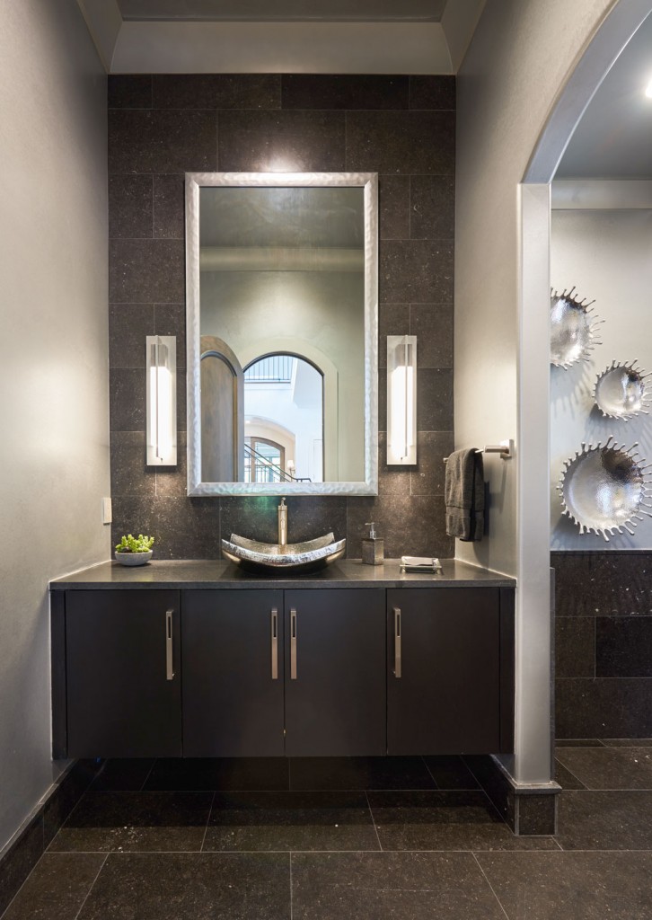
“We used a blend of natural materials in the kitchen and master bath,” Jeff Johnson of TileStone Distributors in Tulsa says. “There’s such a broad range of new materials, including the Belgian bluestone and polished, stained Turkish white tile. These materials are well priced, have a thick base molding and different components all in the same color. Pillowed limestone has softly rounded edges and gives a quilted look to a room.”
In this kitchen, filled with low maintenance appliances, paned windows are a special feature. They reach to the 15-foot ceilings to create a sunny, light-drenched environment for cooking and casual entertaining.
“Working with architect Mike Dankbar, the family custom designed the home,” Nierenberg says. “With large windows at both ends of the kitchen, they have a view of the front lawn, as well as another vista that overlooks the pool and outdoor cooking area. This is definitely the dream kitchen they wanted.”
Personal amenities abound in the master bath. A shower with “his and her” doors divides the wife’s bathroom from her husband’s bath. The shower has solid sheets of tile as walls.
The flooring is designed of 2-inch hex Turkish white polished marble with a light gray grout. The brick walls are fashioned of the same product with light gray veining. The large vanity includes two separate areas for a sink and a makeup area. The Kitchen Concept cabinets allow a custom design for the placement of the knee space.
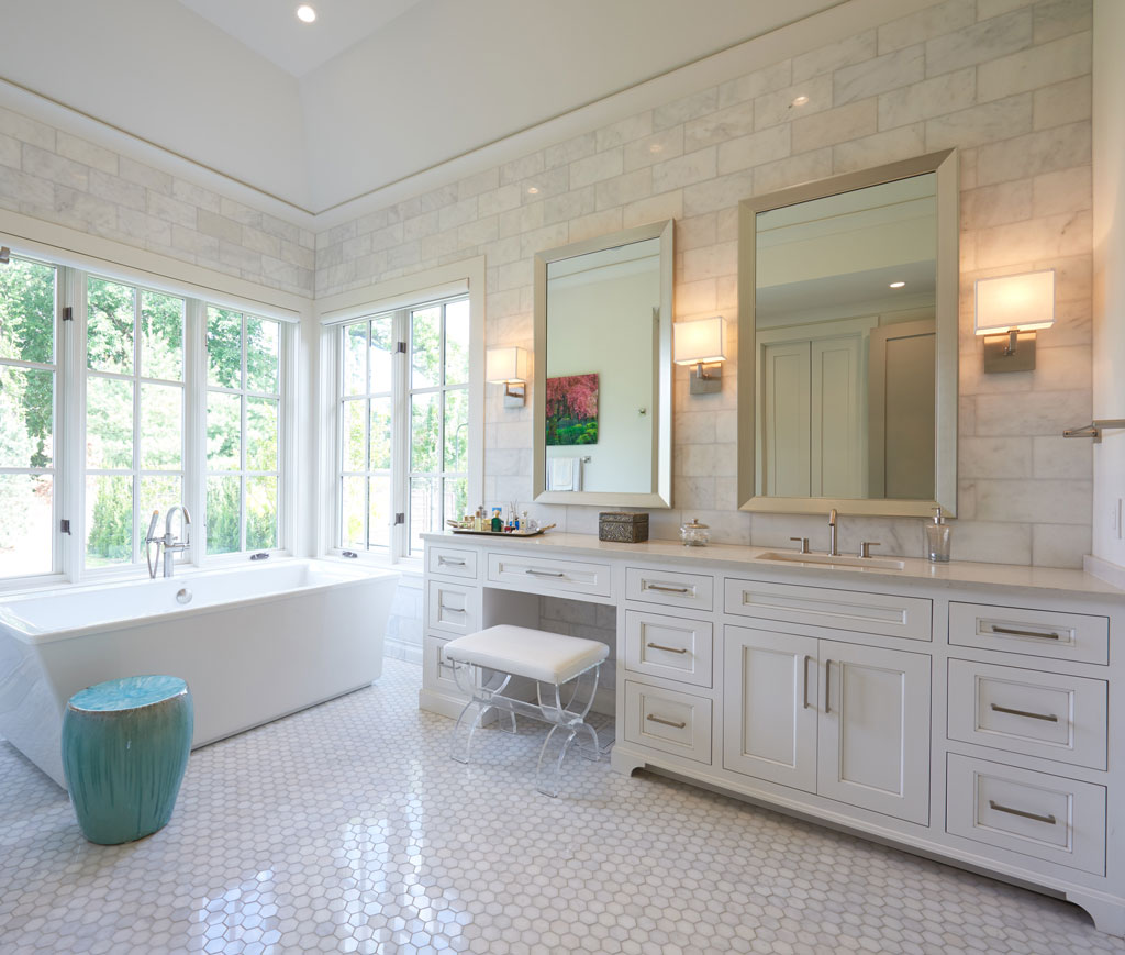
Stained white Turkish tile was placed behind the vanities.
The large windows overlook the expansive back lawn and feature motorized shades for privacy. A small, elegant powder room is set by the entry to the master bathrooms.
The kitchen and baths both reflect the family’s love for living in a home that has all the modern amenities for luxurious living.
Elegance Brings Bliss
Photos by Charlie Rosenthal
Jeff Johnson’s parents had no idea when they established TileStone Distributors in the 1970s that the Tulsa company would become a niche market for luxurious tile and stone accents in kitchens and bathrooms.
A recent bathroom project in an upscale midtown Tulsa home represents the best of this firm’s talents. Jeff chose a light and dark gray color palette to complement the marble and glass used in the master bathroom.
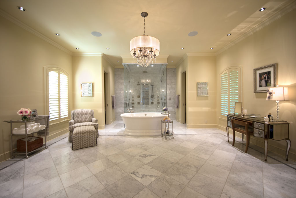
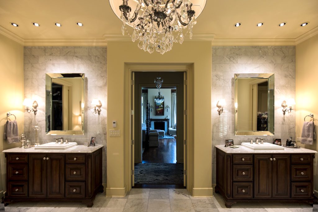
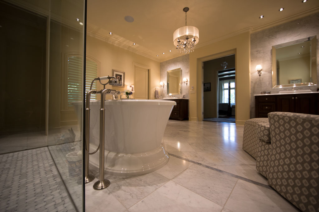
Johnson and his son, Kramer, were drawn into the project when builders Jack Arnold and Tony Jordan asked them to implement several design details.
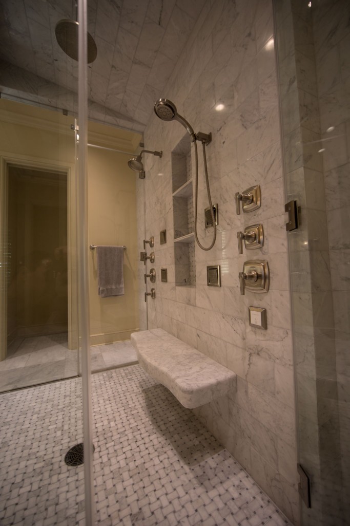
“I was impressed by the overall simplicity of the design,” Johnson says. “There’s only one marble wall in the shower that houses both the shower controls and a recessed niche. Everything else is glass.”
The polished marble mosaic for the floor also was used on the back of the recessed oversize niche in the shower.
“That niche was a great idea,” Johnson says. “It’s functional and adds a design element.”
With Kramer importing mostly European limestone and porcelain, Johnson notes that the company is “involved with all types of products, not all high end – porcelain tile from Italy and Spain, limestone from Belgium, France, Portugal and Eastern Europe.”
Johnson advises anyone tackling a new bathroom or a renovation project to “hire a designer. Tulsa is fortunate to have so many talented interior designers.”
Renovation Enhances Historic Kitchen
Photos by Focus B Studio
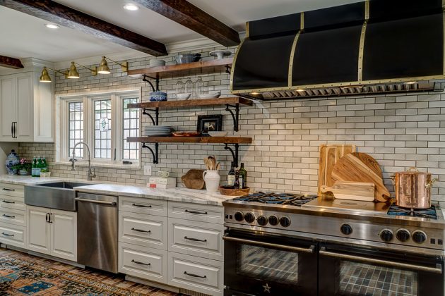
Architect John Duvall has the expertise to show that a 1928 kitchen can be transformed to function in the 21st century.
“The kitchen in this Forest Hills home in midtown Tulsa was designed by the late Charles Dilbeck,” Duvall says. “It is one of the grander renditions of the French country style that was typical of Dilbeck’s work in the 1920s and 1930s.
“As with any historic home renovation, our challenge is to achieve our client’s functional goals while maintaining the integrity of the original home design. The kitchen is at the back of the home and is the family’s primary circulation path to the rest of the house.”
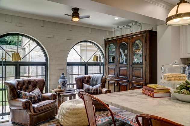
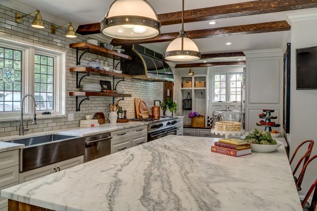
The homeowner, an avid cook, wanted a more functional kitchen design that would open to the adjacent dining room and include a comfortable sitting area. Duvall’s challenge was to integrate modern appliances and conveniences while using design details respectful of Dilbeck’s original design.
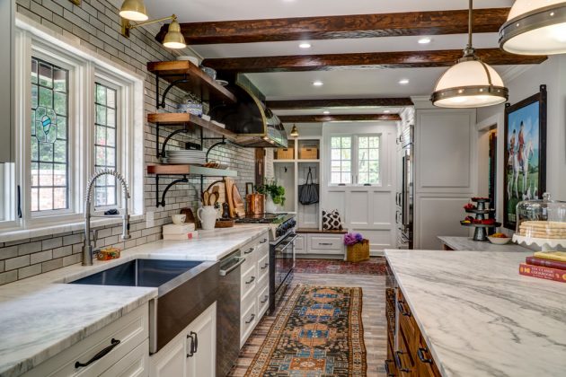
“The goal of the design was to create a light, open feeling, while maintaining some of the richness and detail of the original home,” Duvall says.
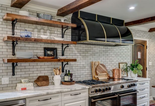
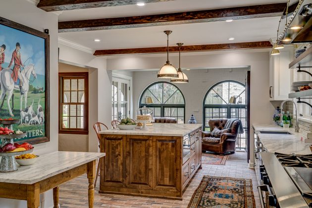
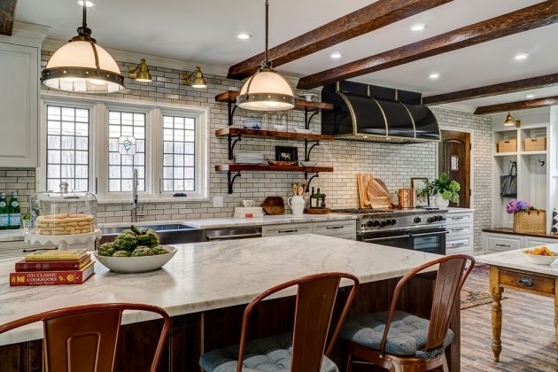
He accomplished the goal with a series of major face-lifts. First, he blended light cabinets with an off-white, glazed, handmade tile on the kitchen’s focal wall. Next, he created a stained alder wood island and stained alder wood open shelving. Along with adding stained fir beams to match existing beams in the dining room, Duvall also introduced an antiqued brick tile floor extending from the side entry door to the door leading to the back porch.
“We continue to see clients wanting open kitchens, full and light, designed around their particular functional needs,” Duvall says. “In this kitchen, we hope the first impression is of a seamlessly integrated design that feels as if it is still a part of the original historic home.”
Sleek and Seamless Simplicity
Photos by David Cobb
Sleek, seamless and shiny as polished silver.
That was the desire of a Norman homeowner who asked Brenda Helms to remodel her early 1990s traditional Dallas-style kitchen.
“The original kitchen was U-shaped with the cook top on the island, and the sink was in a forlorn, back corner,” Helms says. “The basic white traditional kitchen cabinets were flanked by red walls. A small corner pantry was across the room.”
“There were a few challenges and parameters for this job. A very large skylight in the middle of the room made lighting over the new island difficult. She also wanted a design with many flush surface interactions – a flush mounted cook top, countertops with the door faces, flush integrated floor vents and concealed outlets.”
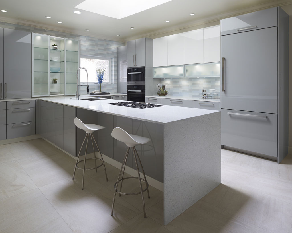
The homeowner’s desire was to have a modern kitchen where she and her husband could cook and enjoy entertaining guests. She also wanted a well-organized space with a place for everything.
Banking on the current on-trend color theme – light blue-gray, white and silver – Helms used a mix of white, high-gloss acrylic for the cabinets. A silvery, light blue-gray high-gloss acrylic, with a dash of brushed aluminum, was chosen for the frosted glass doors.
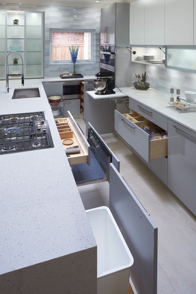
To make the kitchen highly functional, Helms selected Miele brand appliances from Germany.
“This kitchen features a steam oven, which is one of the most popular new high-gloss acrylics in kitchen appliances,” Helms says. “These cook food by steam and preserve freshness, vitamins and minerals.”
As Helms completed the renovation, she hoped guests would feel “refreshed” when they saw the kitchen’s modern transformation.
“I wanted them to feel like they were about to experience something very special and unique,” she says. “The kitchen now has a fresh, cool, calming feeling.”
She wasn’t disappointed. Neither were the homeowners.
“Guests have commented [that] they just want to linger there for a while,” Helms says with a smile.
Stillwater Lodge Gets a Rustic Face-Lift
Photos by David Cobb
When Brenda Helms stepped inside an old-fashioned, two-story home in south Stillwater, she knew it needed a major renovation. She still remembers that encounter vividly.
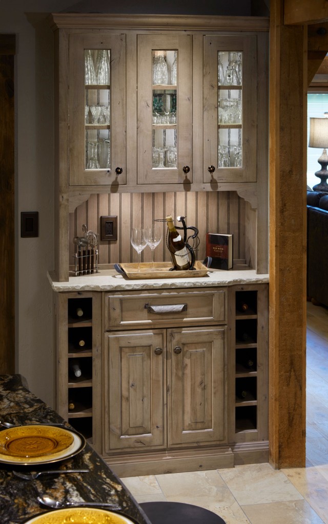
“The original kitchen was still sporting gold appliances with Formica counter tops and floral wallpaper,” she says. “And all of that was confined to half the space that kitchen now enjoys today.”
The redesign was not just a casual kitchen makeover, but an overhaul that engaged almost every part of the home.
“After rebuilding the floor, raising a wall that had sunk through the years, dealing with cracks in the foundation, leveling floors and relocating three walls, we then proceeded to add new rear windows that overlook the beautiful creek and wildlife that frequent this country setting,” Helms says.
When it came to taking an ugly duckling kitchen into the 21st century, Helms was well equipped for this daunting task. She and her husband, Robert, have owned Edmond Kitchen and Bath for 16 years.
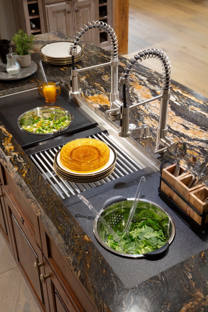
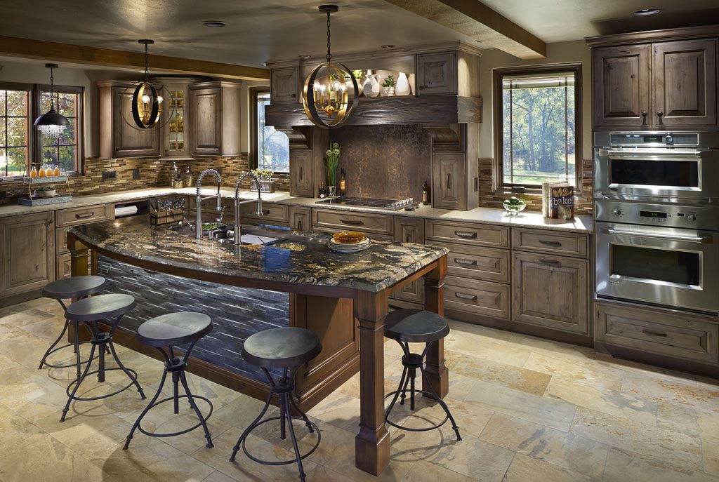
Helms chose a color scheme of natural browns, grays and creams, peppered with dashes of black and rust.
“The biggest challenge in the kitchen involved careful space planning and tying the kitchen and living area together to create a more open feeling in the home,” she says. “Low maintenance was also a goal. The couple have two dogs, so we used a light slate-colored porcelain tile in these areas.
“We also created room for a set of kitchen pantry cabinets by recessing them into an area inside the old laundry space that had been allotted to an outdated wet bar area. This required careful planning around existing ductwork and laundry appliances.”
Helms says the home is a great example of rustic farmhouse elegance and how a forlorn kitchen and living area now express a modern, functioning lifestyle.
Trending Now
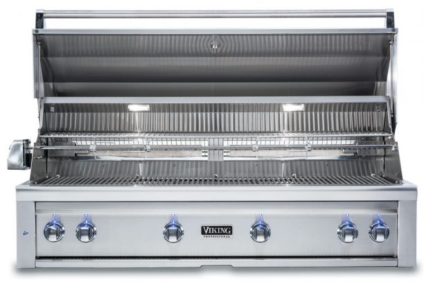
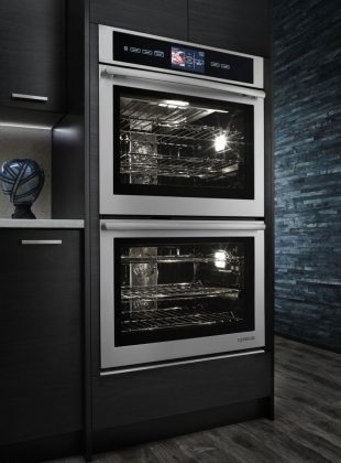
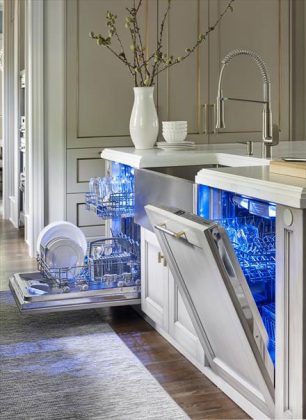
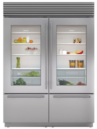
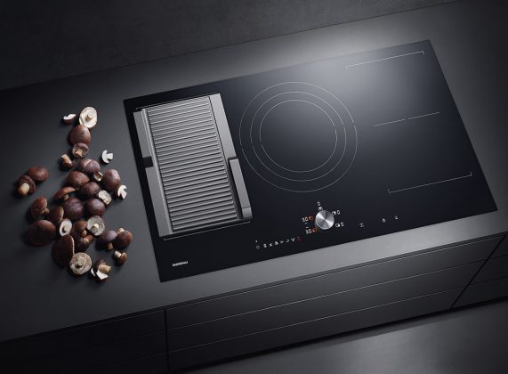
In the dynamic realm of interior design, technology and style meld together in the creation of exciting appliances. These kitchen wonders provide the consumer with cutting edge technology and efficiency partnered with the sleekest looks that mirror popular design trends of the time. Style and efficiency combine for a magical – and trendy – result.


