This homeowner has always loved her midtown Tulsa home. In fact, it is where she grew up.
“She wanted the house to maintain some of the essence of her childhood home, but also wanted to modernize it for her family that includes school age children,” says Mel Bean, co-owner of Austin Bean Design Studio, which took on the interior design of the home.
The homeowner worked with architect Scott Ferguson to design an addition that opened up the existing small, enclosed kitchen and added a casual dining area and spacious new family room. A three-car garage and connecting mudroom were also added. Tony Jordan of Jordan & Sons was the builder.
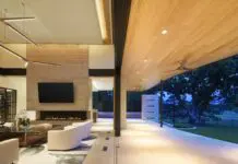
“The goal was to create a large family room space that was both comfortable and cozy for their family, but also an inviting area to entertain,” adds Bean.
Working from the homeowner’s love of blue, Bean focused on creating a neutral, monochromatic color palette that includes grays and blues.
“We used textures and finishes to create a layered design rather than rely on multiple colors,” says Bean.
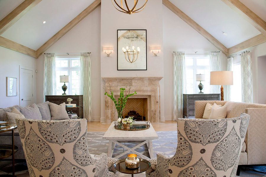
Because of the sizable volume of space in the family room, a large-scale, custom fireplace of brushed travertine was designed. Above the mantel, an antiqued mirror with a custom steel frame reflects the chandelier and ceiling beams.
“We used a custom paint finish designed to replicate antique beams that picks up the warm tones of the floor, fireplace and furnishings,” says Bean.
Grounding the space are white oak wood floors installed in a herringbone pattern with a custom whitewash finish.
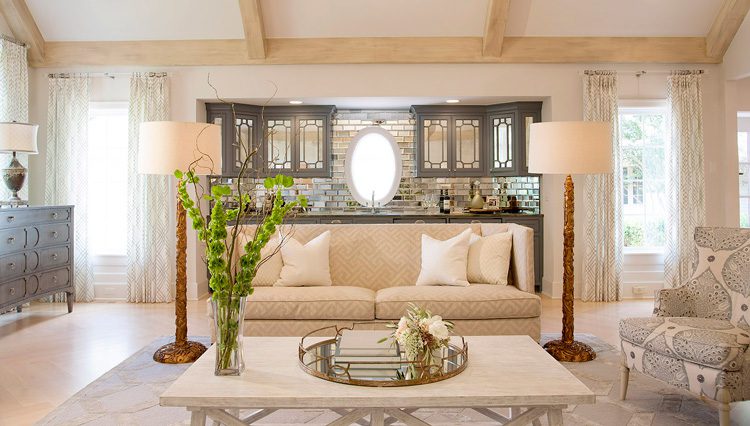
“The bar area is a little more adventurous without taking over the whole room,” says Bean.
An oval window was chosen, and cabinet doors have antique mirror finish insets with nickel hardware. The countertop is blue-and-green stone in a leather finish, while the backsplash uses beveled antique mirror subway tiles. The freestanding sofa that sits in front of the bar has a unique sculptural back that adds interest to the space.
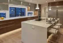
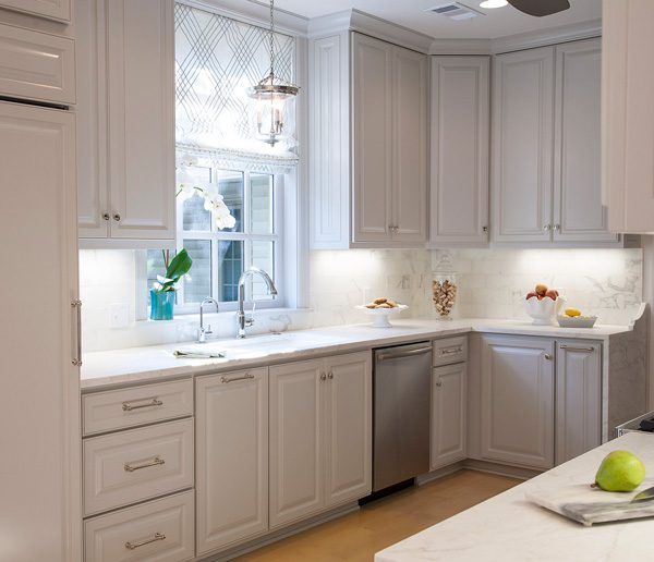
The adjoining kitchen renovation was simple. The existing copper hood was maintained as homage to the design of the original house. The existing dark cabinets were replaced with custom cabinetry, painted white, that extend to the ceiling. Countertops are Calcutta marble with a waterfall edge.
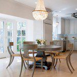
Nearby, Bean chose a round, hammered metal table surrounded by comfortable chairs to create an inviting, casual dining area. A capiz shell chandelier sparkles above the table.
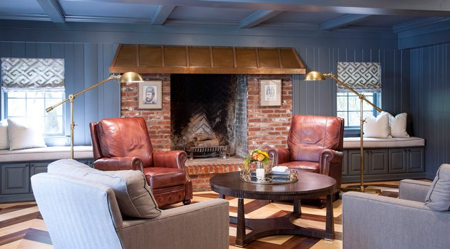
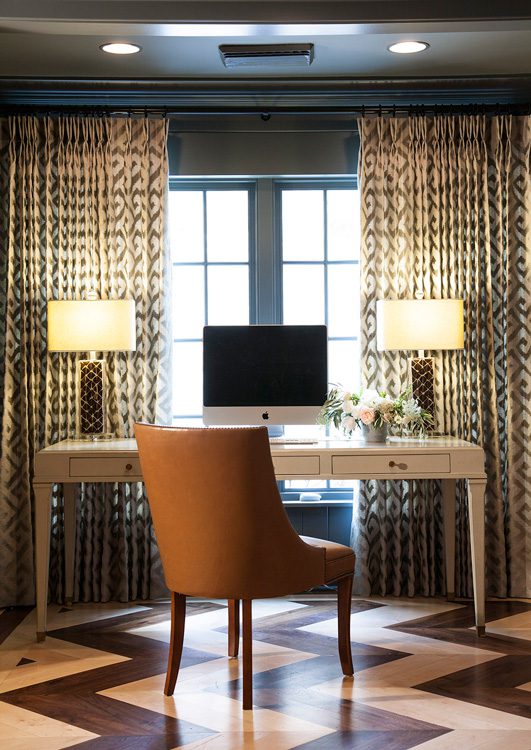
What is now considered the den was the original family room. It was dark with an old tile floor. The wood paneling and ceiling were painted the same shade of deep blue-gray to highlight the existing copper hood over the fireplace. A custom, two-toned wood floor in a chevron pattern creates a bold statement.
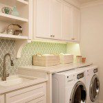
A bathroom accessible through a hidden panel in the den was gutted to make way for a new laundry room. Custom painted cabinets and a silver travertine floor create a light, bright and functional work area.
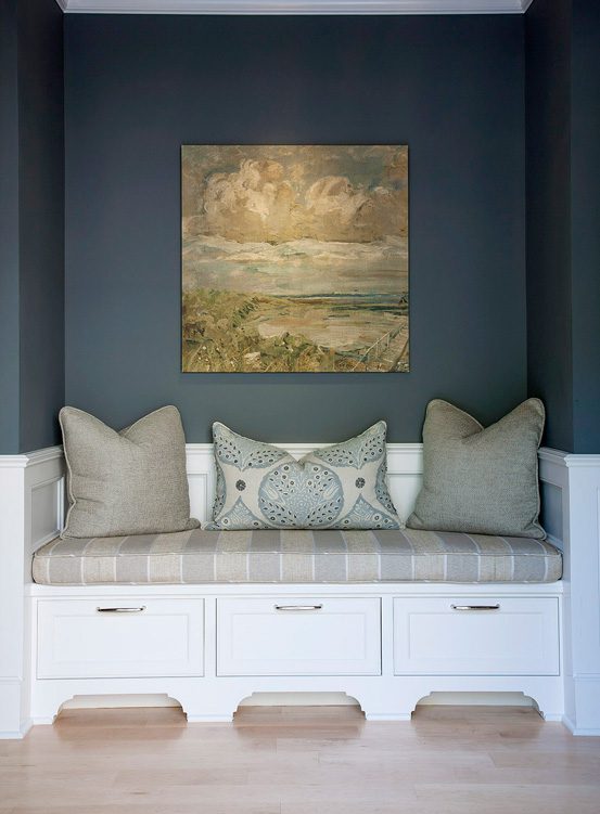
The new mudroom connects the renovated den with the new garage. It was designed with lots of storage and casual seating and to serve as a location for storing everything from backpacks to boots.
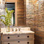
A new powder bath was created by capturing space from the kitchen and a closet. The sink cabinet is a repurposed piece of furniture. The marble flooring is custom cut, and the wall covering from the Gilded Age Collection by Phillip Jeffries uses multiple layers of metallic and matte inks.
While Bean was the lead designer, she credits Jinger Denison, project manager for Austin Bean, with keeping the design and implementation moving forward efficiently on the nearly year-long project.


