[dropcap]Going[/dropcap] to the office must be an immense pleasure for the attorneys who work at The Fulmer Group in the historic Buick Building, located in downtown Oklahoma City. Once housing a thriving automotive showroom, the building, completed in the 1920s, was used more recently as a warehouse. When Midtown Renaissance Group discovered its potential, they purchased the building and planned to bring the building back to life with modernized tenant spaces.
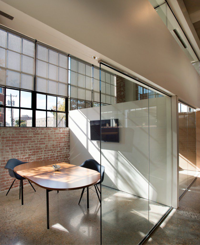
Like The Fulmer Group’s slogan – “not your grandfather’s law firm” – the preconceived notions of a traditional law firm are changed the moment a client sets foot inside this contemporary space. In lieu of individual private offices, the law firm opted for a more collaborative and conversational layout. This design allows clients to engage with the legal team in various transparent conference rooms and break-out areas. This client-centered approach ensures spaces are active throughout the day. Fitzsimmons Architects worked with The Fulmer Group to design these fresh interiors.
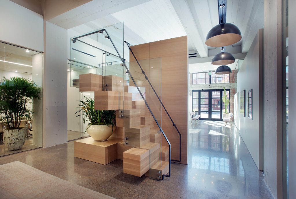
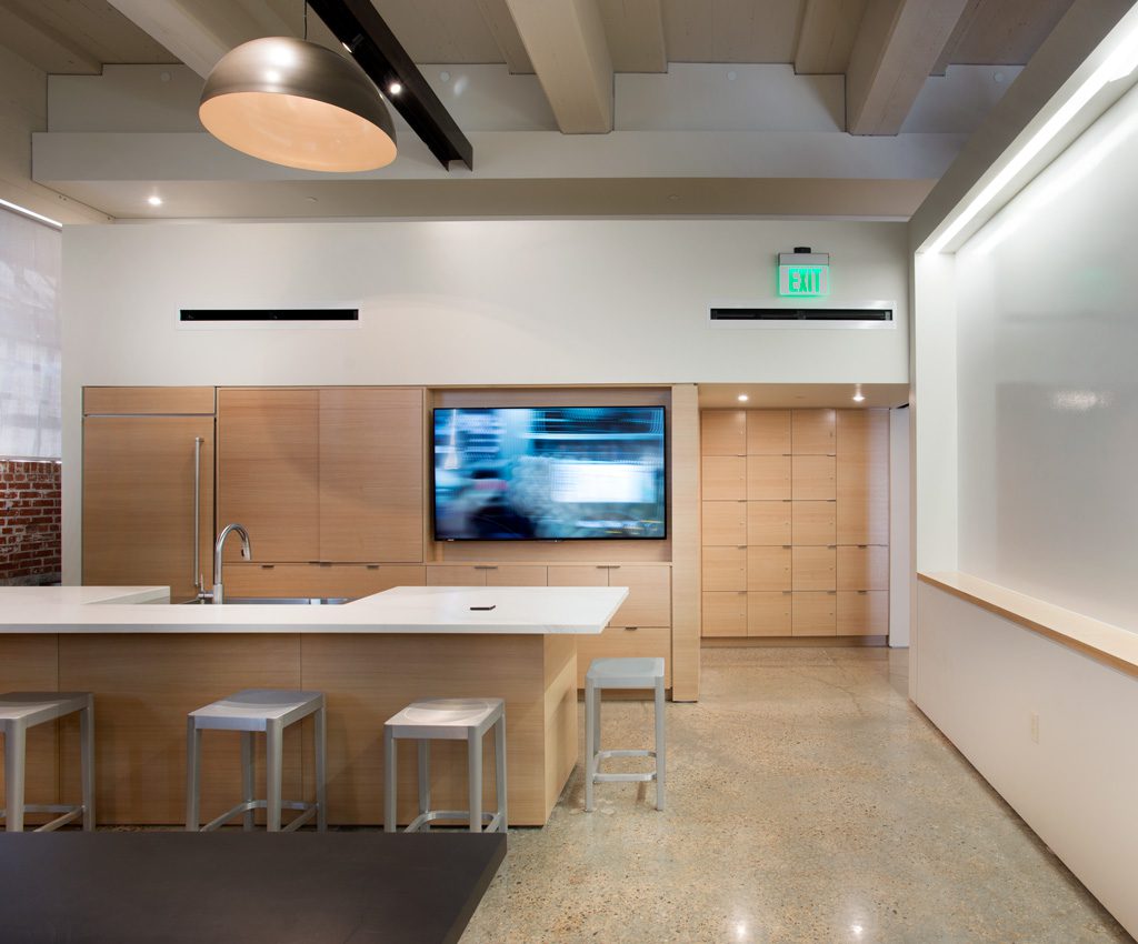
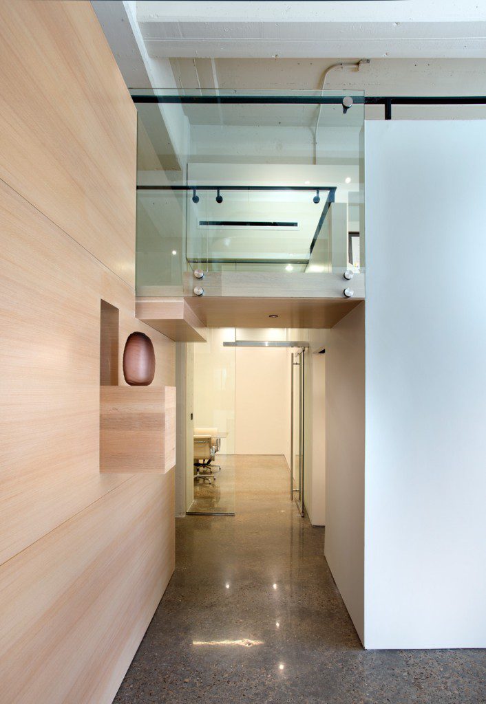
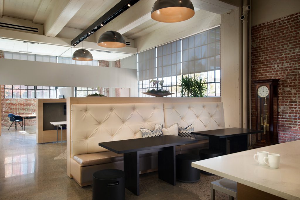
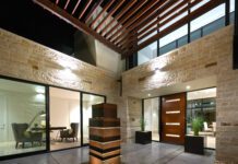
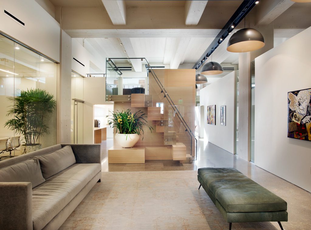
Now, thanks to the Fitzsimmons staff’s forward-thinking architectural and interior design expertise, clients are greeted by crisp white walls and a pleasing combination of glass, stone and wood. Leather is featured in some of the contemporary furnishings. The color scheme is white and soft cream neutrals with gray and black accents. Clients are instantly immersed into an understated but upscale, modern interior when they cross the firm’s threshold.
Comfortable group seating in the reception area and white boards in the break area allow for casual collaboration throughout the day, and the conference room can be divided into two smaller meeting rooms buy a hidden folding wall. The great room on the west wall houses the kitchen and breakroom, individual work spaces and two private meeting rooms. Lockers provide room for personal items to keep the space clean and tidy.
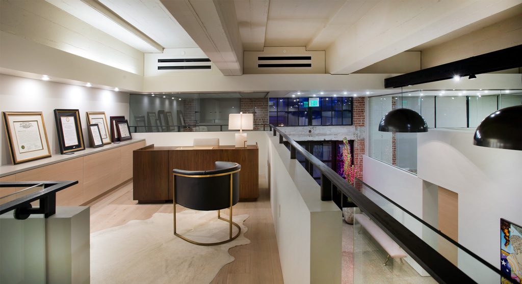
The feeling evoked upon entry is best described as uninhibited. Clients experience a dramatic setting, including vaulted ceilings and a sense of direction provided by artistic ceiling lighting. Sunlight filters through windows, located at the southernmost area of the office. Vaulted spaces intentionally help distribute natural light, creating a pleasant environment for researching precedent-setting cases and solving clients’ legal issues.
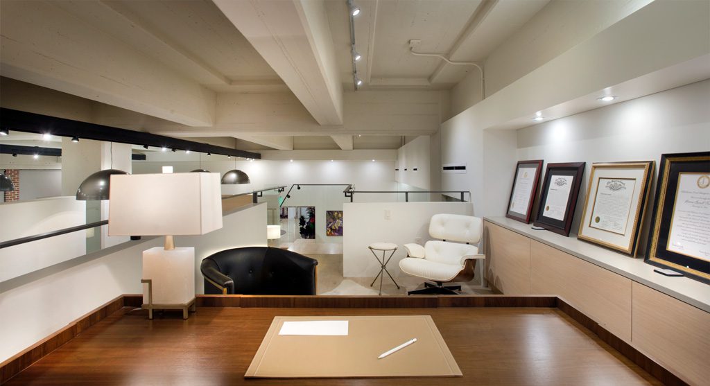
Particularly eye-catching is a dramatic stairway leading to a loft above the main areas. It features wood, concrete and metals – materials and textures repeated throughout the spaces.
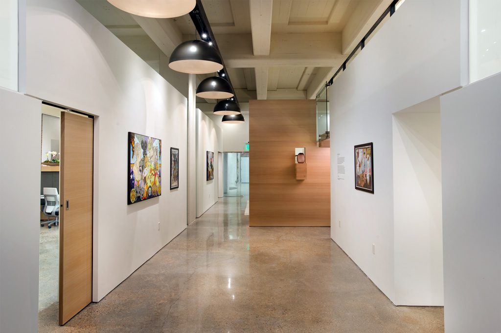
The design of the interior suites is unique in its response to the traditional status quo of the law profession. It articulates the firm’s unique attitude and identity with vividly colored contemporary art and open spaces. Traditional law offices are characterized by rooms with closed doors, suggesting privacy, but the interior design and architectural features at The Fulmer Group reflect the best of a new strategy for serving clients in a more user-friendly environment.
Harrison Lujan, a co-founder of the firm with Simone Fulmer, says, “We had a very specific vision for the layout and design of the office that would reinforce the core values of our group. It was of utmost importance to create an environment that fostered collaboration and creativity, which is not the case for most law firms.”


