A “Cream with
Coffee” Kitchen
Photo courtesy Bill Powers
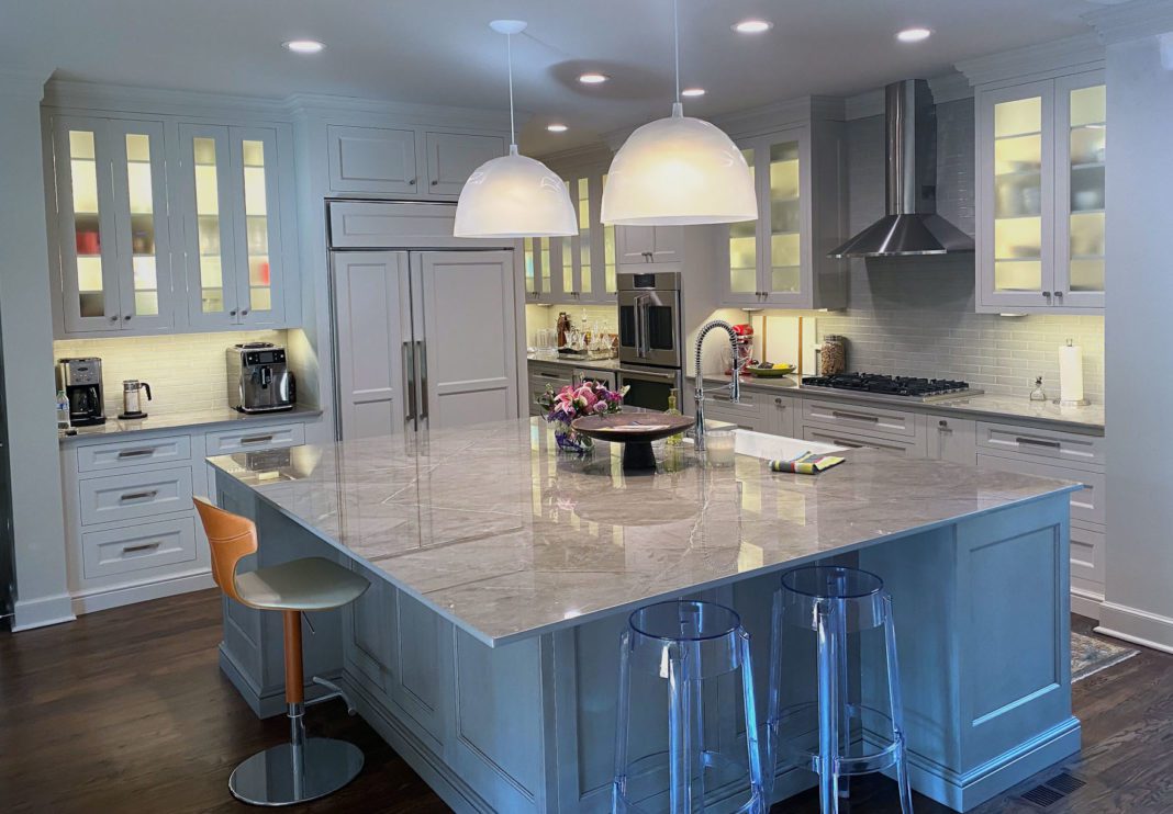
Located in Tulsa’s historic Maple Ridge area, this space was in need of a remodel, and the homeowners looked to Bill Powers of Powers Design and Build, LLC, for his expertise.
The previous owners built a kitchen with an eccentric design, which wasn’t quite the aesthetic the new owners desired.
“Renovations began as soon as they took ownership of the property,” Powers confirms.
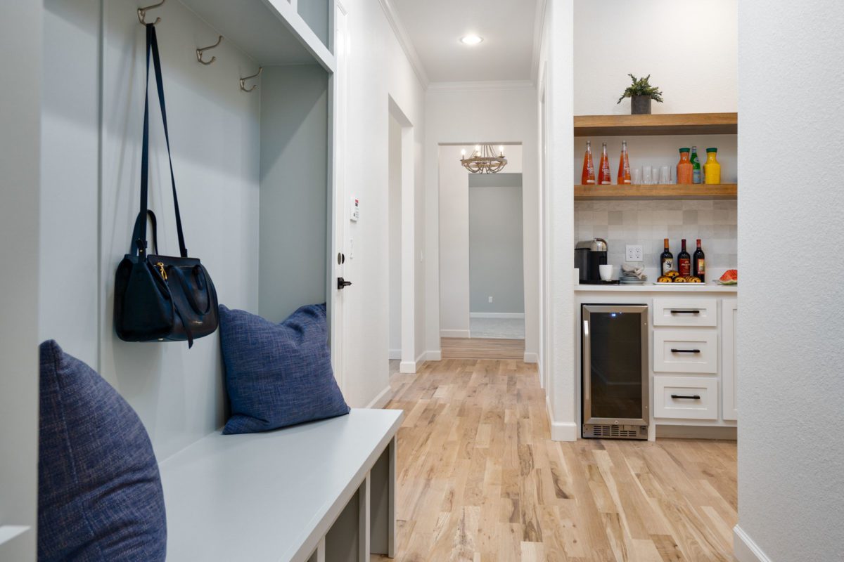
First, the kitchen’s entertainment function was addressed, and good quality appliances were re-purposed. Wanting more than an all-white kitchen, the homeowners picked the paint color – dubbed ‘Macchiato’ – which Powers describes as “cream with coffee.” Set up for entertaining, this kitchen has two wine refrigerators, drawers for cold beverages and a large island that serves as an eating space as well as a serving platform. The style of the kitchen is now, at once, both modern and traditional.
“The kitchen cabinets remained as a furniture element,” says Powers.
Beth Sachse, owner of Tulsa-based SR Hughes, was the interior design partner on the renovation. Elements including the large pendant lighting over the island and the meticulous color coordination were some of her expert offerings.
Powers, who started cooking at 5 years old, has a keen sensitivity to the needs of the chef. Now 68, he still enjoys cooking. With an eye for that cook’s perspective, Powers closely analyzed the area from pantry to refrigerator to cook top to oven.
“I call it the cook’s zone,” he says. This is a space for preparing food and drinks without interrupting the guests, and vice versa.
Powers wears several hats in his firm. In business for 42 years, Powers Design and Build, LLC, is first a design and architectural planning firm and second an interior design firm, addressing cabinetry, tile, wall color, floors and hardware.
Also remodeled in this 5,000 square-foot home were the den and dining area next to the kitchen, along with the master bath.
“It was a collaborative effort,” says Powers.
Easy, Breezy
California style
Photos by Brian Chitty, Shots Aloft Photography
Interior designer Gunta Sandmeyer of Boulevard Interiors, in partnership with her husband Ralph of Southern Homes, built this stunning custom dwelling in Broken Arrow. Sandmeyer’s client, who had a folder full of ideas, wanted a light and airy design, combined with classic California style. Also on the wish list were sophisticated and luxurious details.
“It was to be their forever home,” says Sandmeyer. “They are soon-to-be empty nesters.”
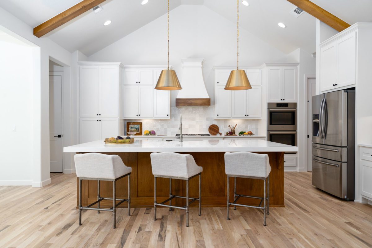
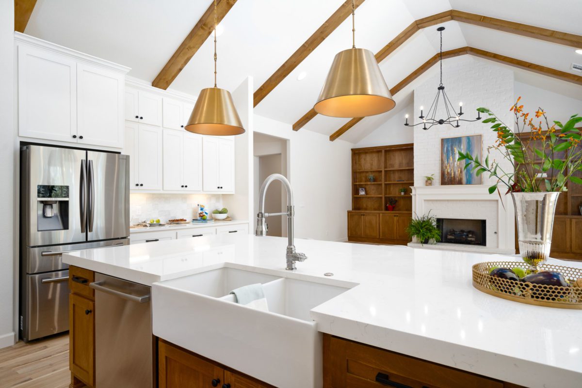
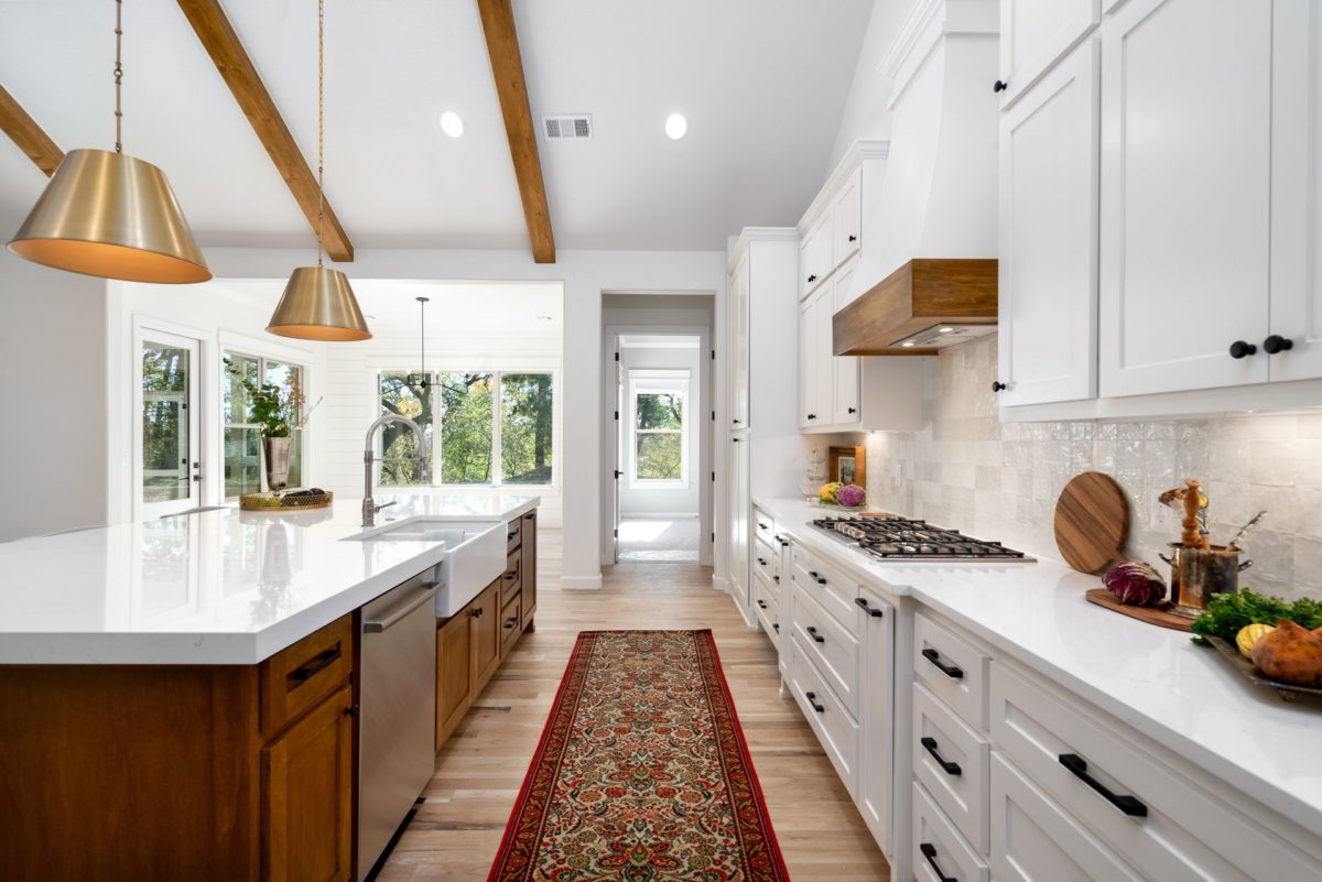
This one-level space has an abundance of windows, so Sandmeyer focused on harnessing that natural light. In the kitchen, light-stained wood beams in the vaulted ceiling bring warmth to the space. The custom range hood also incorporates a wood accent to coordinate with the beams.
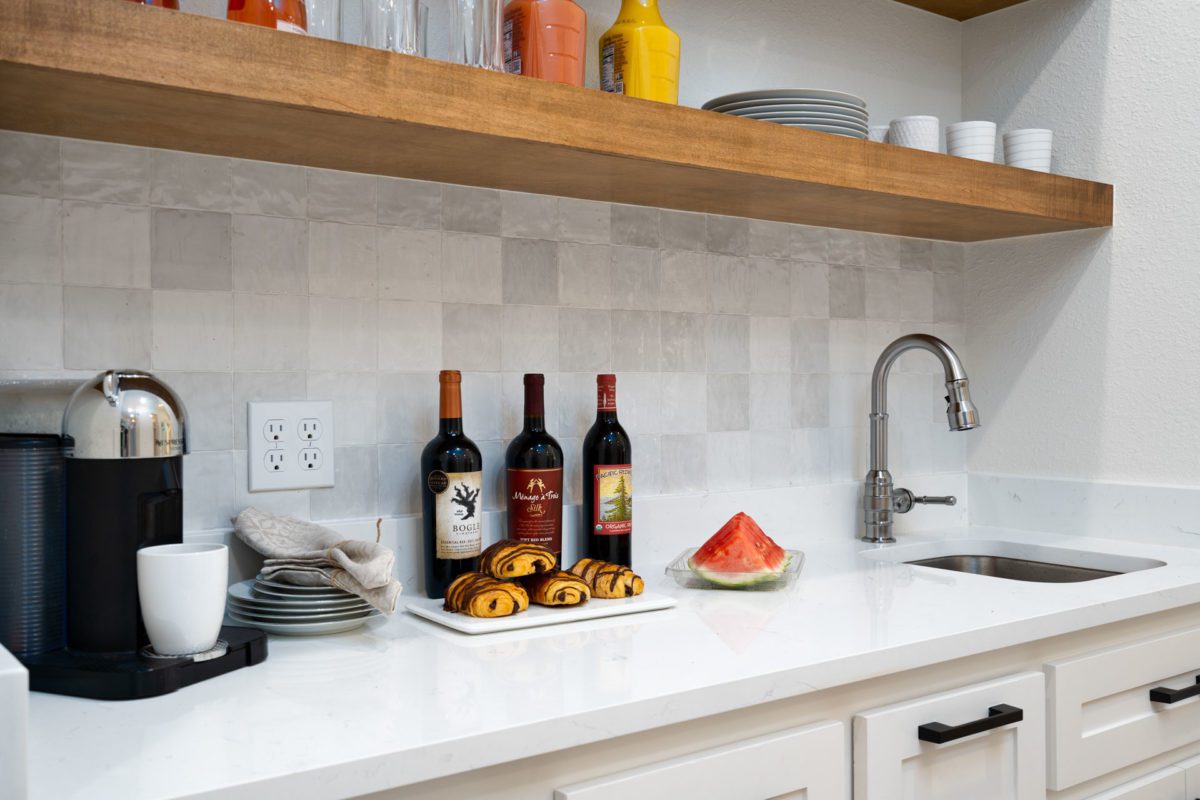
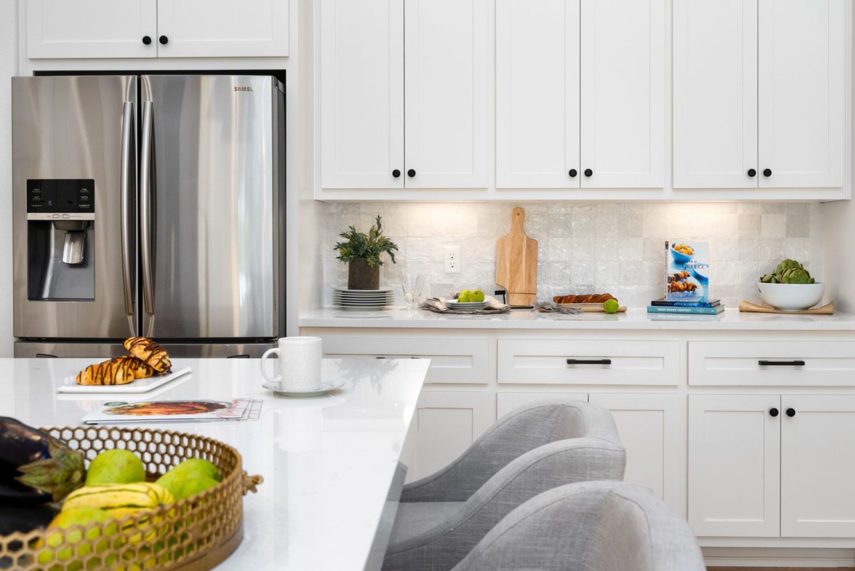
Over the stove is a visually interesting backsplash tile replete with sparkling accents that bounce around in the light. Quartz countertops, cut to a double thickness, and a focal point of gold pendant lighting add sophistication to this kitchen. Black hardware was utilized on the white cabinets and on the island’s stained wood cabinets.
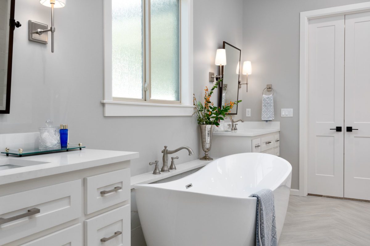
Laid in a Herringbone pattern, the floor in the master bath has a light, wood-like grain. Wall sconces elevate the aesthetic of the space while a luxurious, freestanding tub acts as the room’s prime focus. Two separate custom vanities contain the same white-based quartz counter as seen on the kitchen island. To add a graphic punch, Sandmeyer used bronze fixtures and black hardware.
“People should not be afraid of using mixed metals” within the same space, says Sandmeyer. A single chandelier adds even more visual interest.
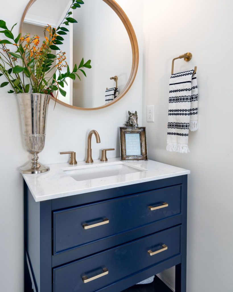
Warming the area in the powder bath is a gold antique brass faucet and gold pull knobs on the vanity, custom painted in a deep navy blue. The gold-toned towel rack and mirror coordinate well, pulling the room together.
“Navy and gold is very much on trend,” says Sandmeyer.
She describes this California-inspired home as clean, airy and warm, flowing from room to room – at once cohesive and distinctive.
Antiques and Art Inspiration
Photos by Tony Li
Redesigned Kitchen and Bath
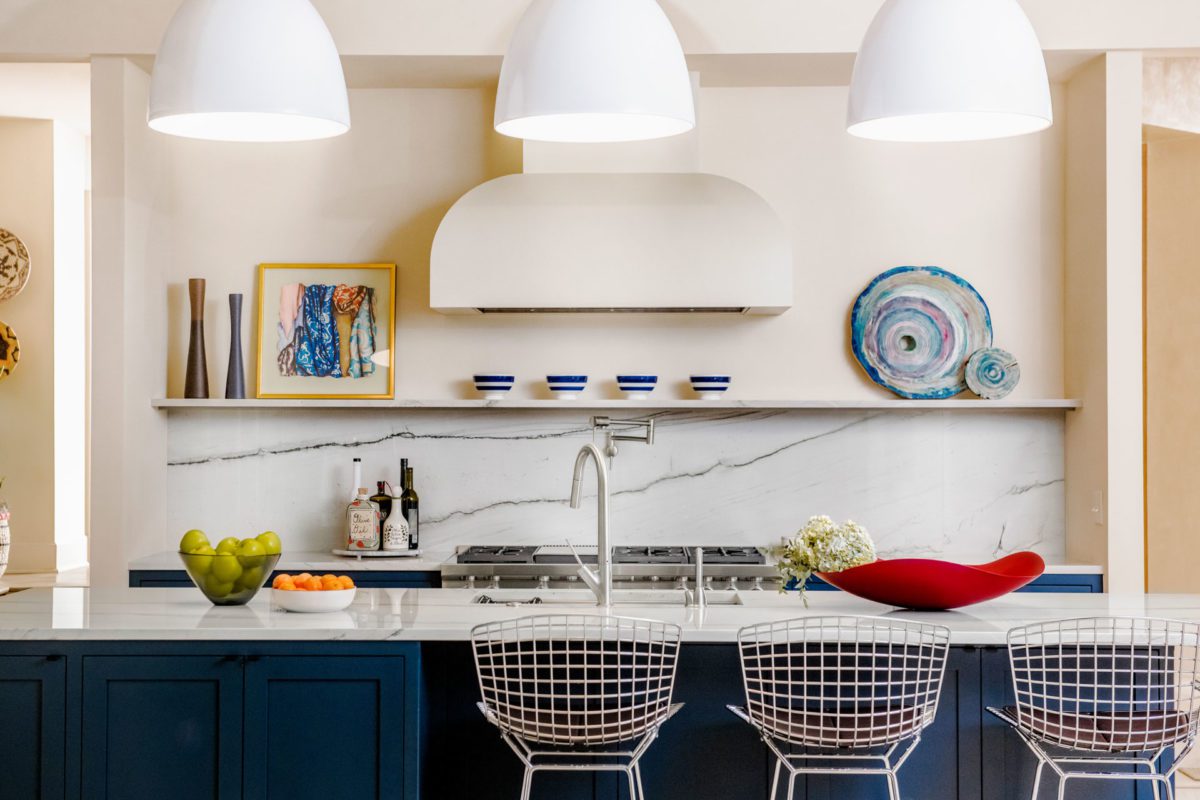
This midtown Tulsa home, built about 20 years ago, is an original Jack Arnold creation. The kitchen remodel was designed and helmed by Beth Sachse (owner) and Cassie Johnson (interior designer) at Tulsa’s SR Hughes. The overhaul focused on two things: beauty and function.
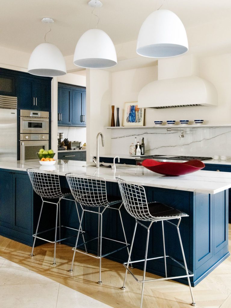
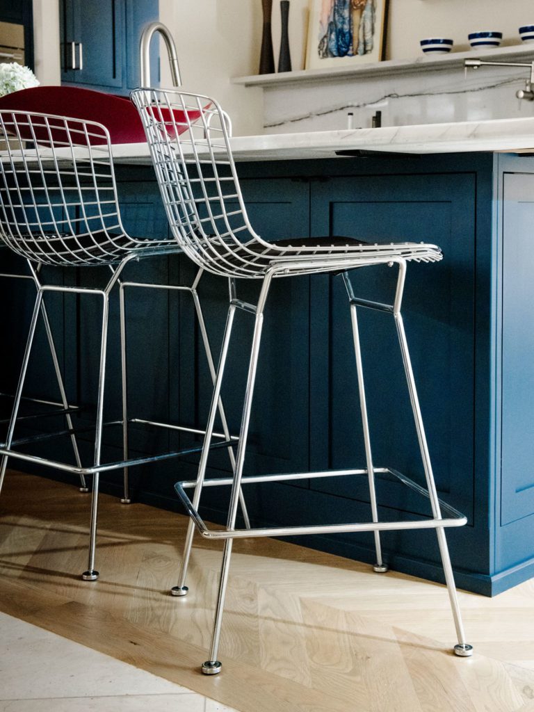
The appliance layout remained with the exception of the range, which shifted for optimal visual attraction. Requiring a total floor replacement proved tricky, since it needed to coordinate with the existing floor tiles of the living room. The light wood floor is set in a Herringbone pattern, and the marble backsplash slab above the cooktop is Monte Blanc Quartzite.
“It is a pretty, happy space,” says Sachse. “The homeowner, Pete [contractor Peter Grant], and SR Hughes were all integral players in the design process.”
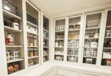
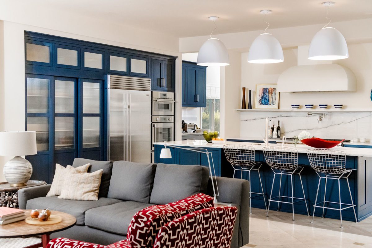
Next to the refrigerator is a pantry, which has reeded glass that diffuses the content inside. Above the fridge is a bank of storage cupboards. The dark blue paint, inspired by the homeowners’ already-established color scheme, can also be found on the island.
“We utilized the concept of the sliding door dish pantry, rather than the traditional separate cabinets,” says Sachse.
The homeowners’ antiques and art lent inspiration to the kitchen.
“It is a mix of the contemporary with the traditional,” says Johnson.
Baths Reimagined
Paige Woolbright, director of interior design for SR Hughes, created this master bath and powder room for her clients who had to rebuild their home after a fire. Using the same footprint, this new build in Oklahoma City’s historic Nichols Hills was aided by the expertise of contractor Jeff Blake of Gummerson Blake Design Build.
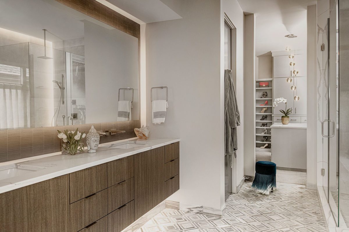
In the master bath, a wood and blended marble vanity creates visual excitement for the clients. A focal point is the LED light, which surrounds the floating double-sink vanity.
“There was a lot of play with light,” says Woolbright.
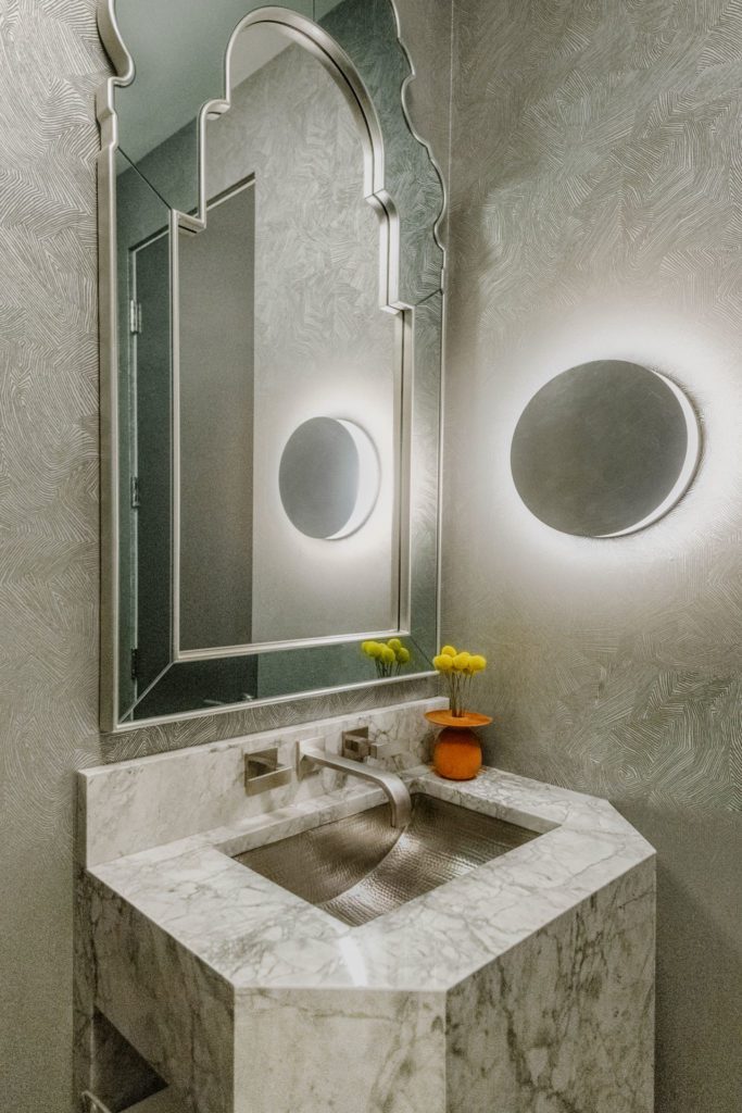
In the powder bath, the squared-off corner vanity is custom-designed by Blake. A disk-shaped wall fixture and a scallop-edged mirror add playfulness, while the iridescent wallpaper bounces light around the space. Woolbright says the homeowners’ art collection served as an inspiration for the area.


This midtown Tulsa kitchen was redesigned by the team at SR Hughes. Renovations included shifting the range, replacing the floors and adding in touches of color, like the recurring dark blue found throughout the home. 

This master bath blends wood and marble with LED lighting for a unique yet calm space. 
A one-of-a-kind powder bath, this space features a custom-designed vanity and scallop-edged mirror.
A Ranch Overhaul
and Rabbit Redo
Photos by Kacey Gilpin Photography
The Bunny Bath
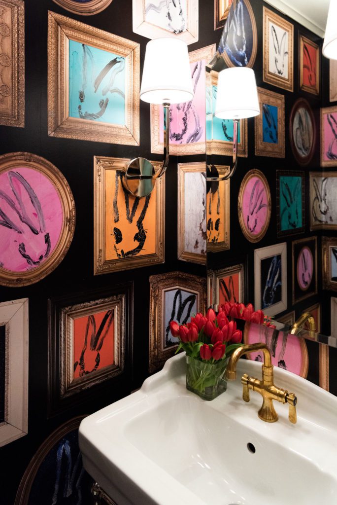
Located in midtown Tulsa, the owners of this 2,500-square-foot home brought Emily Davis, owner of Emily Davis Interiors, onboard to create some interior design fun. The walls of this half bath are covered in a colorful bunny wallpaper, displayed across the entire length of the wall. Coincidentally, the client has a favorite rabbit painting elsewhere in the home.
“How serendipitous,” says Davis.
Using the wash stand instead of a cabinet was important to bring airiness to the space. The faucet, another stand-out moment, is un-lacquered brass.
“It’s stunning,” Davis says. “It is gaining popularity.”
Seen throughout Europe, the un-lacquered brass has a “living finish” that will change color and gain a patina over time. The sconces on the perpendicular walls easily spread out the light in this whimsical space.
A Bright Kitchen
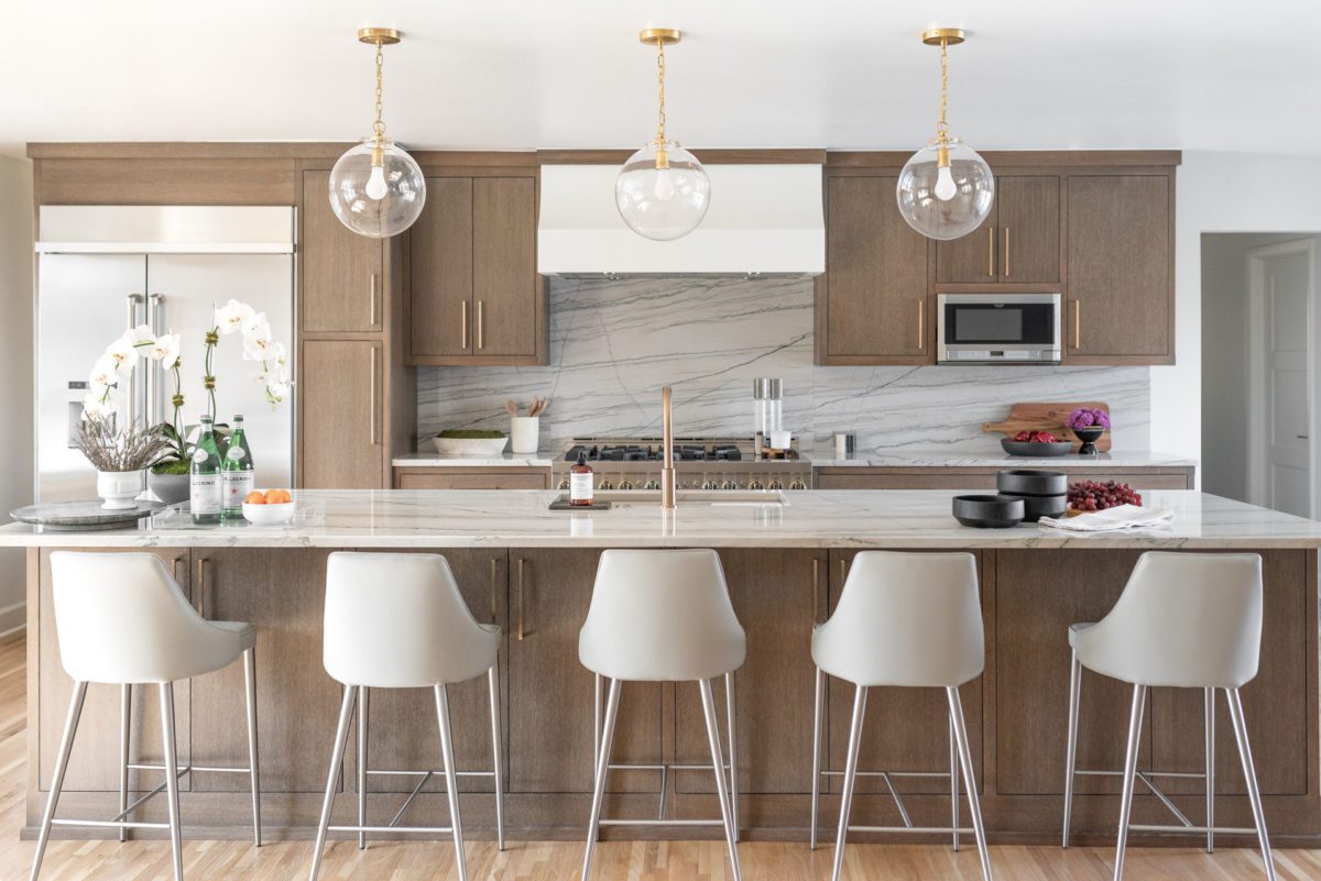
Family-friendly was the goal for this kitchen remodel in the 1950s ranch-style home located in midtown Tulsa. Davis describes the interior as “slightly contemporary.” The native Oklahoman’s clients, who are a young family, wanted a nod to the architecture in this remodel.
In order for the kitchen to have a good flow into the living room, a wall was removed to open up the space. The wood flooring found throughout the home helps create a sense of overall cohesion.
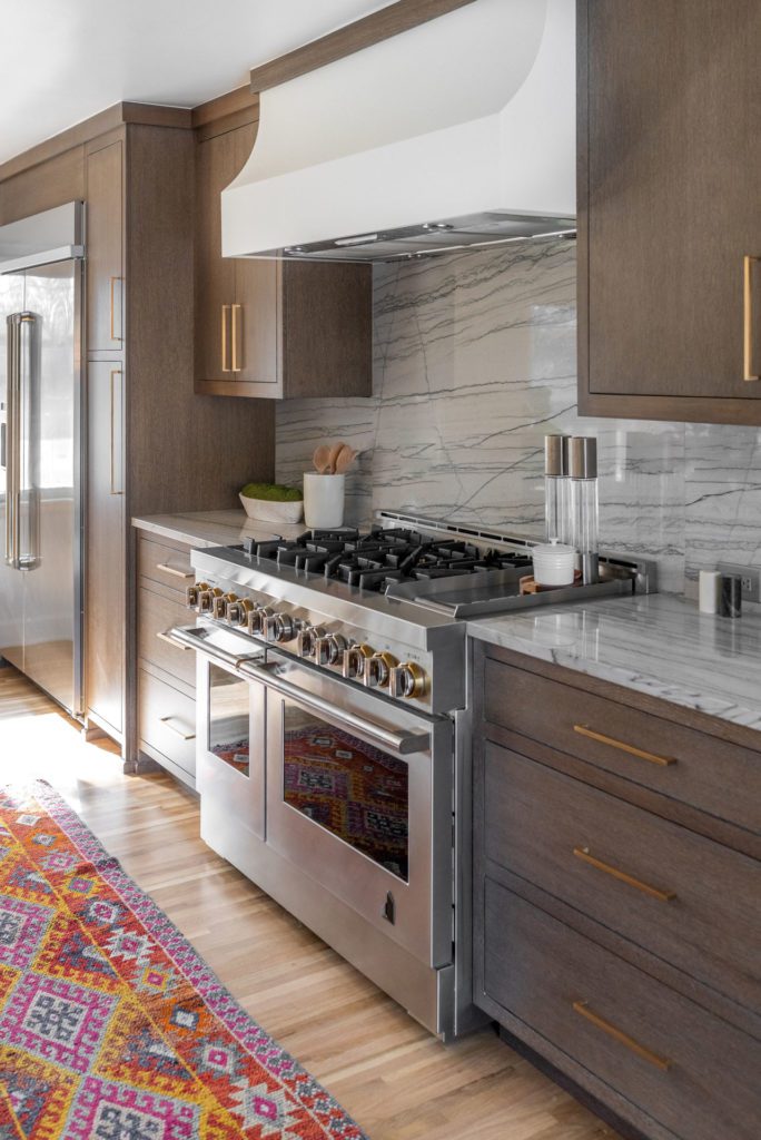
Wanting American-made appliances, the homeowners chose the Jenn Air brand. The gold detail on the range knobs is unexpected and was one of Davis’ favorite elements.
“It is such a wow moment,” she says.
With grey veining, the Quartzite on the counters and backsplash adds warmth, but stays fairly neutral while coordinating with the wood cabinets. Glass globe pendants from Circa Lighting don’t impede the view and instead lend more light to the kitchen.
This active family needed a big island, and to accommodate it, an office was relocated. This move created space for a large window to provide abundant natural light. There is ample cross light from the front of the home as well, through to the kitchen and out to the expanse of windows leading into the backyard and pool.


