When an unknown architect designed a particular home in midtown Tulsa in 1957, he couldn’t have predicted it would go through a magnificent transformation 61 years later.
It’s doubtful now that he would even recognize the home’s interior from its original blueprint.
When empty-nesters who love to entertain asked Kurt Barron of Barron and McClary General Contractors to look at the home, he quickly saw the possibilities of creating an open and inviting environment. Barron and Philip Doyle, the designer, envisioned moving some of the original architectural features that would enhance the homeowners’ flair for elegant entertaining.
Their pivotal question to the couple was, “How do you live in the space?”
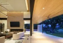
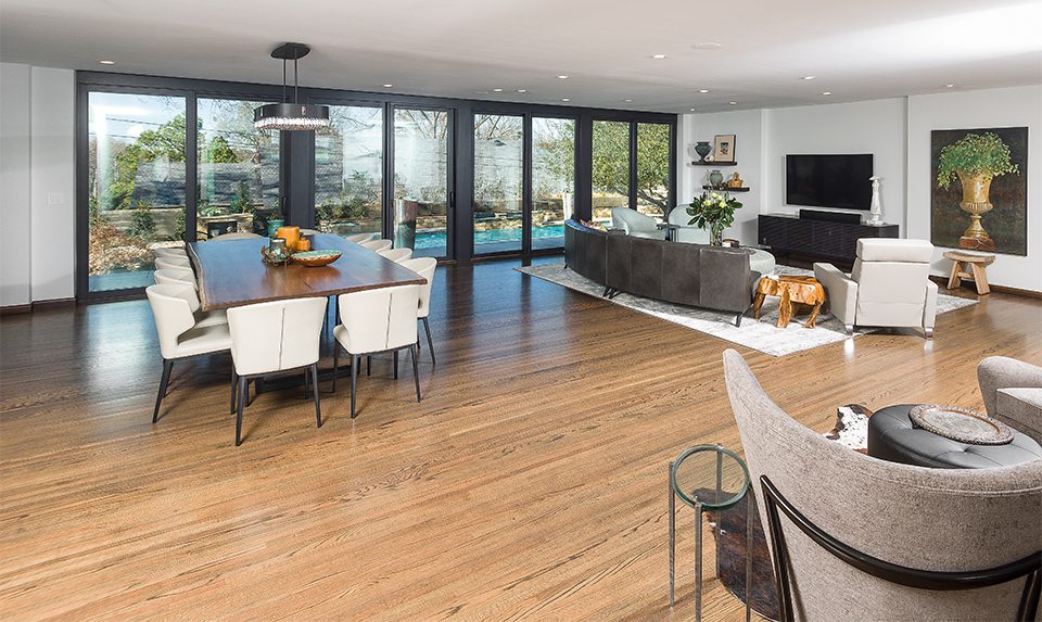
Barron eliminated a step down into the large main dining/living area. He also removed an interior fireplace that blocked the expansive view of the swimming pool and surrounding well-manicured landscape.
With 3,500 square feet of living space to consider, Barron enjoyed the challenges the home presented. Doyle designed the updated floor plan.
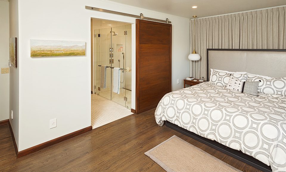
“We remodeled about 2,000 square feet of that space,” he says. “We completely renovated the kitchen, an adjacent utility bar and guest powder bath.”
The project included taking out 30 feet of the exterior back wall to restructure that part of the home, along with the entry to the pool and patio.
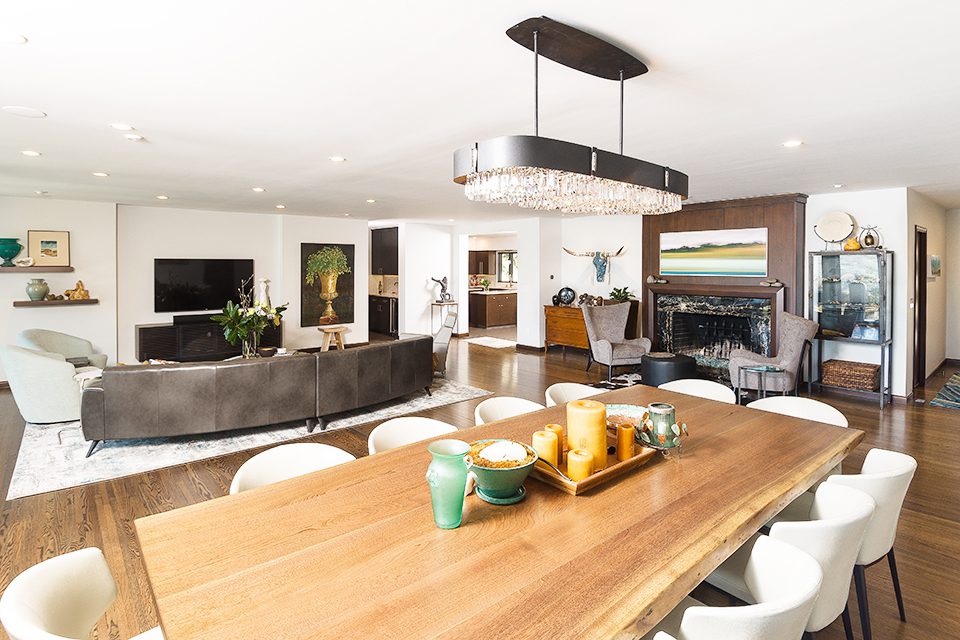
Throughout the home’s main areas, there is a strong influence of geometric design, particularly in the architectural expanse of floor-to-ceiling windows, accented with wooden dividers. The dining room chandelier is a large rectangle of circular lights, accenting the long table that comfortably seats 12.
Wall-mounted shelves hold small, framed paintings and other design treasures. Several large contemporary paintings add artistic drama. A woven rug with a subtle pattern gracefully solidifies the furnishings in the adjacent, open living area.
Complementing and contrasting with this streamlined theme is the softness of rounded corners in the living area furnishings. The circular coffee table is situated close to the leather sofa in the center of the seating area. Upholstered chairs in a pale aqua fabric provide design contrast and comfortable seating. This entire area would lend itself to an intimate dinner party, followed by dancing to the music of a small combo. It’s spacious but still has a warm, inviting character.
Discreetly placed, small, canned ceiling lights repeat the circular theme throughout the kitchen and the living/dining area, where the rectangular planks of the red oak floors are a beautiful anchor.
Barron says he felt at home while redesigning the kitchen because “I grew up in a home that had ribbon mahogany cabinets, just like those in this kitchen.”
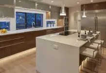
Barry Suderman of Woodmasters designed new cabinetry to match the originals. Barron used the combination of quartzite for the countertops and subway tile for the backsplash. A striking stainless steel hood blends well with kitchen appliances. The kitchen’s geometric theme is sleek and sophisticated.
Accessibility was Barron and Doyle’s intention for creating efficient workspaces. While at the kitchen sink, the homeowners only have to make one turn and there’s the center island sink and counter.
“This was definitely a collaborative project with Philip Doyle,” Barron says. “Tracy and Phil were also very involved in the project every step of the way. They have interior design friends who offered suggestions, too.”
The result is an older home with a fresh, inviting new personality.


