[dropcap]The[/dropcap] conventional wisdom is you can’t always get what you want when buying a home, and it still holds true. But while buying a home involves compromise, renovation does not. Renovation gives homeowners a chance to remake their homes exactly to their specifications, and many Oklahoma homeowners are choosing to do exactly that. Here are two projects where people chose to create the home they wanted rather than compromise.
Modern Glamour
An OKC renovation mixes contemporary and traditional design for a fresh, new look.
He likes contemporary. She likes traditional. Both wanted a change in the interior design of their home, located in Mulholland, an upscale gated community in North Edmond.
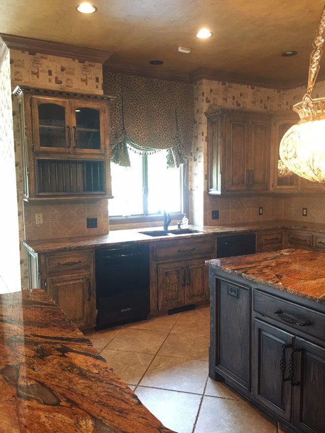
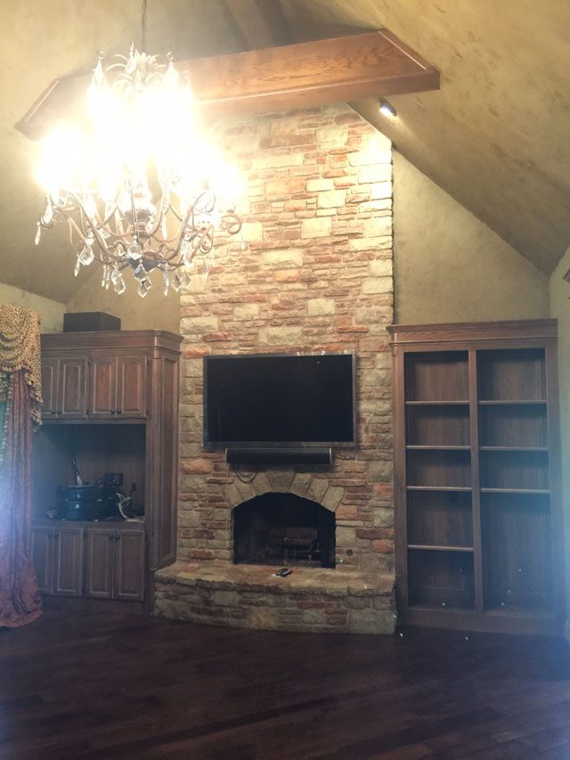
Their renovation wish was no small challenge for their interior designer, Kellie Nicholas of A-Line Designs LLC. Originally, the home was shrouded in dark brown tones. Rooms had a claustrophobic atmosphere as if these spaces were begging for more open, light-filled spaces.
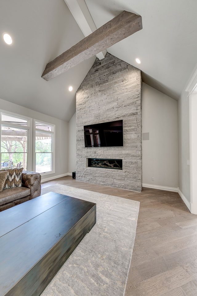
Scroll left and right to see before & after photos.
Mulholland homes feature traditional architecture. “We couldn’t get too modern, so our solution was to meet in the middle with a contemporary look,” Kellie says.
The transformation is worthy of superlatives – magnificent, astounding, amazing.
The front door became the key to this home’s revival. “We changed it to a modern iron and glass door, compatible with the contemporary updates we made to the home’s interior,” Kellie says.
The renovation went well beyond designing a new front door.
“They wanted to completely transform the entire home,” Kellie says. “We removed all the hardware, flooring and plumbing. We opened up some walls downstairs. In the living room, we took out a wet bar to create more open space in the public areas. We completely redesigned the layout of the kitchen as well as the master bedroom.”
Beyond the front door, the entry was redesigned with a clean, formal look accented by a dramatic chandelier. “We changed the original wooden banister, installing a new iron railing to give it a more sophisticated, modern look. The black iron complemented the light washed wood floors to create the modern high contrast look we were striving for,” Kellie says. “We really wanted an updated formal statement as guests walked into the home.”
Throughout the home, there is an emphasis on geometric themes, especially in the kitchen, where modern updates enhanced the home’s traditional motifs.
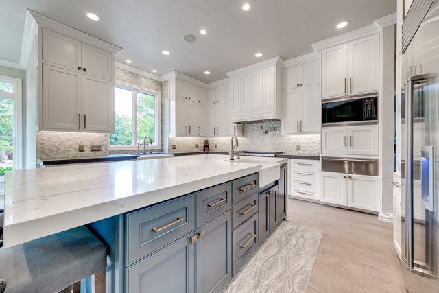
“We selected a glass mosaic backsplash tile, which combined modern glamour with a curved diamond pattern adding a traditional note,” she adds. “The kitchen window was framed with the backsplash material. That wasn’t part of the original plan, but it created a subtle, interesting focal point in the kitchen.”
MetroQuartz white marble with random geometric streaks added design drama on the countertops, center island and surrounding spaces. “The veining of the Calcutta Siena slate, an engineered stone, has a natural, high contrast modern look. The same material was reprised for the butler’s pantry, laundry room and bathrooms. This stone is durable, stain resistant and awesome for longevity and family use,” Kellie says.
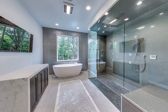
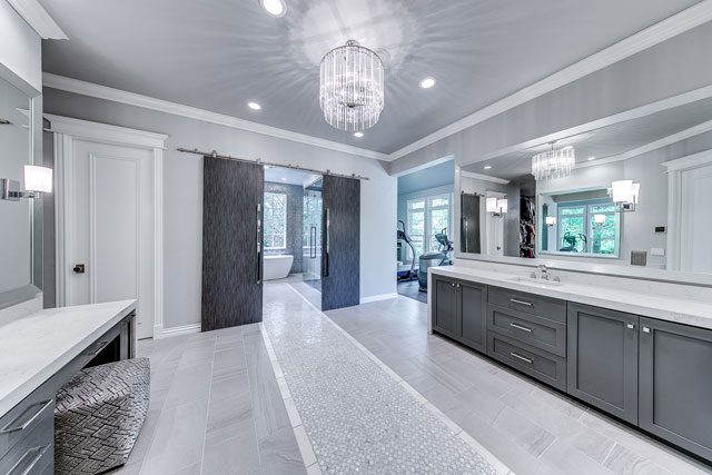
Extensive renovations occurred in the master suite and bathroom, which had been ultra-traditional. Now, this area has a contemporary look, with high contrast in furnishings and finishings. The transformation included adding rectangular charcoal gray bath and vanity sinks with a waterfall edge, chrome fixtures and a steam shower.
Following this impressive change from traditional to modern, Kellie suggests, “If you’re renovating a home – period makeover or otherwise – make sure you have a clear vision: your own or a designer’s. It is important to think through the functionality as well as the aesthetics of your home when remodeling.”
A Personal Design
A Tulsa family plans their own design in a historic home renovation.
Dr. Mike Hinkle and his wife, Becky, often cruise the historic neighborhoods in Tulsa’s Utica Square and Florence Park. On those forays, they are not just admiring the period architecture or the beautiful landscaping. They are usually searching for homes to buy that they can renovate and sell, known as “flipping” in the real estate world.
One quaint home seemed perfect for this passion shared by the Hinkles and their son, Gant, a Realtor with McGraw Realtors. “This particular home had stone walls so thick it looked like Europe to us,” Mike says. “It is quintessentially Country French in the greatest of details on the exterior. Actually, it was love at first sight 15 years before we purchased it.”
Scroll left and right to see before & after photos.
On the Hinkles’ recent sighting, there was also a dumpster in the driveway – a clue to them the home might finally be available. The owner had died several years previously, but the home was in a trust and the Hinkles were not allowed to see the property until legal procedures were completed.
“Luckily, the estate’s trustee was a wonderful woman who lived next door to the house we admired,” Mike says. “We learned later that Charles Faudree, the noted Country French authority and author, had fallen in love with the home before the estate was ready to part with it.”
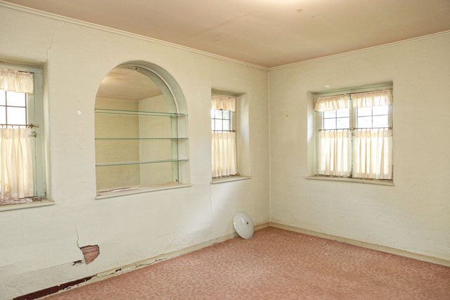
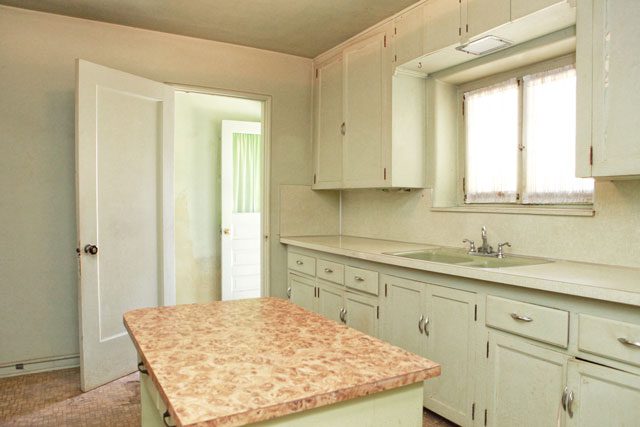
The Hinkles’ first visit across the home’s threshold was shocking. Plaster was falling from the walls. Asbestos was in the heating system. Most prospective buyers would have fled quickly. “The interior was dilapidated beyond anyone else even offering a bid,” Mike says. He and Becky immediately placed the first offer on the home and became the proud parents of a massive renovation project.
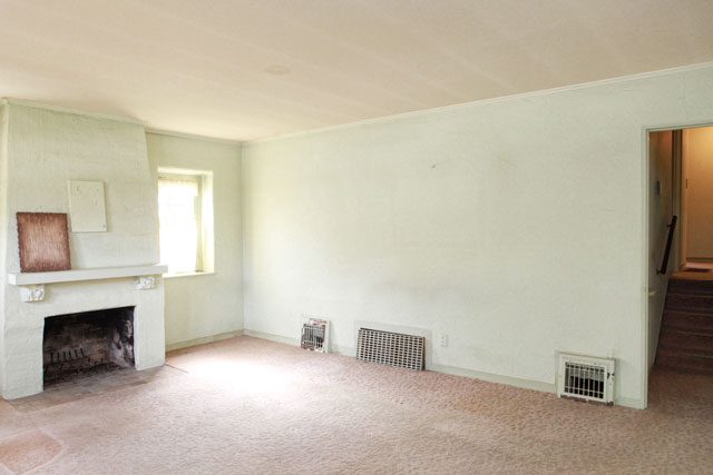
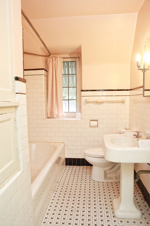
Scroll left and right to see before & after photos.
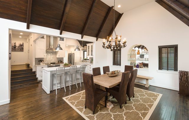
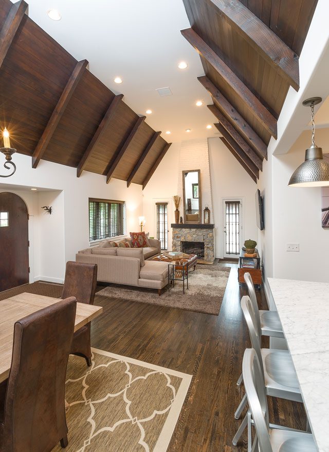
They found beauty in the wooden ceilings, circa 1929, the year the home was built. “They had covered the ceiling in the early 1950s to save on heating bills. We dreamed of expanding the chopped up living and dining room and opening up the kitchen into one grand space,” Mike says.
Their dream came true.
What was required to fulfill their dream for a renovation on a grand scale was restructuring the entire roofline of the house – no small feat.
“I knew the roofline was the key to opening up the inside to have a grand cathedral shock effect after walking up to a cute little cottage and expecting tiny, separated rooms that really don’t reflect today’s home buyer and how they want to live,” Mike says.
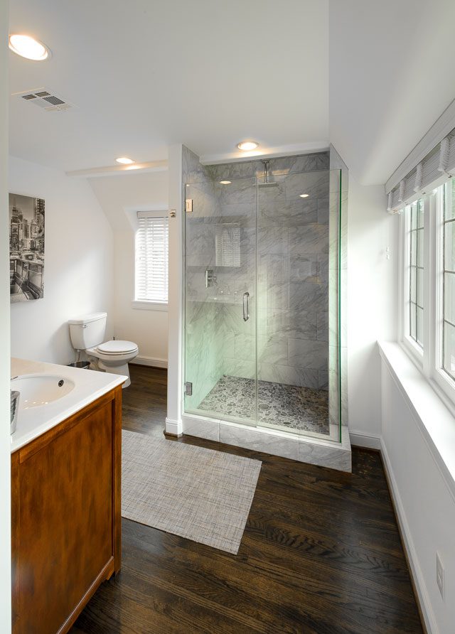
“While we were at it, we added a second floor with two additional bedrooms and a Pullman bath to allow the home to expand from the original small three bedrooms/one bath to the current spacious two bedrooms/two baths.
“The greatest challenge was hiding a huge second floor on the back of the house without changing the character of the home. Our goal was a seamless addition that looks like the 1929 original. We hid the roofline by adding a French hat on top of that section to conceal the second floor elevation.”
To make their vision come true, the Hinkles turned to the people who knew their vision best – themselves. Instead of hiring an architect for the remodel, the family chose to create the design for the renovation.
Once completed, the Hinkles did not have to search too far for a buyer for this impressive project. This precious, enchanting cottage is now Gant’s home.
For all the unusual quirks the Hinkles found in this treasure of a small home to renovate, they were undaunted by the project. A fifth redesign project in the Utica Square area is now in the works for this enterprising Tulsa couple.


