A good designer has to know who his client is at the core; it’s arguably a great designer who can be his own client.
“For many designers, their own home is the hardest project to tackle,” says Christopher Murphy of Christopher Murphy Designs.
The three-level townhouse he shares with partner Benjamin Stewart tells a story of those who make their life there. An array of striking art, unique figures and pops of color fill the spaces of each room.
“It’s my style,” Murphy says. “It’s not Oriental or retro-inspired. It’s just wholly my own aesthetic.”
It’s with self-awareness and sense of humor that Murphy has created this Midtown Tulsa haven.
“We like to entertain, but we love our quiet time, too. This place is like a cocoon. It’s comfortable while being inspiring,” he says.
Murphy finds color and juxtaposition energizing, which explains the combination of a vintage hot-pink rug against white pebble flooring in the entryway.
That love of playfulness and humor is a common theme that can be seen in the furniture choices for the third-floor terrace that features a traditionally shaped sofa and seat that are made of plastic for year-round use.
One of Murphy’s favorite pieces in the house is the red Craftsman tool chest that holds French silverware.
“I love the fun and play of it. And it’s perfect for the silverware because of the separate drawers,” he says. “People are tickled by it.”
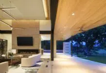
The second floor opens up into a living, dining and kitchen area. A mirrored wall with a mounted fireplace serves as an anchor in the living room.
The high-style Italian furniture pieces, such as the sofa and ottoman, both from B&B Italia, and the boiled leather custom colored chairs serve as the serious side juxtaposed with the giant pick-up-sticks game located next to the ottoman.
“It’s that new and old, humor and seriousness, that I like to mix together,” Murphy says of his choices.
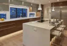
The walnut cabinetry, Caesarstone quartz countertop and stainless steel appliances help make the galley-style kitchen functional yet attractive.
Extending from the kitchen, the dining room holds an Italian table and new captain’s chairs that are sleek and modern and work wonderfully with recovered 1970s conference chairs that line each side.
Lighting plays a big part in design, and of Murphy’s design in particular.
“I believe lighting should create highs and lows; (I enjoy) mixing recess with direct lights and blending ambient and reading lights,” he says.
Ambient lighting, such as the two snake candle sconces in the master bath, highlights a five-piece square art feature, which is part of a collective artistic endeavor. Throughout the room, Murphy created a pattern of squares to please the eye that coincide with the square window and painting as well as the Italian glass mosaic tiles in neutral shades.
A figurine collection found on a nightstand tells the story of the trips the couple have taken.
“These are from our travels, but they also mean something,” Murphy says of the figurine collection that ranges from cultures such as ancient Egypt and 15th-century Mexico to little trinkets given out at a new sushi restaurant.
“Each and every piece holds a special memory of either the place I got it or the people I was with,” he says. “It’s great. I’ll walk by and get a smile because it triggers a memory.”
No matter the art form, Murphy recommends that people not just try to find something to fill a space.
“Buy what you love,” Murphy says of art choices. “Edit carefully. The trick is that sometimes less is more, and showing something in an unexpected way can be even more interesting.”


