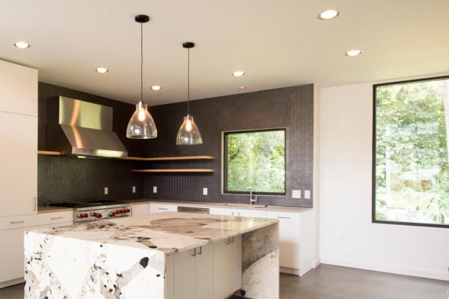
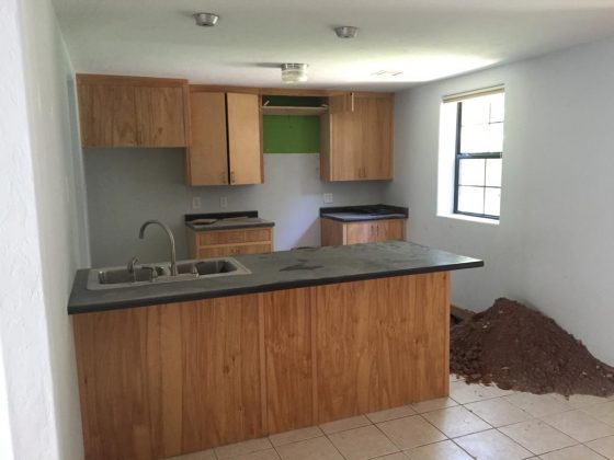
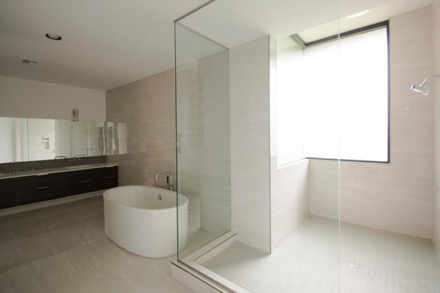
Older houses can present challenges to owners, architects and designers. Sentiments and desires connected to the homes may have prevented technological and aesthetic upgrades. However, massive renovations may not fit the look and feel of the neighborhood. With care, extensive remodeling jobs can yield stunning results. Following are two such examples in Oklahoma City.
From dark and dated to light and expansive
Valerie Helgeson discovered her passion for interior design nearly three decades ago while working for a Southern California property management firm furnishing and decorating model apartments. Helgeson worked with talented designers and quickly realized her affinity for the profession.
After moving to Oklahoma City 15 years ago, she established Design Directions. Those early experiences became valuable when she had the opportunity to renovate a 1980s home in the exclusive Val Verde enclave.
“I love walking into a space that needs updating or remodeling and seeing its potential,” Helgeson says. “I think that’s my gift – my super power. I see into the future of a home.”
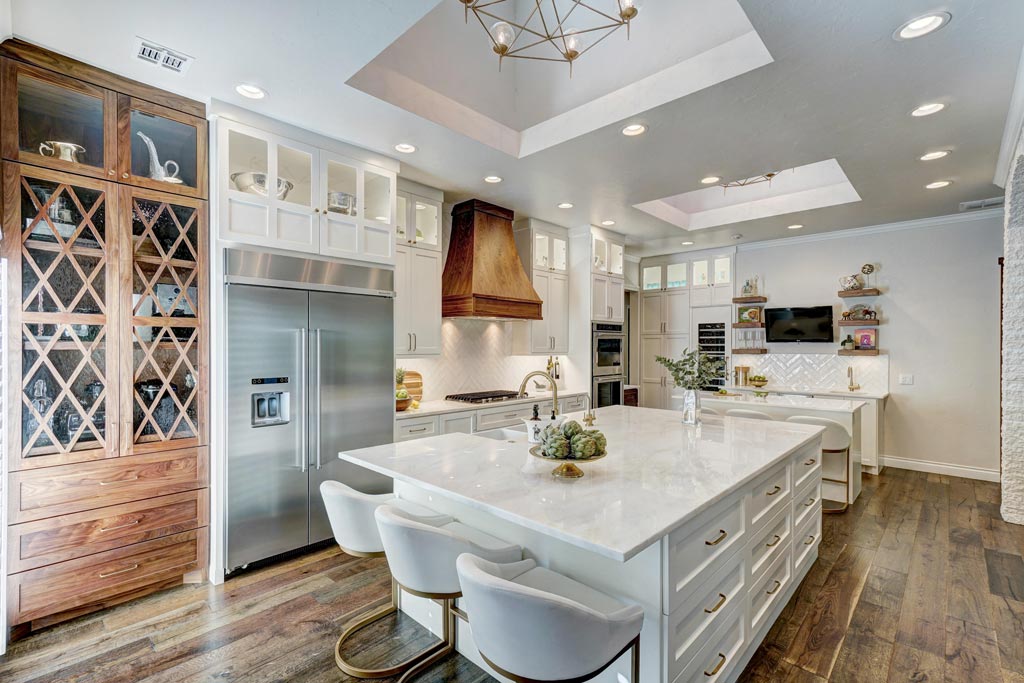
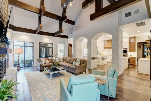
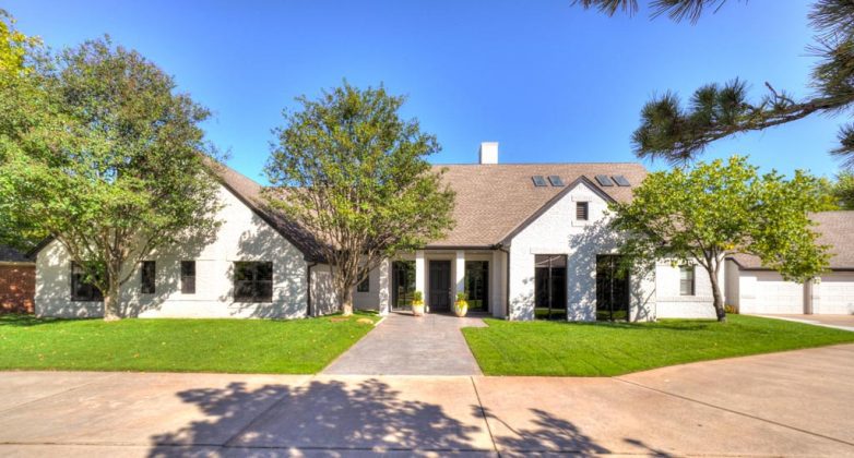
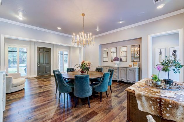
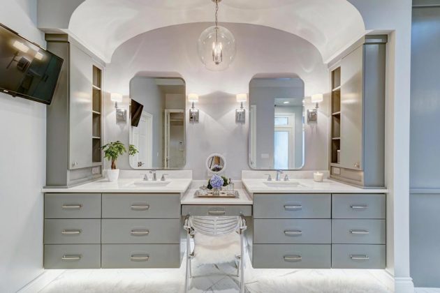
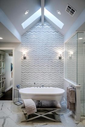
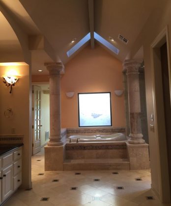
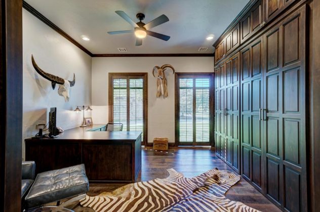
To say it was a massive renovation is an understatement. No room was spared as the 4,200-square-foot home was transformed from a dark, outdated residence into one with a light, airy spirit and an enviable design personality.
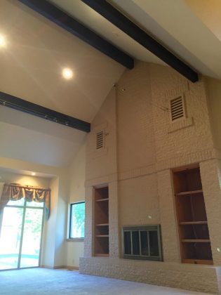
“Every new project is a learning experience,” Helgeson says. “There were some updates through the years and it had been loved and well cared for by the wife’s grandparents. Still, it was very ‘last century.’
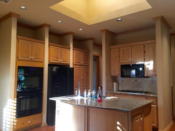
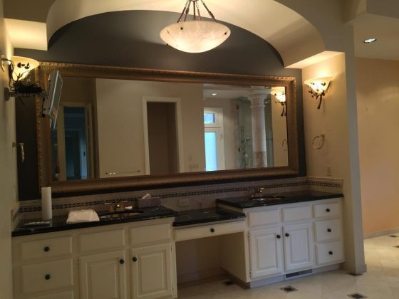
“The home suffered from a lack of light. It had a maze-like quality with walls and doorways – a lot of them – that didn’t make sense. The interior was typical of the home’s era – confined, confusing spaces, lots of medium, dark built-ins, no smooth flow throughout the home.
“I knew instantly I wanted to take out some walls, create an open floor plan and embrace the beautiful views.”
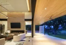
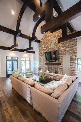
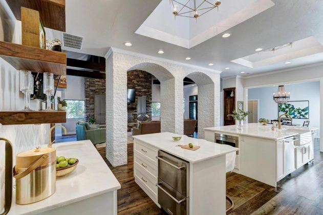
Helgeson’s vision was ambitious. She had walls and windows moved; doorways closed or eliminated; impressive beams with ceiling lighting added in the main living area; and rooms – once like rabbit warrens – opened to become expansive and functional. The original bland color palette changed with crisp white walls. Hidden spaces became bright and usable.
She respected the sentiments her clients had for the home; she wanted to keep it in the family as a gathering place.
“My clients wanted me to create a comfortable, updated, vibrant and unique living space,” Helgeson says. “It was gratifying to know I gave them what they were hoping for. I’m still thrilled with the project. It’s warm, inviting, comfortable, with just a touch of flash. I’m really proud of the work our team did on the home. We poured our hearts into it, and it shows.”
From tiny block house to roomy treasure
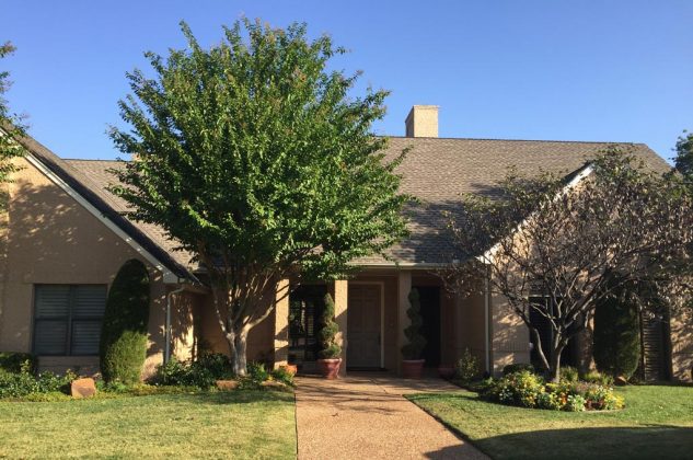
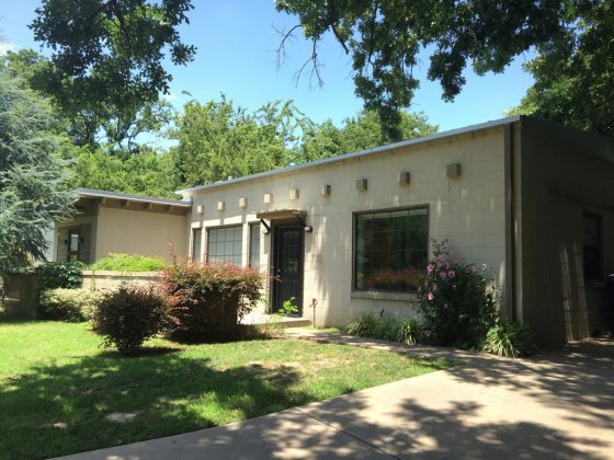
A simple, 1950s concrete block house has evolved into a treasure nearly 70 years later, thanks to an extensive renovation. The house, bought as a rental property 10 years ago, is a hidden gem in the secluded Brookhaven addition. A thin ribbon of the North Canadian (or Oklahoma) River runs through the area.
Adrienne Husted grew up in this quiet neighborhood and fully intended to keep the home as her personal residence later in life. She and her husband, Dave, called her longtime friend Erin Smith, a licensed architect, to turn the small house into a wonder.
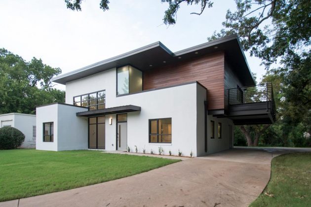
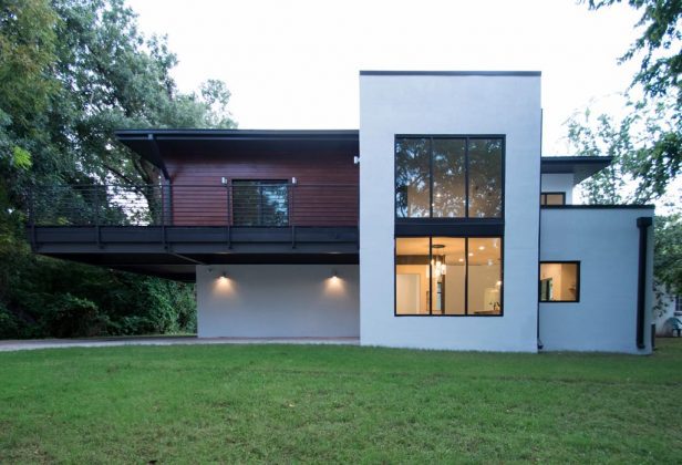
“We demolished most of the existing structure, but kept the exterior walls and windows and built a second floor,” says Smith, who worked with her husband, Ryan, a building contractor, on the project.
“The existing footings could not support the second floor, especially with the cantilevered balcony. A new steel frame supports the second floor. We in-filled the first floor with framing around the existing concrete blocks.”
For drama, Smith kept a lot of the steel structure exposed inside the house.
“It’s nice to look at what holds the house up because it goes back to the mid-century style of architecture, which originated in Europe,” she says. “In that style, exposed structures were celebrated rather than hidden.”
The renovation increased the size of the house from 1,212 square feet to 2,344 square feet. A new guest house has an additional 1,580 square feet. A Big Ass (trademark name) ceiling fan is a surprising visual feature, as is the staircase leading to the second-floor master suite, bath and study.
“The biggest challenge was creating the double-cantilevered balcony,” Smith says. “The structural engineer wanted to just add columns to simplify the job. That would have been easier.
“What we did was so much more appealing. It’s now twice as large as the surrounding houses, but it still reflects the neighborhood’s same design language. We kept the architectural style while making the home useful for the family. This house was perfect for what Adrienne and Dave wanted us to do.”


