If one renovation is good for a home, two must make it perfect.
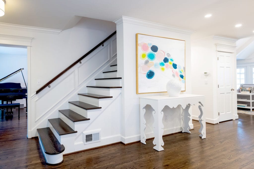
Carolyn Fielder Nierenberg, an interior designer with Campbell Designs, renovated this midtown, two-story Tulsa home eight years ago. Built in the 1930s, the house needed a master suite and a large utility-laundry room. That remodel included fresh paint on the stairway, enlarging the garage, and adding a mud room for three children.
Two years ago, the homeowners requested another face-lift and more extensive renovation. Nierenberg worked with Scott Pohlenz, architect and owner of Pohlenz Cucine Moderne in Brookside, and contractor Kurt Barron of Barron and McClary. The trio achieved an impressive, well-planned makeover.
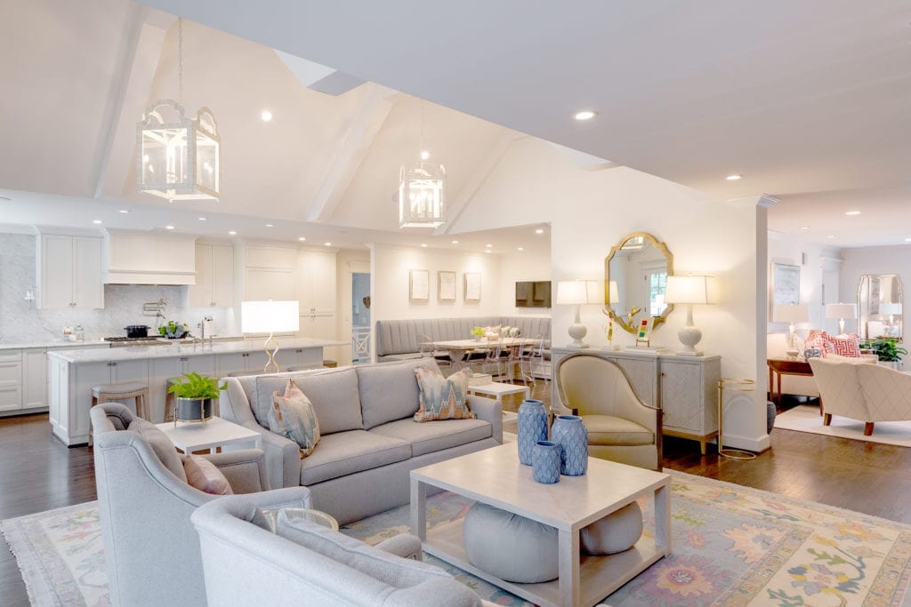
“The key to adding on to the back of this neo-colonial home was establishing a feeling of continuity with the volume of the space,” Pohlenz says. “The challenge was to tie the old with the new in a seamless transition from the existing space to the addition. There was also the challenge of not losing the light in the upstairs bedrooms by raising the downstairs ceilings. I wanted to make the home more current with today’s design trends.”
Barron’s challenge involved grading in the back lawn. This was his third time to work on the home, and he calls Pohlenz’s vision nearly flawless.
“It was a treat to work with Carolyn and Scott,” he says.
The home aged well, but it needed a fresh look. This time, the exterior benefited from the trio’s expertise. The brick and shake shingles were painted light gray, the shutters were painted charcoal, and a new front door added a welcoming ambiance.
“Now the exterior of the home looks really crisp,” Nierenberg says. “The landscaping features bright green shade grass and nice, colorful flowers. It looks cheerful and sophisticated compared to its original 1930s appearance.”
Nierenberg praises the homeowners for “always being willing to push the envelope throughout the last renovation. They have such an adventurous spirit and they were willing to do the things Scott and I wanted to do,” she says.
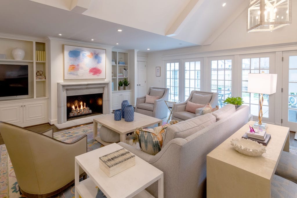
One suggestion included raising the ceilings in the great room – no small feat in any remodeling project.
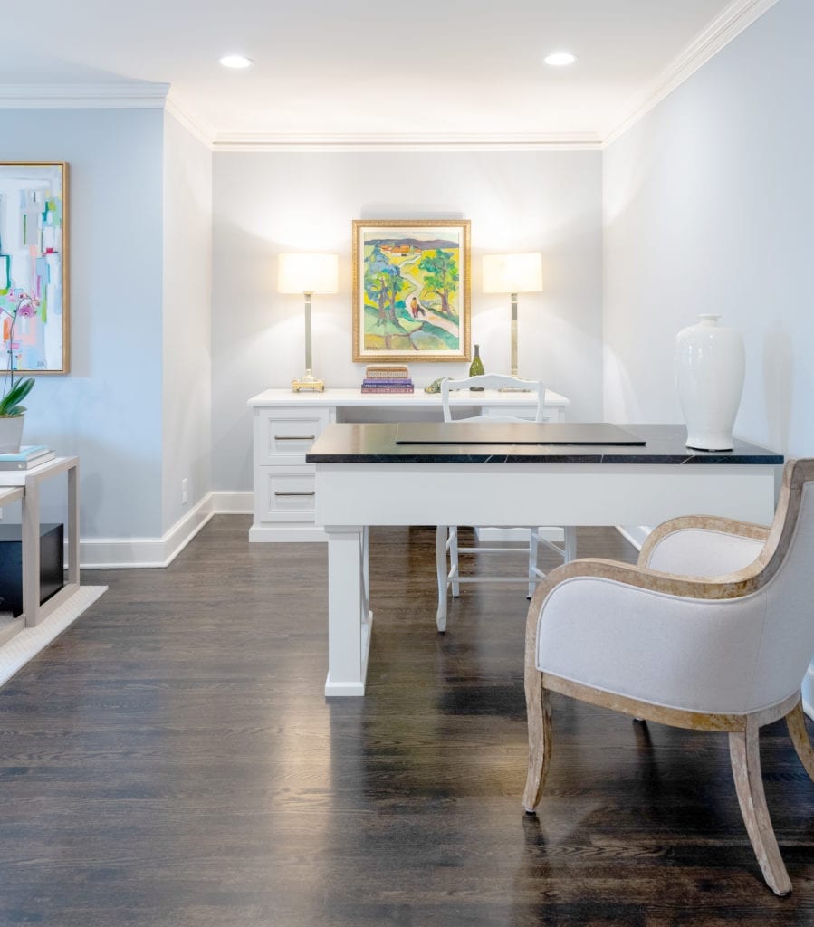
The office, near the mud room, is a highlight of the renovation; Pohlenz strategically positioned it with windows overlooking the back lawn so the children can be seen at play. Nierenberg designed the floor in the office with porcelain resembling limestone and extended the same sturdy material into the nearby utility room.
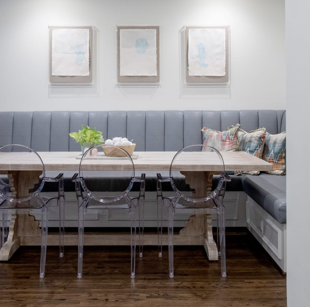
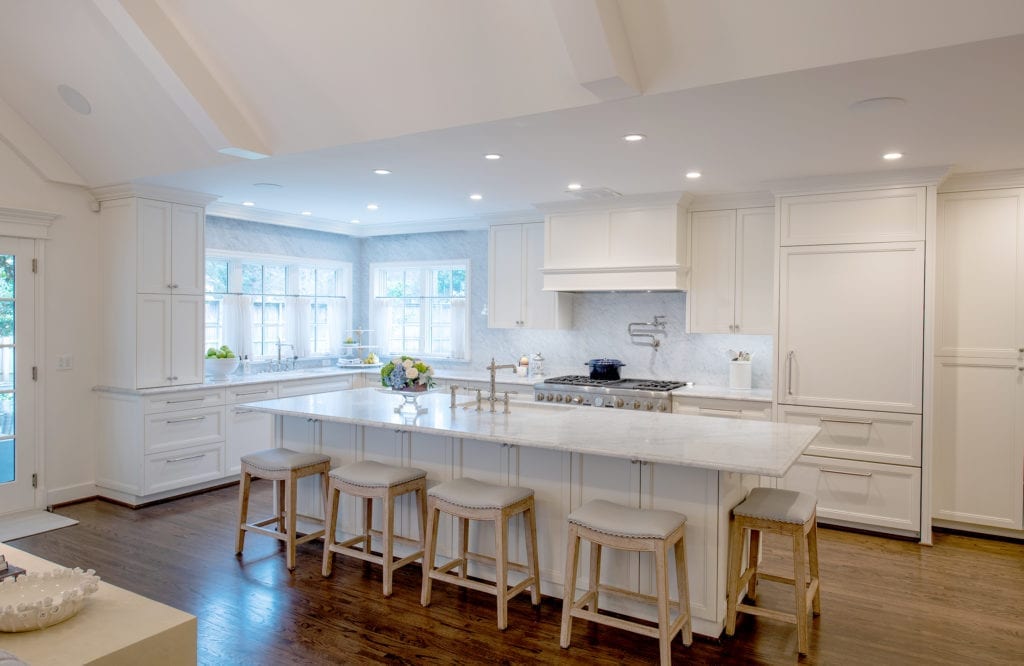
In the kitchen, the center work island is perfect for food prep and casual dining. A banquette near the kitchen provides a cozy eating area.
Nierenberg also applauds the homeowners for accepting and encouraging her use of bright paint schemes.
“They were not afraid to push the limits with splashes of color,” she says.
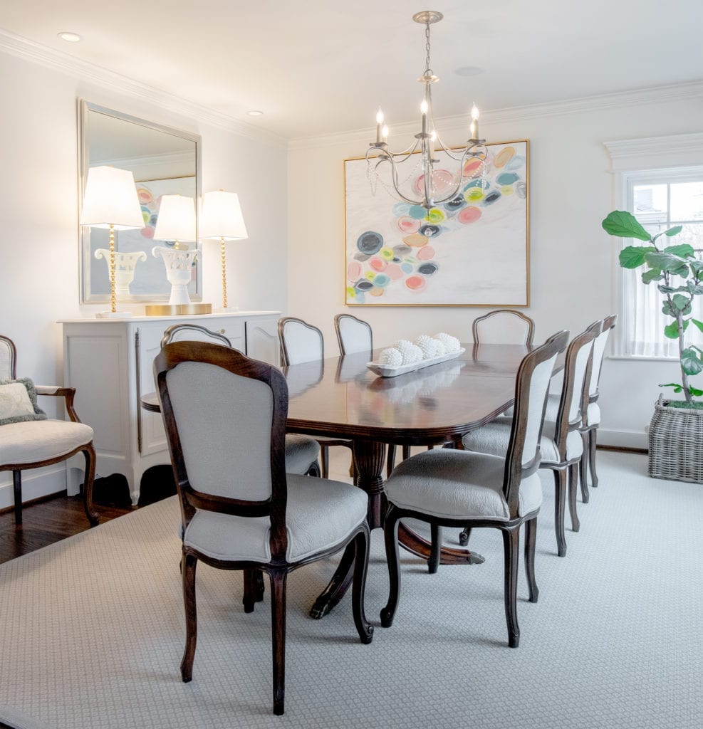
That concept is seen in a variety of contemporary art in bold, vivid hues, along with area rugs, throw pillows and other interesting accessories. The palette includes bright cornflower blues, raspberries and greens, softened with neutrals in upholstery. A warm and creamy white was used on ceilings to mask the extensive renovation, giving a new, seamless look throughout the home for its latter (and perhaps final) renovation.
