A Recipe for Change
Photos by Nathan Harmon
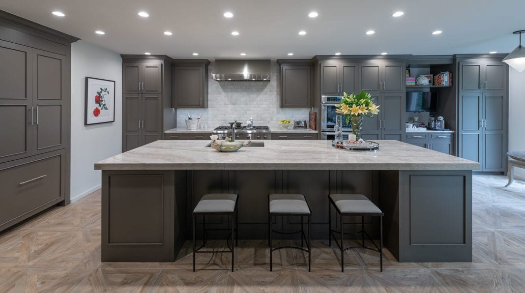
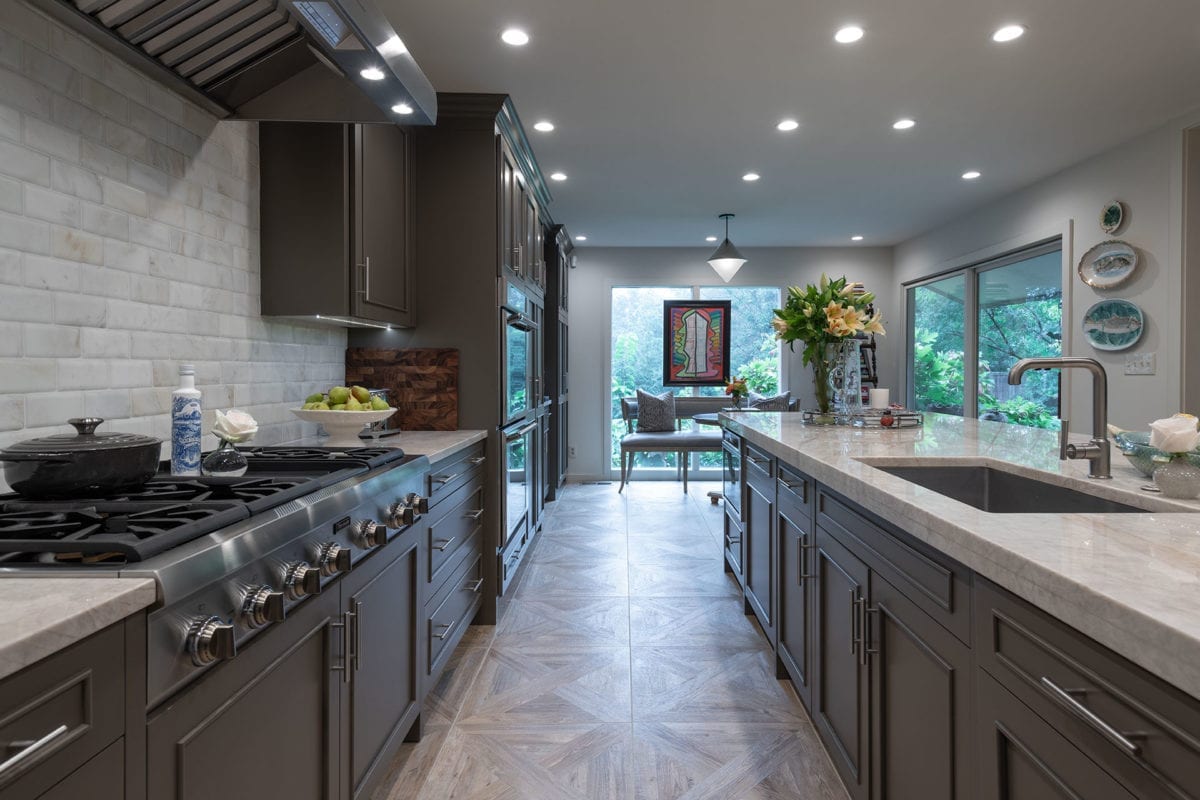
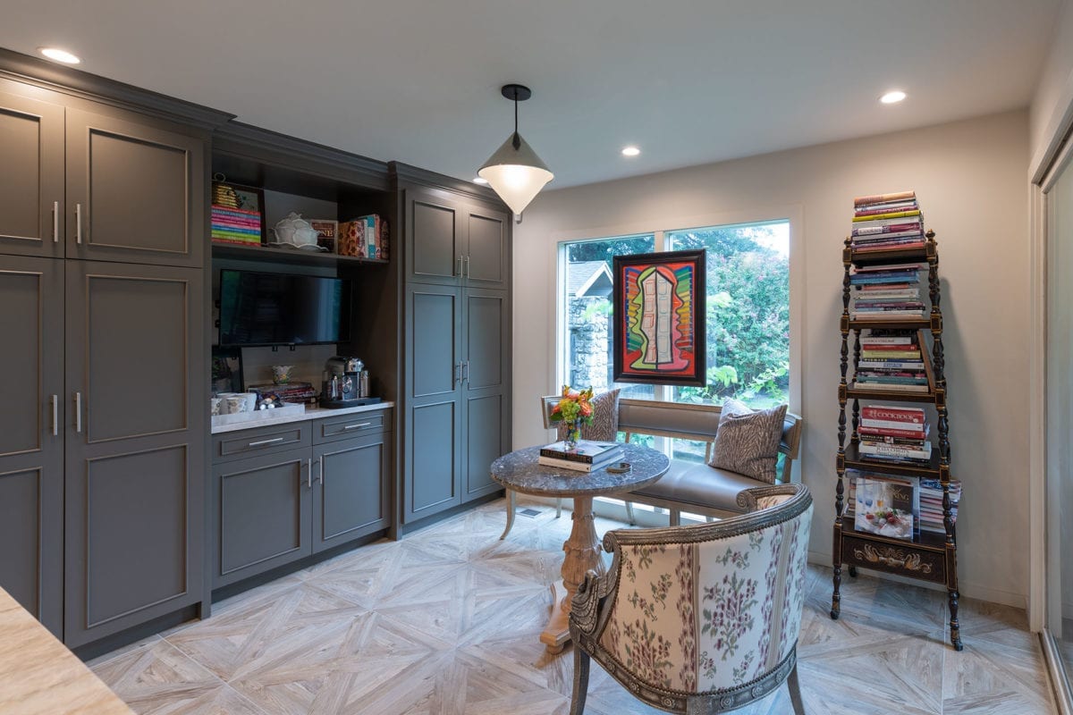
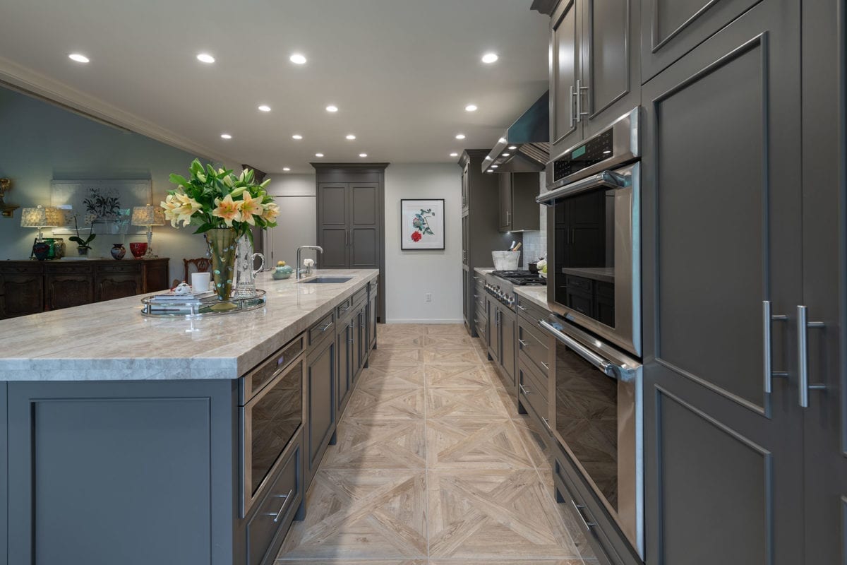
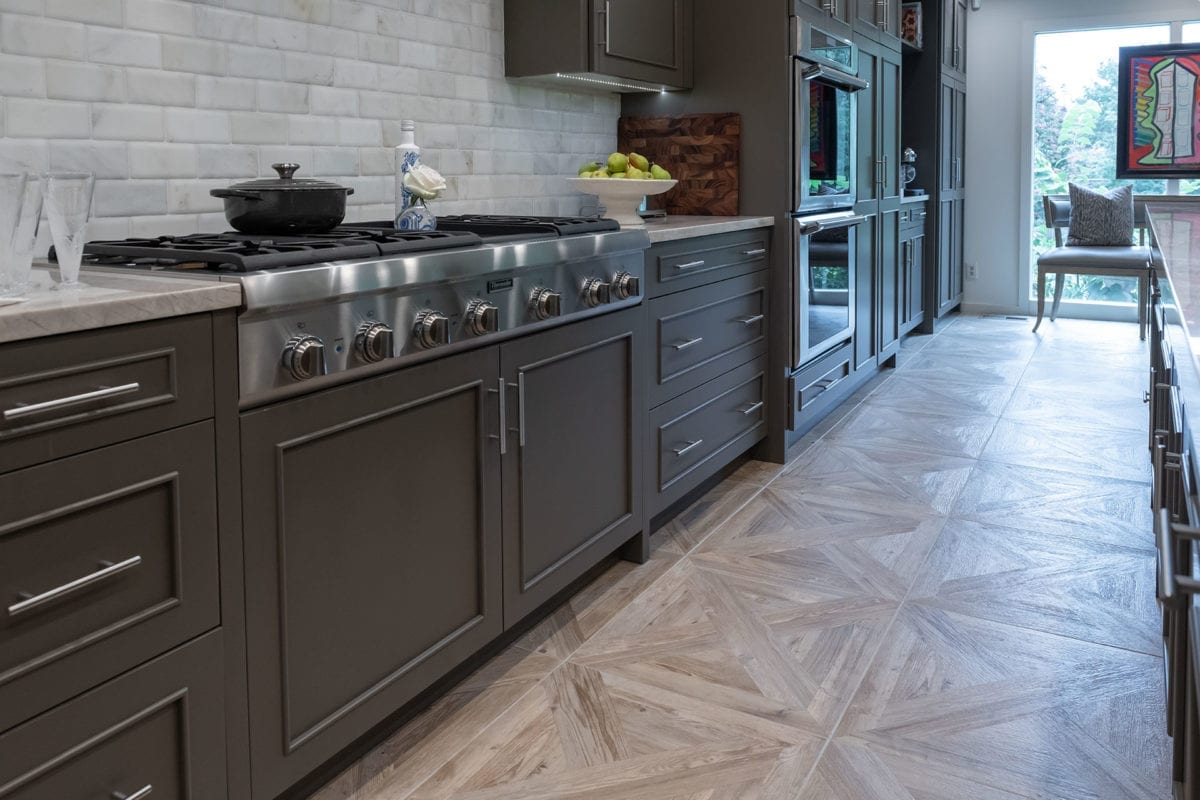
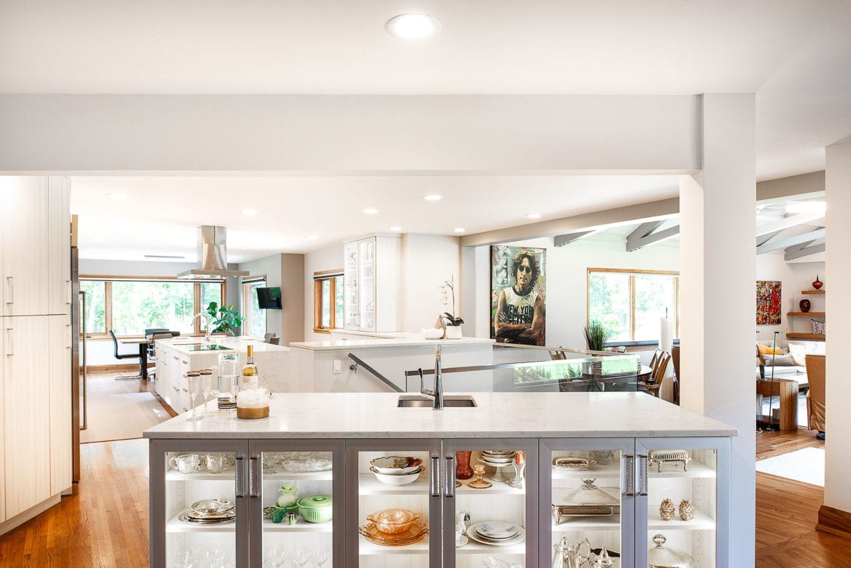
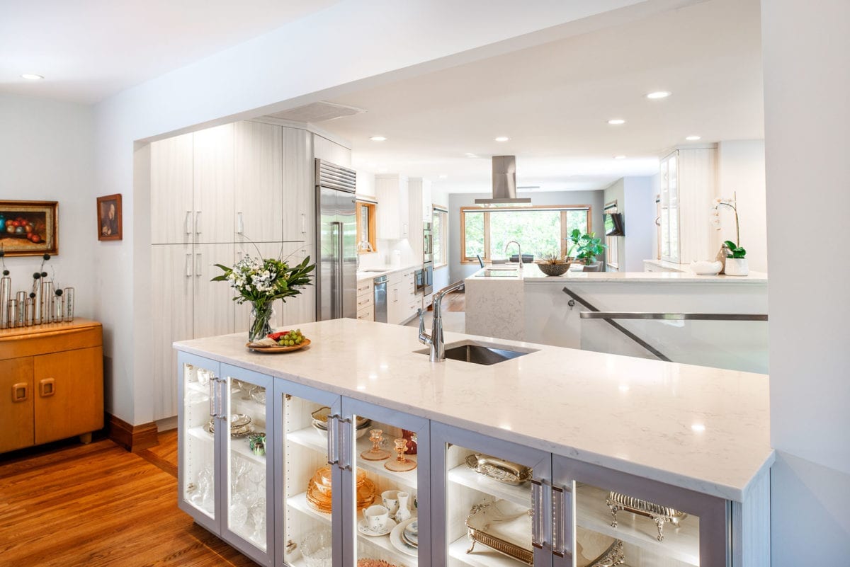
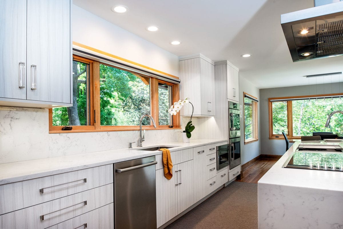
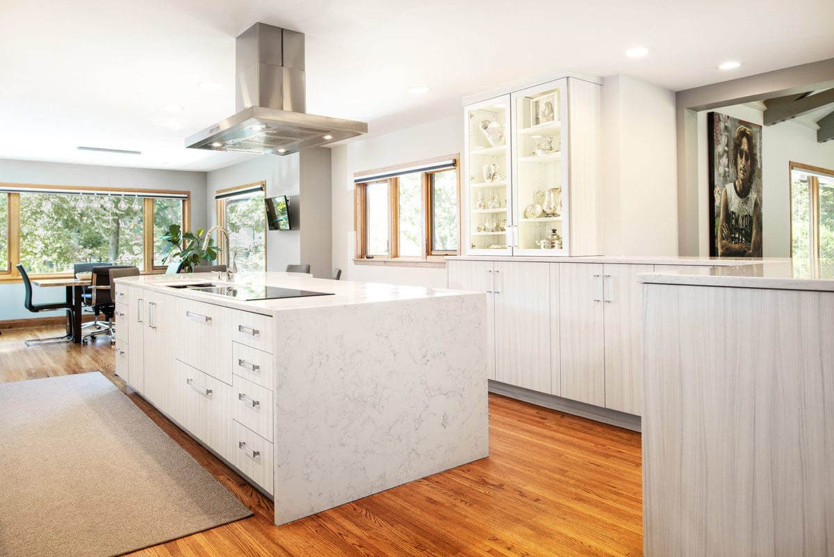
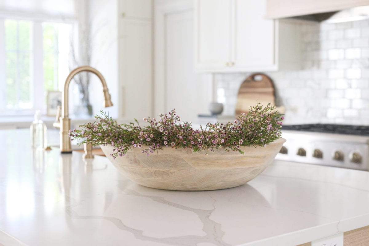
Well-known Tulsa interior designer Jack Arnold recently took a kitchen that was hungry for a fresh look and turned it into a perfect place for frequent entertaining. After all, this isn’t just any ordinary kitchen – it is the haven of a well-known Tulsa florist.
Toni Garner, no stranger to entertaining, has designed fresh flowers and centerpieces for luncheons, dinners and special occasions, including weddings … more than she can count. Arnold’s challenge in this architectural renovation was to refigure the existing space to be more efficient in the kitchen and create a more welcoming setting for guests.
“She has an endless imagination for flowers, but she was always apologetic for the crowded space in her kitchen,” says Arnold. “She wanted to push forward, and asked if we could redesign the space. I admit, I did cannibalize a little space from the adjacent garage. I opened up walls into the great room, close to the dining area. We didn’t go outside the envelope of the existing space.”
Among the major considerations in redesigning this kitchen were electrical, framing and structural capability challenges, says Arnold.
“The transformation is amazing,” he says. “Toni wanted a window over the kitchen sink – she wanted to be able to see her neighborhood. She also wanted the entertaining space in her home to be comfortable for her guests.”
A larger center island in the kitchen was a must. Visitors often gather there before moving a few steps away into the formal dining area, where beautiful fresh flowers take the spotlight in the center of the dining table.
Call it homework or “a case study,” but Arnold and his wife, Susan, had an opportunity to see how the space could be better served when they were among guests at Garner’s home for a holiday event last year. Being “in the moment” with a kitchen full of guests and a seasoned hostess was the perfect way to create an architectural recipe for change.
Ample Space to Shine
Photos by Melissa Lukenbough
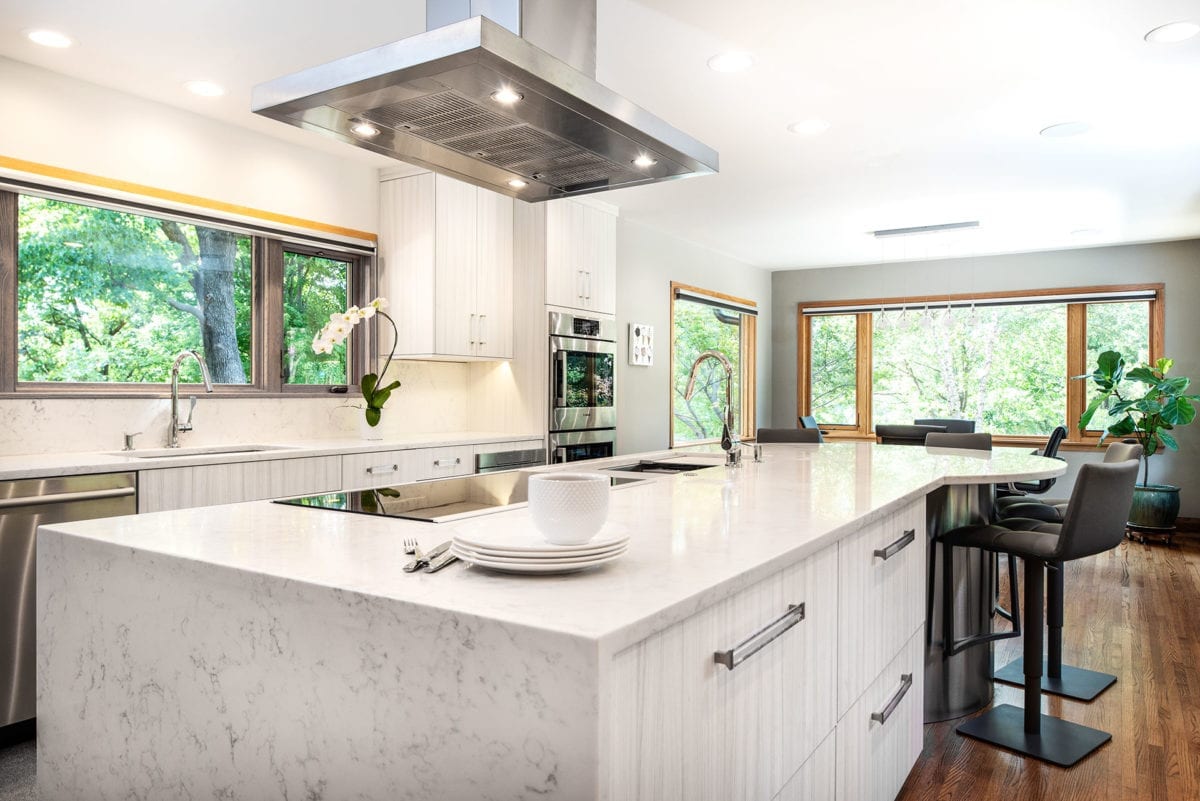
Crisp, clean, sparkling. A dazzling kitchen, designed by Michael Thorp of Tulsa’s Kitchen Ideas, is a shining example of the power and charm an all-white space can bring. Add to that the appealing views from horizontal windows, which welcome a refreshing touch of nature’s green environment into the home, and subtle ceiling lights that enhance the room’s charm and sense of space.
“The client was looking to maximize function and storage in the kitchen, which is why I was involved in the project,” says Thorp.
The large center island is more than a work space – it anchors the room and provides a one-of-a-kind focal point.
“My favorite part of this space is the unique island shape,” says Thorp. “It allows linear-style prep and cooking, and provides island seating arranged for good conversation.”
A refrigerator and built-in stove, housed in the lower island cabinets, along with a cook stove atop the counter make this kitchen efficient, stylish and sleek. There’s even a hood above the center island to draw out the mixed flavors of cooking. Leather-backed chairs accent the center island, and a breakfast dining area is nearby, offering a view of nature.
Like many of today’s new or revitalized homes, this open kitchen leads directly to the main entertaining areas of the home. It is a seamless transition that makes hosting a joy, not a chore.
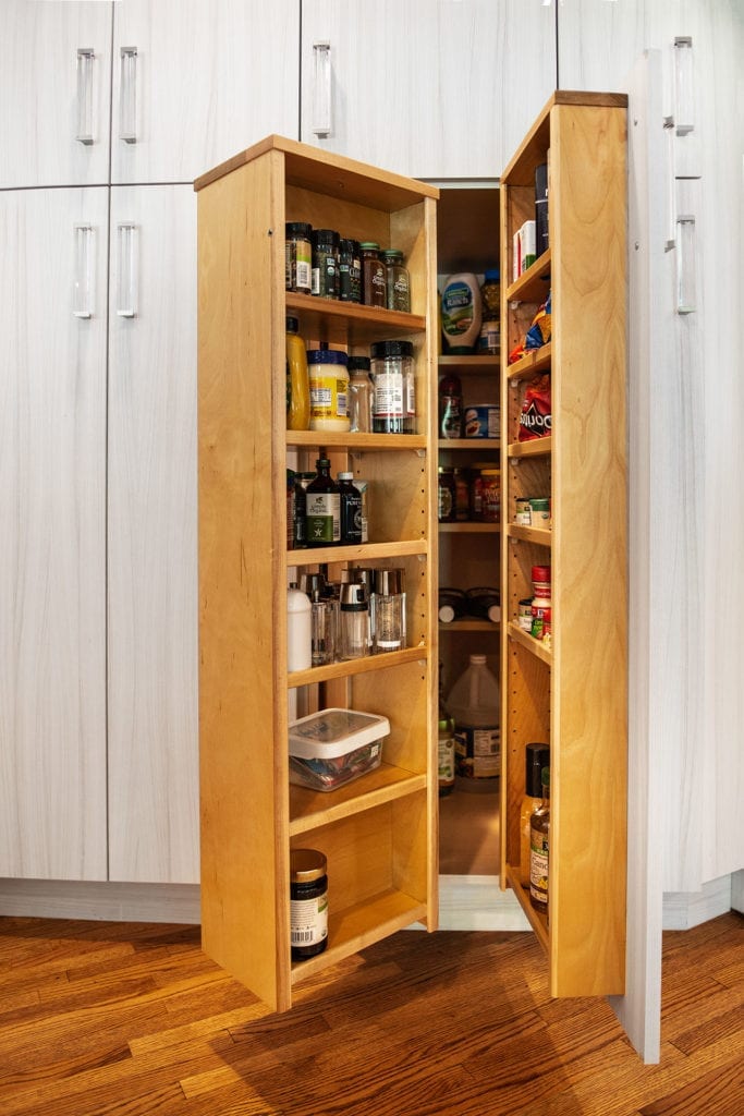
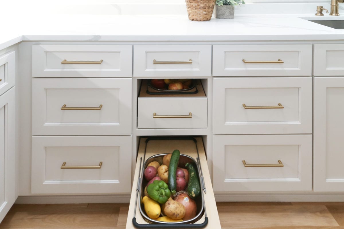
The long, horizontal arrangement of the kitchen is a major plus. Hidden storage cabinets add to the sleek and streamlined efficiency. Guests awaiting a meal can sit at the island, enjoy a cocktail, pitch in to help and enjoy the company of their friends. Kitchens are, after all, the heartbeat of a home and so much more than just a place to dine.
A Diamond in Rough
Photos by Sarah Baker
When Jason Gibson and Marcia Richards first saw the condition of this 1938 Bren-Rose home in Tulsa, they knew it was going to be a challenging yet rewarding project. The dwelling had certainly passed its glory days, and the pre-war era kitchen, bedrooms and bathrooms were small, lacking in design, function and storage.
“It was in poor shape,” admits Gibson, the principal architect at Align Design Group. “There was no landscaping. It had a tiny stoop by the front door, plus wood rot.”
Richards, principal interior designer and managing partner of Upside Interiors with her daughter, Mariah, saw the potential, saying that “the bones were amazing and the grounds offered great potential to enlarge the home.”
The team began the extensive makeover in the winter of 2018, and the project was photo-ready by the middle of June 2020.
“Bringing new life with an open concept and a timeless design was the goal,” says Richards.
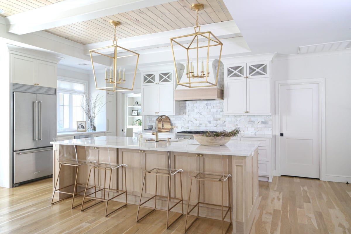
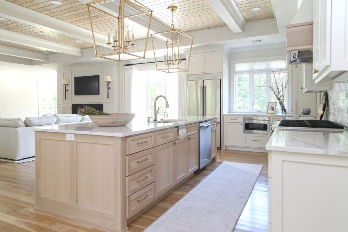
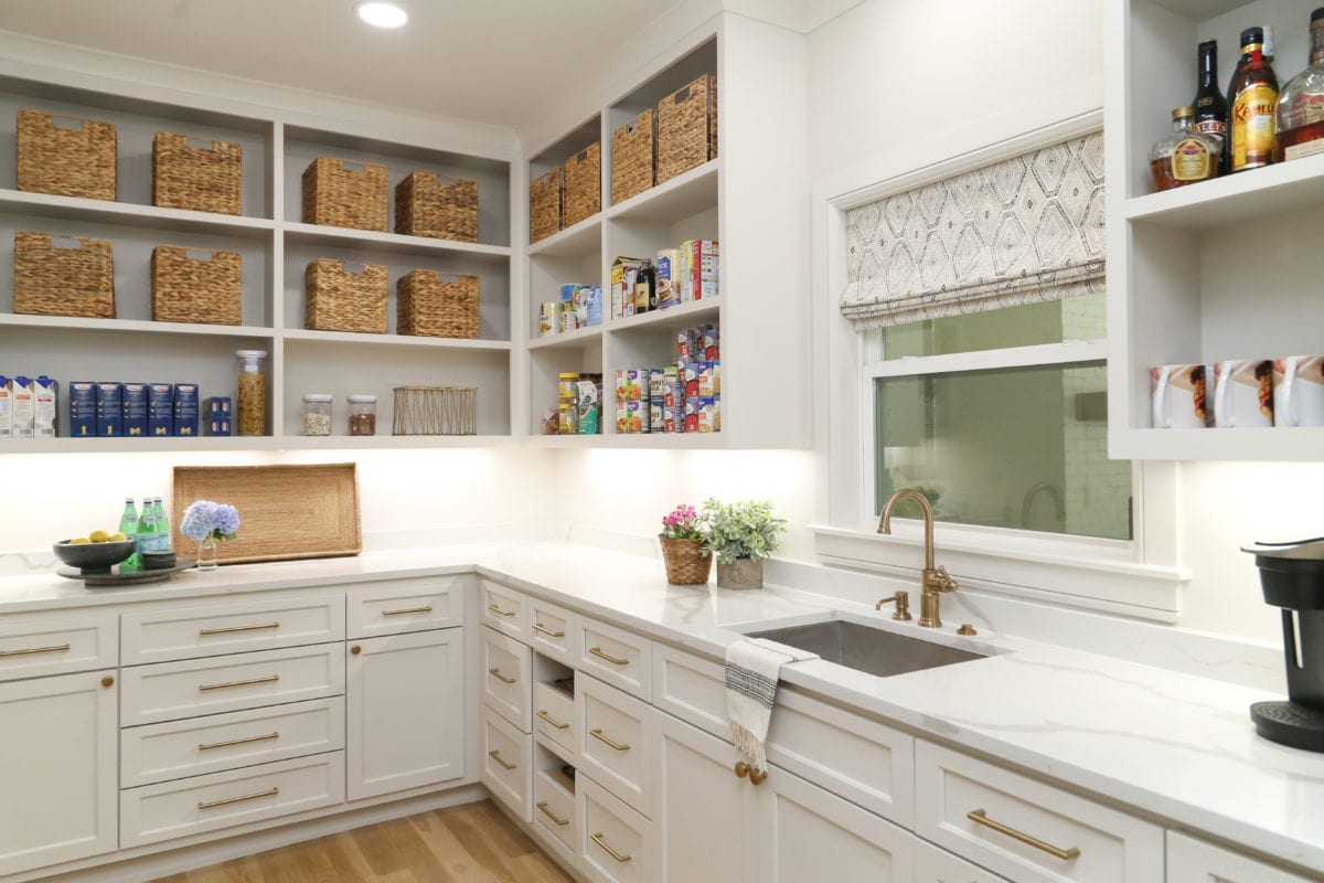
The kitchen was originally closed off from the rest of the home. The team opened and lightened up the space; soft white layers denote the hues found in the perimeter cabinets, paint colors and wood tones throughout. The kitchen features a beveled marble subway backsplash, a quarter sawn white oak furniture-style island, large scaled soft brass pendants and a large window for natural light. White oak is highlighted on the vent hood, the wood floors and between cross beams on the ceiling to repeat the design element. Open to the kitchen is a large dining space, with floor-to-ceiling windows that cast one’s eyes towards the giant oak tree in the back yard. The team also added an oversized working pantry with additional cooking and refrigeration; it’s clear no detail was left unturned.
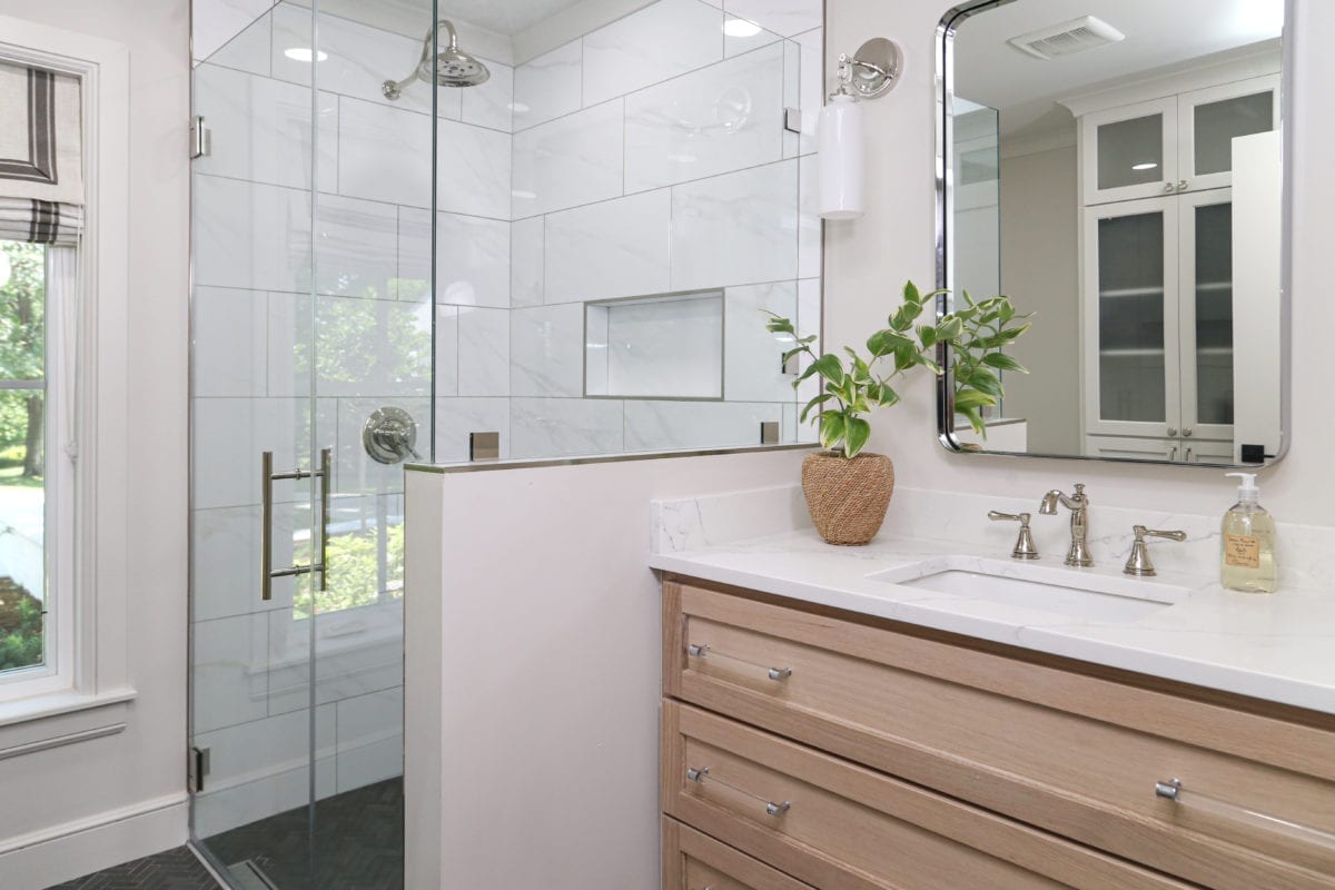
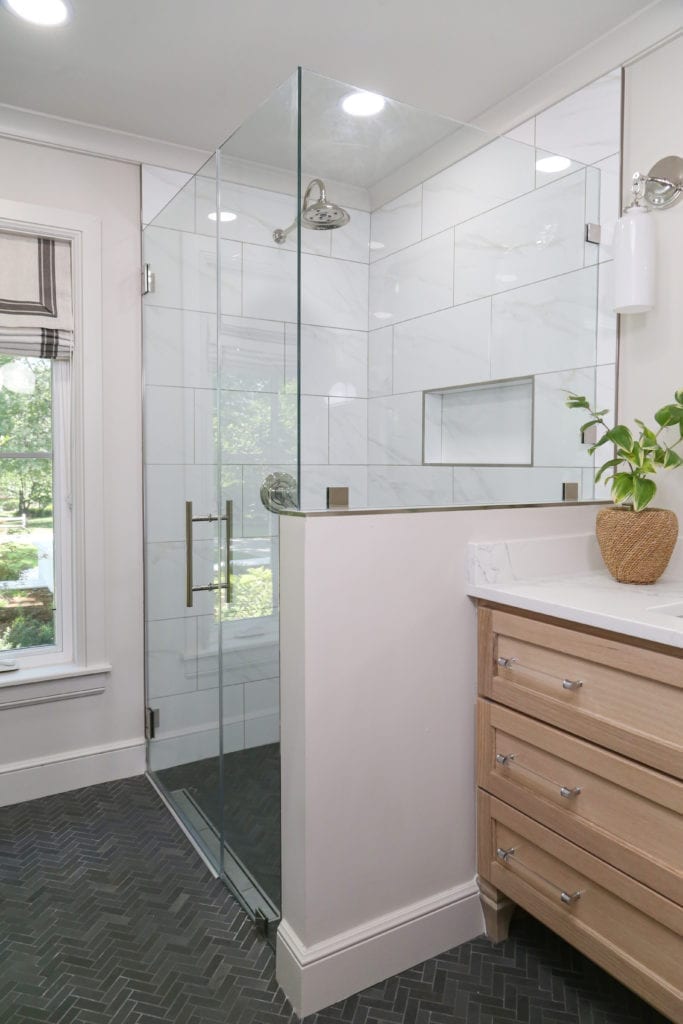
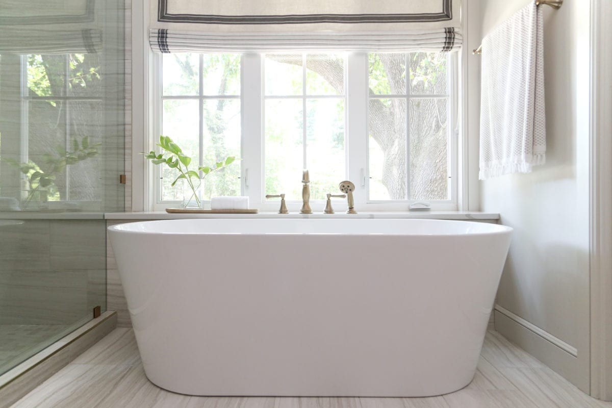
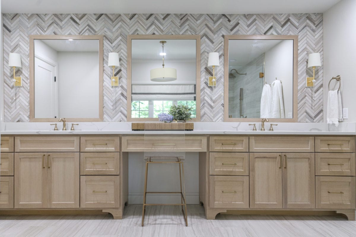
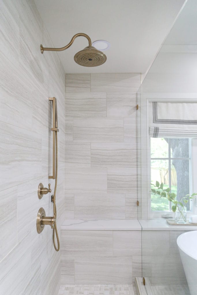
Another highlight of the house is the new master bath. With a grand his and hers vanity, walk-in shower, freestanding tub and expansive window capturing a view to the back gardens and new pool, this has become a joyful place for the homeowners to relax and rejuvenate.
“I was most proud of being able to take something in bad condition and make a drastic difference,” says Gibson.
A Glorious Overhaul
Photo by Nathan Harmon
When Bill Powers entered a Tulsa kitchen for a renovation project, “I knew why I was there,” he says. Powers, owner of Powers Design and Build, has been cooking for over 60 years and designing or re-shaping kitchens for over 40. He speaks about this area of the home with authority and experience.
“The kitchen is the most important, most expensive and most used room in a home,” he says. “There is a science behind the creation of a kitchen. Sometimes kitchens are just not very well planned.”
Because of Powers’ love for cooking, he knows the trademarks of a good kitchen, whether it be residential or commercial. This particular south Tulsa kitchen was beyond dated, Powers admits.
“It was a poor configuration; it was an awkward kitchen. The cabinets were outdated and not functional,” he says. “The appliances probably had as much history as the home. The challenge was to renovate the kitchen to accommodate the needs of the parents and their three children.”
Kitchens are, after all, the greatest gathering place for family and friends, says Powers. Fortunately, the homeowners were well aware of the kitchen’s flaws and ready to make some changes.
“They were very responsive and appreciative to our workers,” says Powers. “They helped us do a good job with the renovation.”
These savvy homeowners knew this area of the home needed more than a fresh coat of paint and were open to a complete overhaul.
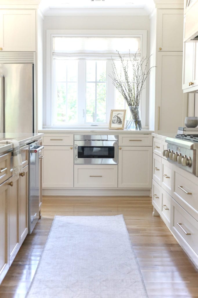
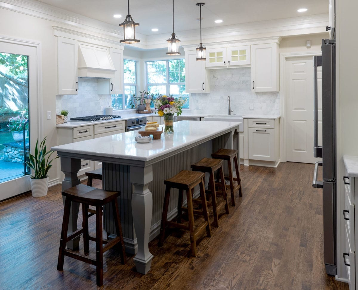
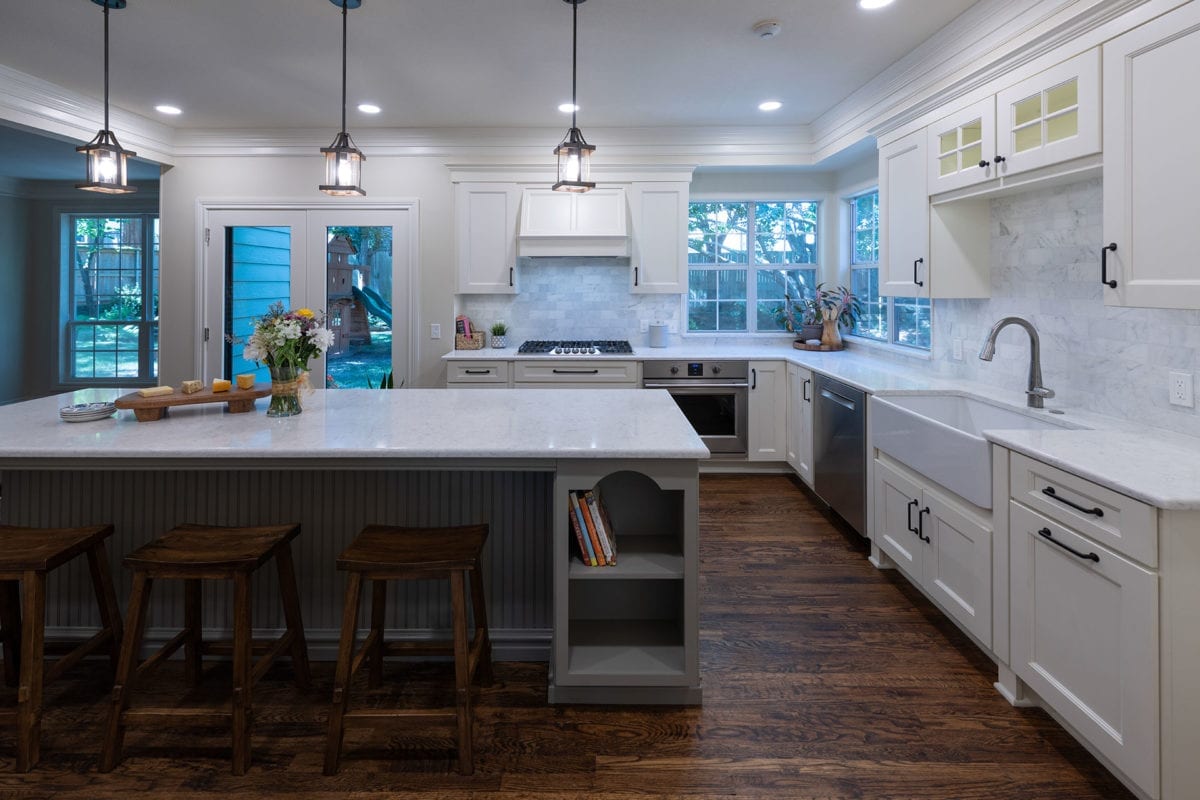
“I unified everything,” says Powers, who used subtle white and gray color schemes as a neutral backdrop. He then added hard-scraped hardwood floors that have a centuries-old look, along with updating all the appliances. The result is a workable and efficient kitchen that now takes center stage in the home as a place that’s both comfortable and inviting.


