A Revival for the Ages
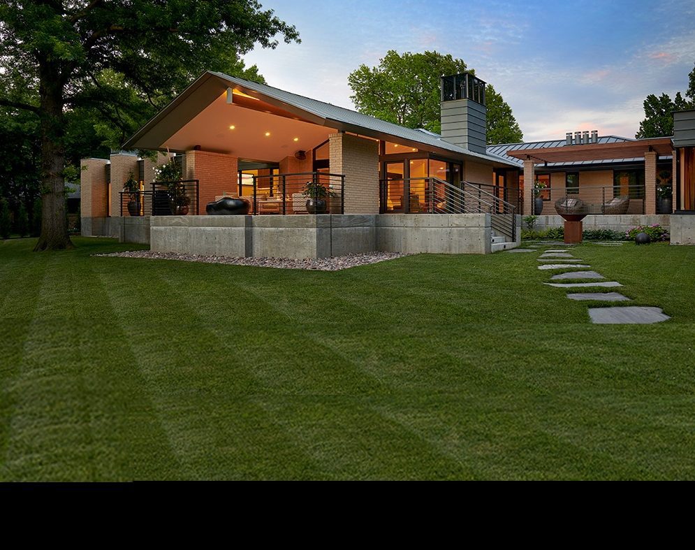
When couple Bill and Beverly Kellough discovered a rather ordinary ranch-style home overlooking a midtown Tulsa lake, they knew it was the perfect place for them. They also knew Brian Freese, owner of Freese Architecture, was their choice to transform it into a beautiful, modern residence.
Freese’s challenge was to have the home complement the tranquil setting and perfectly suit the couple’s lifestyle. Both are retired; Bill was an attorney and district judge, while Beverly was an executive at a publicly traded gas company.
[images-comparison image_1=”https://okmag.com/wp-content/uploads/2019/06/Freese-front-before.jpg” image_2=”https://okmag.com/wp-content/uploads/2019/06/Freese-front-after.png”]
“Since we are older, we knew it was important to have a home where we would be aging in place,” Beverly says.
Other special needs for the home included an office for Bill and his occasional clients, a room for arts and crafts and a workout space.
“My husband is an insomniac, so a reading space for him was very important,” Beverly says.
The small, secluded lake, surrounded by 16 homes, was a major draw after they looked at several other properties.
“We mentioned this home to Brian and he had seen it before,” Beverly says. “We spent a lot of time with him while he was designing a complete renovation. I think it was a labor of love for him.”
[images-comparison image_1=”https://okmag.com/wp-content/uploads/2019/06/Freese-backyard-before.png” image_2=”https://okmag.com/wp-content/uploads/2019/06/Freese-backyard-after.png”]
What particularly impressed the homeowners is the way Freese integrated the interior and exterior spaces.
“There’s a lot of glass and beautiful views from the windows,” Beverly says.
Freese adds: “The home’s vaulted family room gives it an entirely new gathering area, with expansive lake views, which the home never had before.”
[images-comparison image_1=”https://okmag.com/wp-content/uploads/2019/06/Freese-kitchen-before.png” image_2=”https://okmag.com/wp-content/uploads/2019/06/Freese-kitchen-after.png”]
The spacious, 4,600 square-foot home includes abundant patio space, perfect for casual entertaining. This is Freese’s favorite area of the home.
“It’s a glorious outdoor space, very roomy, and a wonderful place to enjoy the neighborhood lake,” he says.
Various wildlife frequent the lake, adding to the home’s charm.
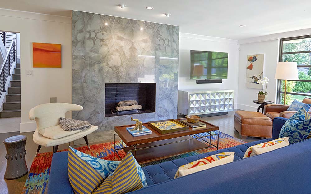
The kitchen and family rooms are major assets for entertaining. The family room’s white walls and black fireplace create a dramatic setting. The focal point is the Steinway baby grand piano. Bill plays the piano and guitar, so there’s no lack of music at their gatherings.
The home is a new style and residential departure for the couple.
“Neither of us had ever lived in a modern style home with this kind of architecture,” Beverly says.
Now they can’t imagine living any place else.
[images-comparison image_1=”https://okmag.com/wp-content/uploads/2019/06/Freese-living-before.png” image_2=”https://okmag.com/wp-content/uploads/2019/06/Freese-living-after.png”]
The Zarrow Legacy
When the Henry Zarrow home was built in 1954 near Tulsa’s Utica Square, neighbors complained that it was a one-story house in a traditionally two-story neighborhood. Zarrow was nonchalant about the complaints.
“Well then, we’ll just add another story,” said the well-known Tulsa philanthropist.
The home became a Midtown symbol of classic elegance for Henry and Anne Zarrow. Both are deceased, but their legacy lives on through three charitable foundations. The mid-century style home was a one-of-a-kind design and often the setting for tastefully lavish entertaining.
The home was a Tulsa Designer Showcase in 2015, and Lance Cheney of Richard Neel Interiors worked on it then.
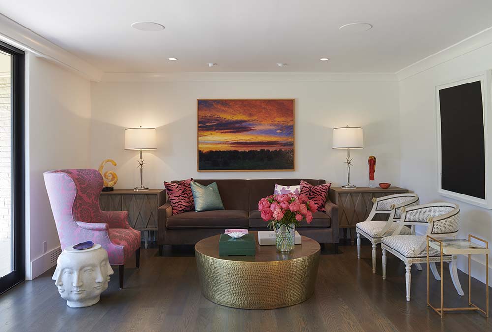
“While designing the family library, I just fell in love with the Zarrow home,” he says. “So I was thrilled when the new owners asked me to adapt the home for their lifestyle.”
Cheney had worked with the couple on a previous home nearby and was familiar with their tastes.
“The husband had always wanted to live in this neighborhood, on this street, and have a circle drive, so it was like all the stars were aligned,” Cheney says. “But he wasn’t really crazy about the house … until he saw the interior.”
Then, it was a love connection.
Tulsa architect Michael Dankbar salvaged as much as possible of the original residence before updating it to match today’s trends.
“Dankbar doesn’t usually work on renovation projects, but because of the mid-century design, he accepted the challenge,” Cheney says.
Numerous upgrades brought the home into the 21st century without changing the original footprint.
“The major change was a 1,200-square-foot master suite addition with two large walk-in closets,” Cheney says. “The 1950s homes were not known for spacious closets.”
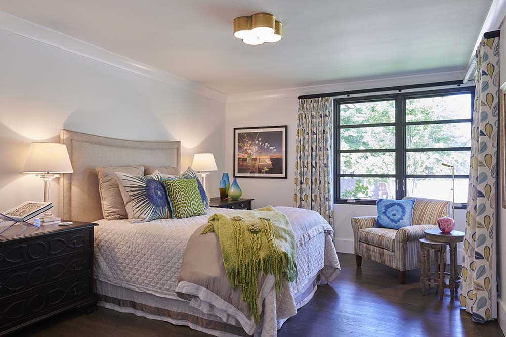
The large master suite includes an elegant bath and a spectacular floor-to-ceiling bedroom window for an expansive back lawn view.
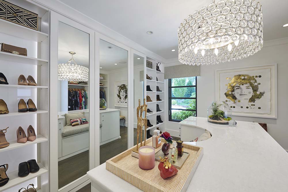
While preserving its original character, a more open design enhanced the residence. A comprehensive lighting plan accents the large, impressive art collection. Each room and adjoining hallway resemble a high-end art gallery. New, large windows offer stunning garden views. The glass garage door and windows match the home’s windows, and water features were added to the home’s front and back. Where once was a pool, there is now a park-like garden.
No doubt, the Zarrows would applaud this luxurious transformation.
Streamlined Simplicity
High ceilings. Sweeping but functional spaces. Minimal embellishments.
That was the desire for a Tulsa couple – empty nesters – who wanted to create a haven for themselves and their large extended family.
They loved the midtown location near Utica Square where they had chosen to build their home … but the lot had to be cleared to eradicate a home some considered an eyesore.
Tim Yardy, of The Maison Group, says that this process wasn’t easy.
“There was concrete and steel everywhere. Neighbors were cheering as we demolished the previous home,” he says. “What Mark Nelson, the architect, and The Maison Group, the design/build firm, envisioned was a 5,600-square-foot home on the lot, measuring almost an acre. The couple moved in during the fall of 2018.”
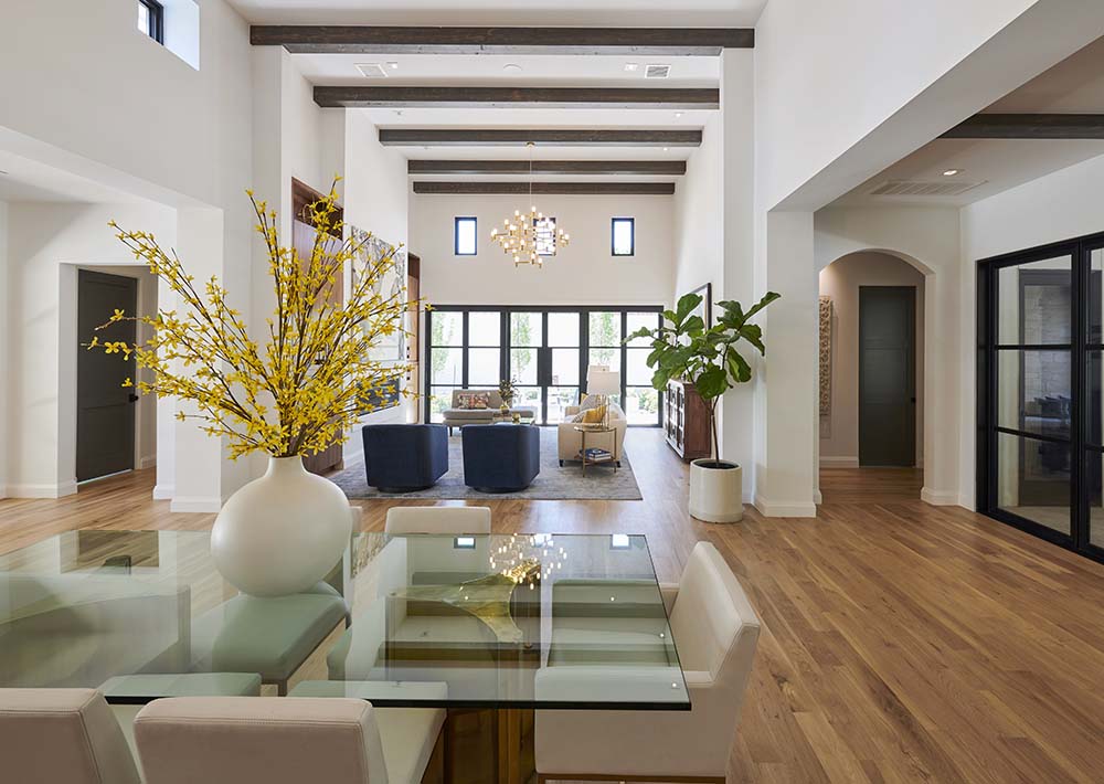
While the home reflects an air of streamlined simplicity, it also has a dramatic flair, enhanced by ceilings that range from 10 feet to 20 feet high.
The Maison Group envisioned the lower level as a comfortable setting for entertaining this large family. It includes a playroom for the grandchildren. The second level provides guest quarters for frequent visitors.
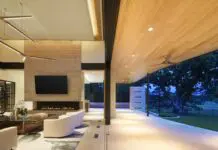
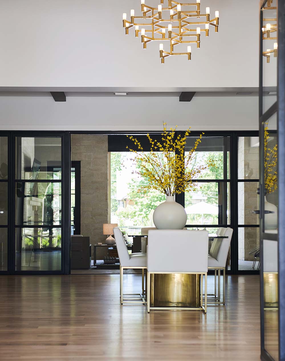
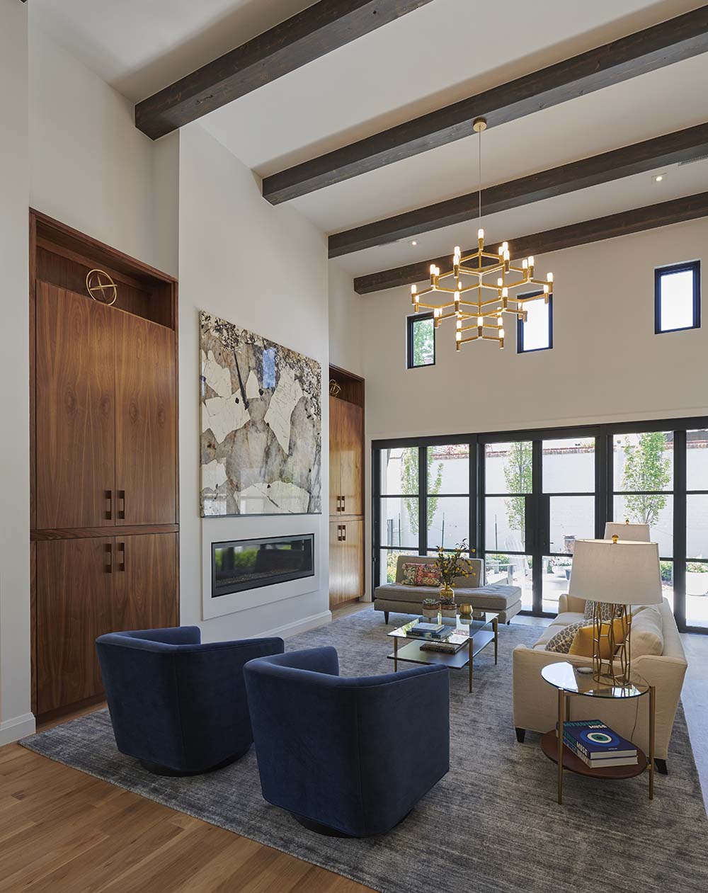
The Maison Group created what Yardy calls “transitional luxury.” Off-white walls throughout are enhanced by floor-to-ceiling windows, white oak wood floors and impressive cedar ceiling beams that have the patina of age.
“It’s an open floor plan, but it has a sense of formality,” Yardy says. “Every space in the home was well planned, including a home office on the first floor.”
The formal living room, just off the long, impressive front entry, is the family’s favorite area for frequent events, he says.
The furnishings are arranged so that conversation is easy. The formal dining area is within view, but far enough away to give the illusion of being a separate area.
“The family loves to eat together,” Yardy says.
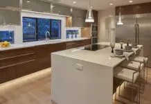
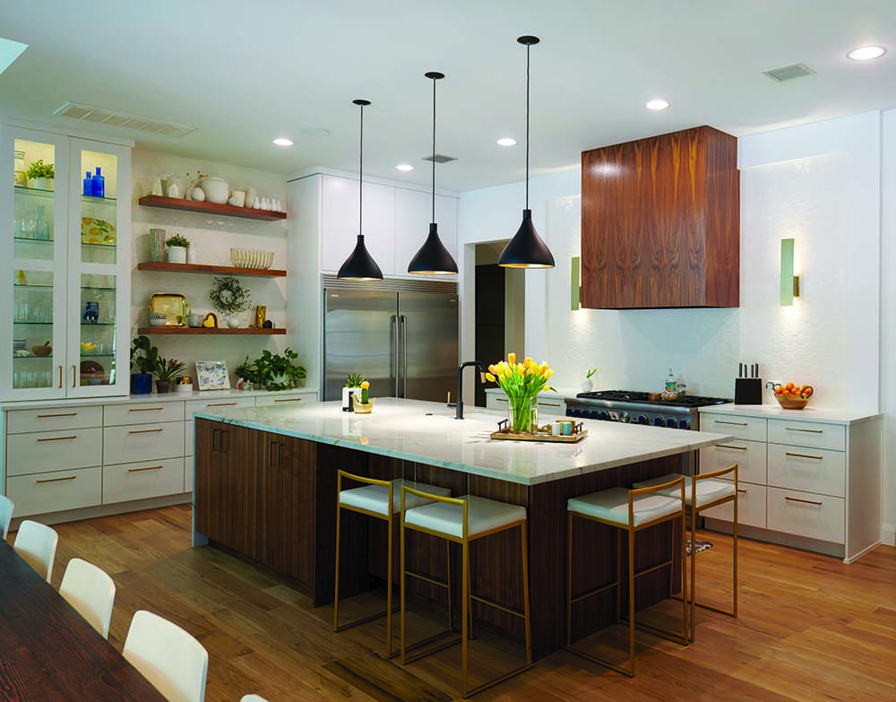
The kitchen is nearby and provides seating for six at the center island. The breakfast table seats 12.
“An air of luxurious simplicity is the hallmark of this well-designed home,” Yardy says. “That is also evident in the patio, pool and outdoor living, dining and entertaining areas I designed. There is also a cabana, a splash pad for the children and a fire pit where the family also loves to gather.”
This is a home designed to enhance family ties, and that goal was met tenfold.
[media-credit name=”Nathan Harmon” align=”aligncenter” width=”1000″]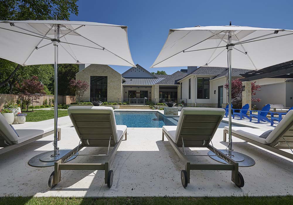 [/media-credit]


