[dropcap]A[/dropcap] Tulsa couple was well on their way to building a new home. The design plan for the residence was established. They were working well with their interior designer, Mel Bean, owner of Austin Bean Design Studio.
Then, by chance, they discovered an older home near Utica Square that spoke to them, much louder than a whisper. Its multi-level, rambling style had an appealing charm. It did need updating, but the couple decided this home could be as impressive and comfortable as the one on the blueprints that they had approved.
The Midtown location and the possibilities the home offered for renovation won over the original new home plans.
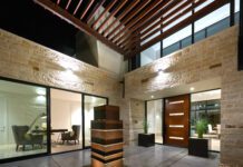
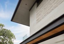
“The exterior did need updating,” Mel says. “It was dark and disjointed. We softened the exterior by painting the brick and wood white and enhancing the landscaping, enlarging the walk to the front door, adding a curve to the threshold and a small seating area near the entrance.”
While the interior of the home also needed a fresh look, the couple loved the neighborhood and decided this home could achieve all they wanted in a new “old” residence.
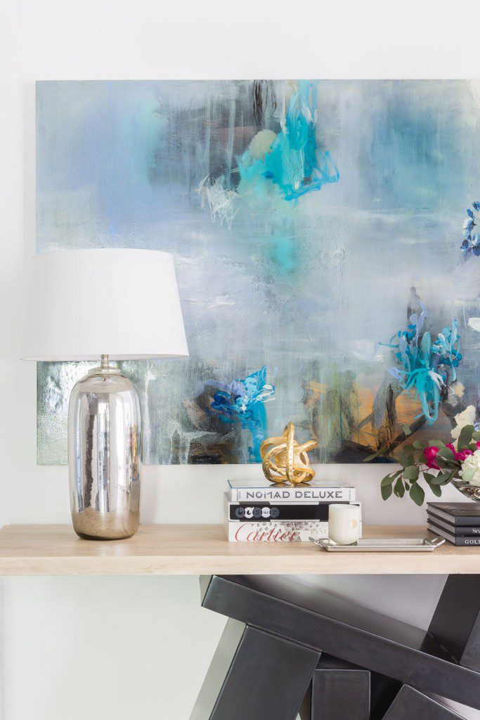
The entry makes an impressive statement. The couple have professional interests in geology, and the entry sets the stage with a welcoming console featuring mementos of geological history.
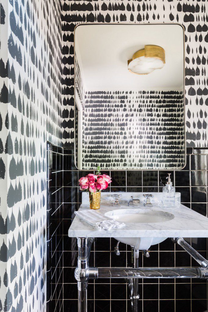
The couple’s interest in earth science is complemented with a variety of materials used in the furnishings and accessories. Among the materials are chrome, glass, metal, steel, stone, subway tile, copper, selenite and Calcutta gold marble. Wood floors, stained a medium dark brown, anchor each room to add a pleasing contrast to the pristine white theme. Guests to the home could have an interesting treasure hunt for the variety of materials and textures.
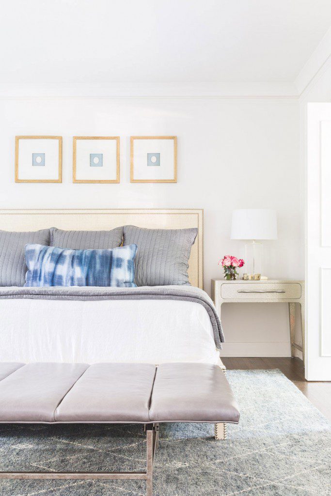
A soft touch was added by featuring a mixture of fabrics, including velvet, rugs fashioned of a wool and silk blend, soft leathers and straw-hued raffia for a master bedroom headboard.
A few structural changes were necessary, Mel notes. An awkward column was removed to provide more space to create a larger kitchen and family room for infomral meals and entertaining.“This is a very approachable, casual room designed for easy living,” Mel says
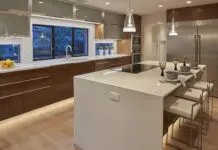
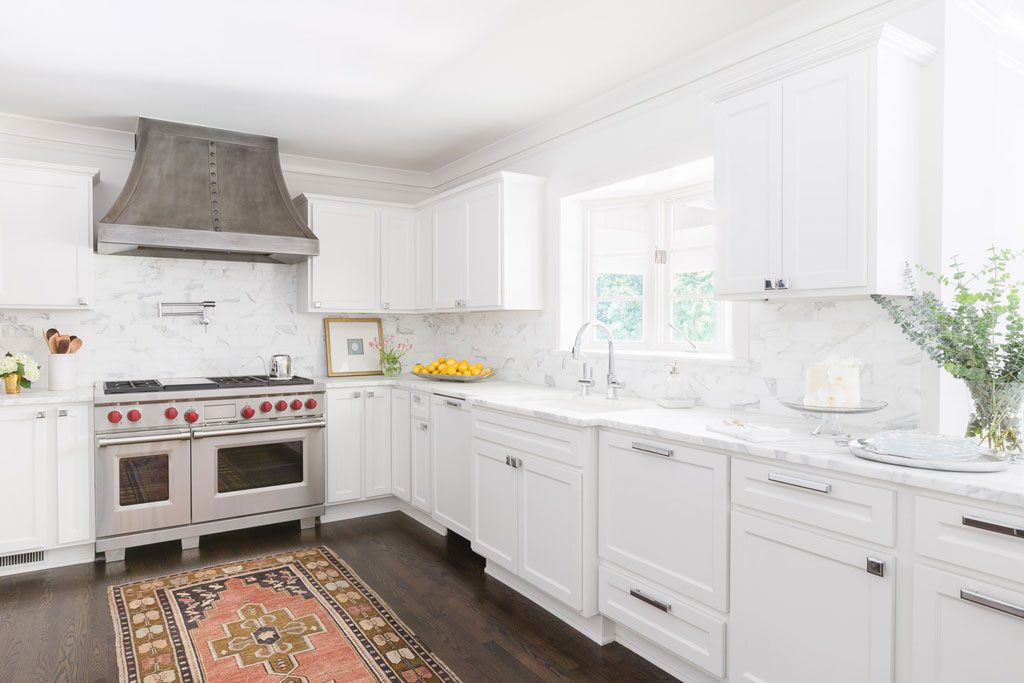
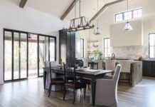
The kitchen got a facelift. New cabinet doors give the existing cabinets a contemporary updated look, enhancing the all-white theme. A new Wolf range and a custom designed hood look impressive. No longer a drab setting, the room is a great area for informal dining. The perfect splash of color is an antique patterned rug accenting the large commercial range.
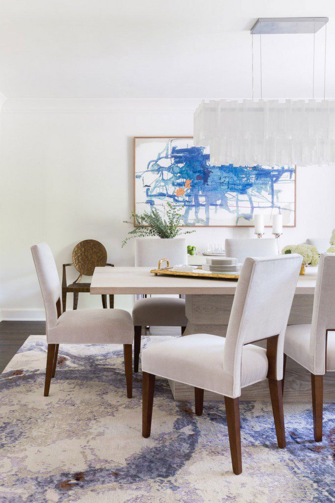
The dining room overlooks the spacious front lawn and is an elegant setting for entertaining. The centerpiece is a dramatic selenite chandelier that, Mel says, “glows beautifully in the room.” The table for eight is flanked with white upholstered chairs.
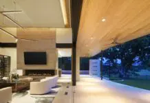
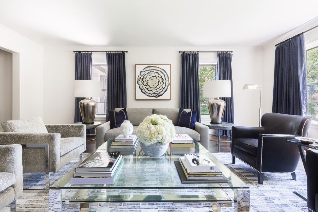
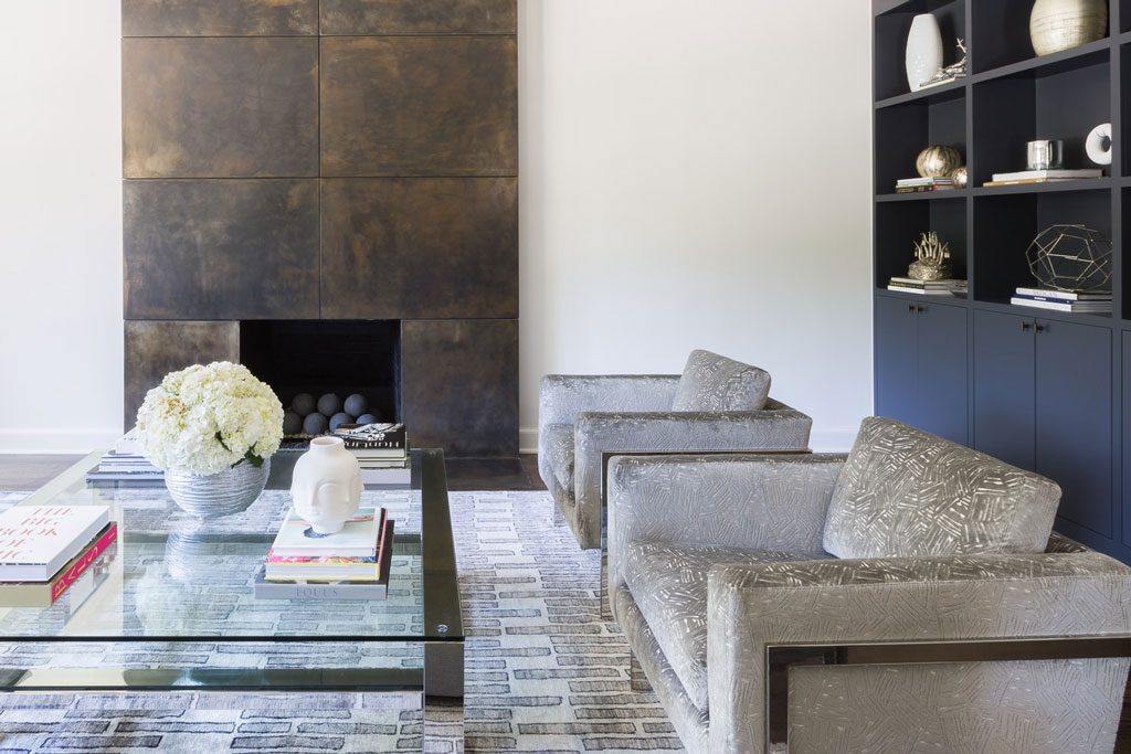
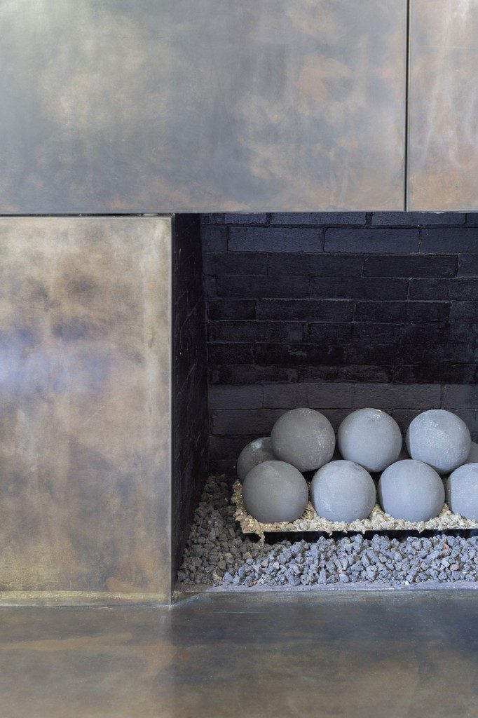
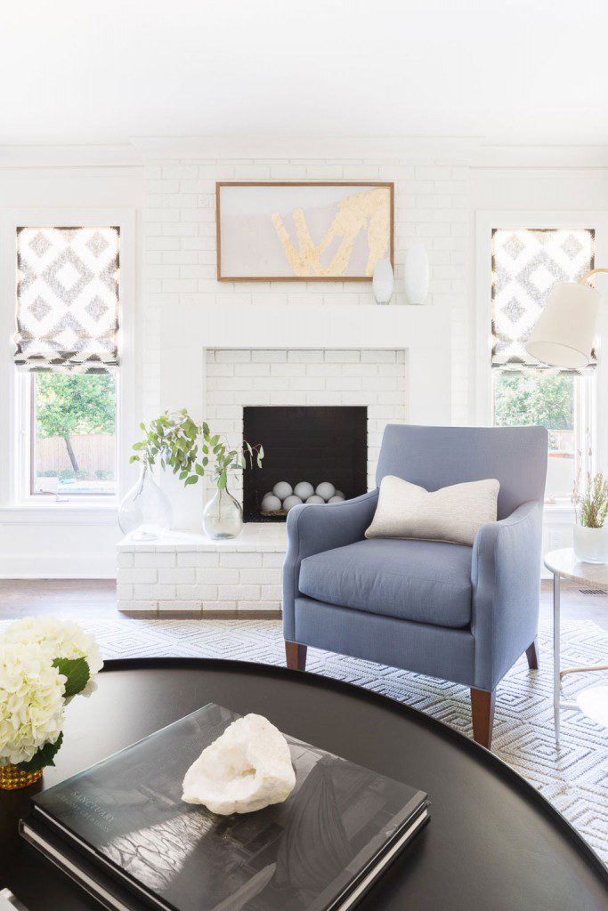
The formal living room exudes a serene look. The custom fireplace is a major focal point, dominating one end of the room. Its dark bronze surface is accented with gold tones. A gray rug in a wool and silk blend is designed in a geometric pattern, and a chrome-and-glass coffee table enhances the seating area. Two lounge chairs, covered in navy velvet, invite seating near the fireplace.
While the room makes a beautiful first impression, Mel says it is “not too formal to be comfortable.” The design of the room and the placement of the furnishings invite conversation with guests.
Many of the rooms in the home overlook the garden areas, with nature adding its own color palette to the interior design.
Throughout this spacious home, the interior color palette is restrained and based on crisp white walls and some white upholstery accented with shades of blue and gray, adding the “pops of color” that Mel likes to use in interiors.
The home took seven months to complete, from the purchase of the home to moving day. Mel desribes it as “a wonderful project.” The clients were organized, delightful and trusting of the design firm to bring their dreams to fruition.
“The before and after photographs make this look like a brand new house,” Mel says.


