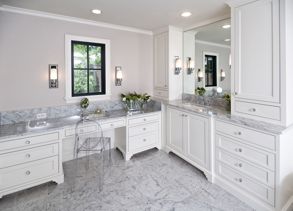
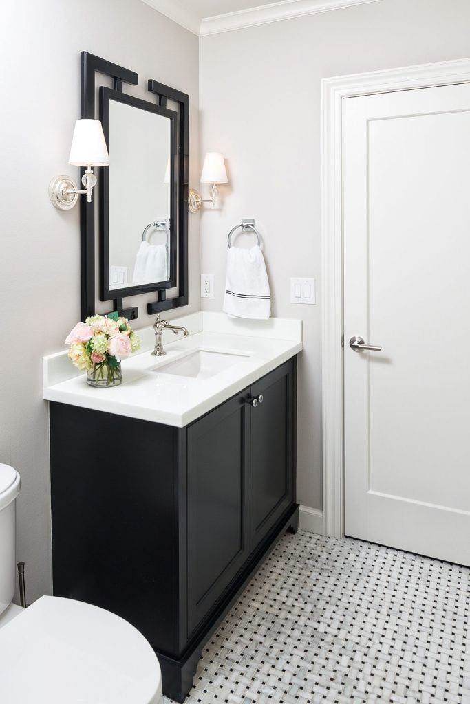
Kitchens and bathrooms have transformed from utilitarian to elaborate. Once cloistered away from a home’s living areas, the kitchen is now the family centerpiece. With amenities for dining and entertaining, today’s kitchens are often dressed in stylish tones of gray and white. “Smart” appliances with voice-activated devices assist with chores. Pantries, with ample storage room, can feature nooks for informal dining. Meanwhile, bathrooms have become more than just functional spaces. They are luxurious spas, designed for relaxation. Join us for a journey through some uniquely modern kitchens and baths.
‘Warm and Inviting’
The kitchen, master bath and pool bath are definitely stars in this home in northeast Oklahoma City. Paige Sheller of A-Line Designs, an interior design firm in Edmond, remembers the project well.
“Our clients’ goal was to build their dream home as a perfect place for entertaining family and friends,” she says. “They asked us to help with the millwork [and to] finish selections, lighting and area furnishings.”
The soft beige, stucco and stone exterior, with cedar and iron accents, is a clue to the home’s interior. With 8,600 square feet and three levels to work with, the design firm made magnificent contributions.
The home features a large basement, the main floor and the upper level. A double patio, the width of the home, provides a view of a secluded wood, adding to the property’s charm.
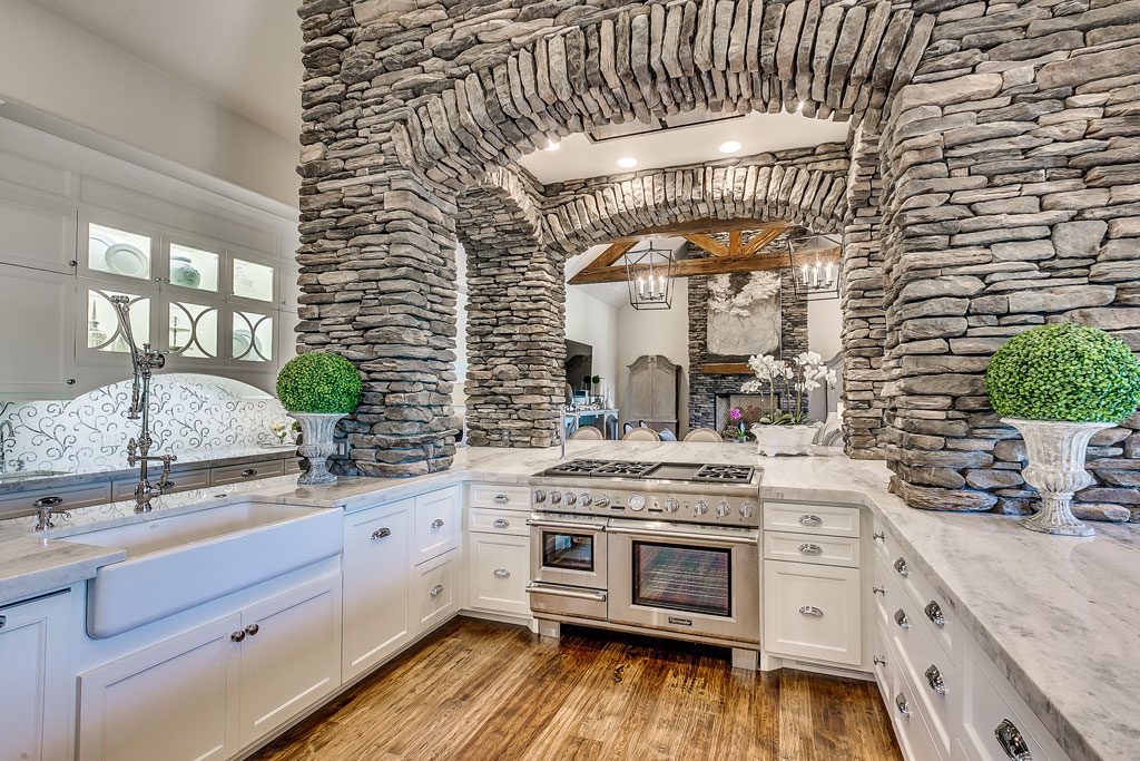
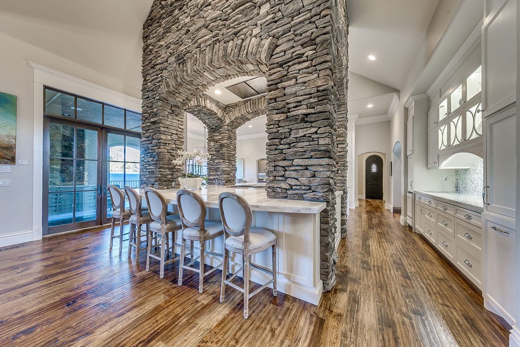
The living area’s mammoth fireplace, made of Eldorado stacked stone, extends to the open kitchen. It adds a rustic touch to the clean lines of the interior, which mixes traditional and contemporary design elements. The color palette blends soft whites and grays. The all-in-one space – with a continuous, vaulted ceiling – is spectacular. Four floor-to-ceiling stone columns serve as space dividers in the kitchen.
“Like the rest of the home, the kitchen is warm, welcoming and inviting,” Sheller says. “We chose casual finishes throughout the home, so it is not too formal.”
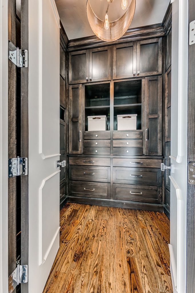
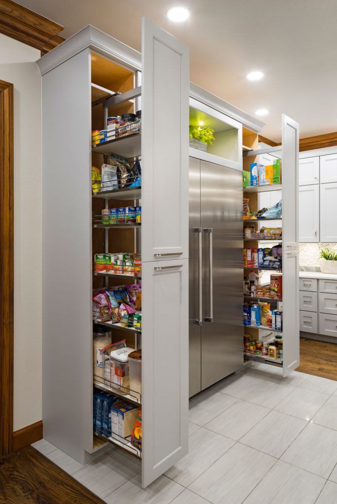
The pantry is a cook’s dream – a galley measuring 12 feet deep by 8 feet wide and adjacent to the kitchen, with custom floor-to-ceiling cabinets.
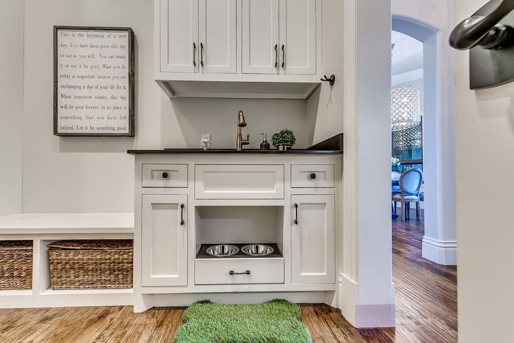
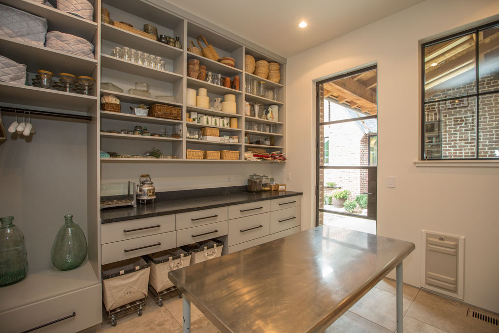
A mud room was essential for a home of this size. Sheller calls it “the drop zone.” Equally as important, it’s home for the family dog, pampered with custom food bowls.
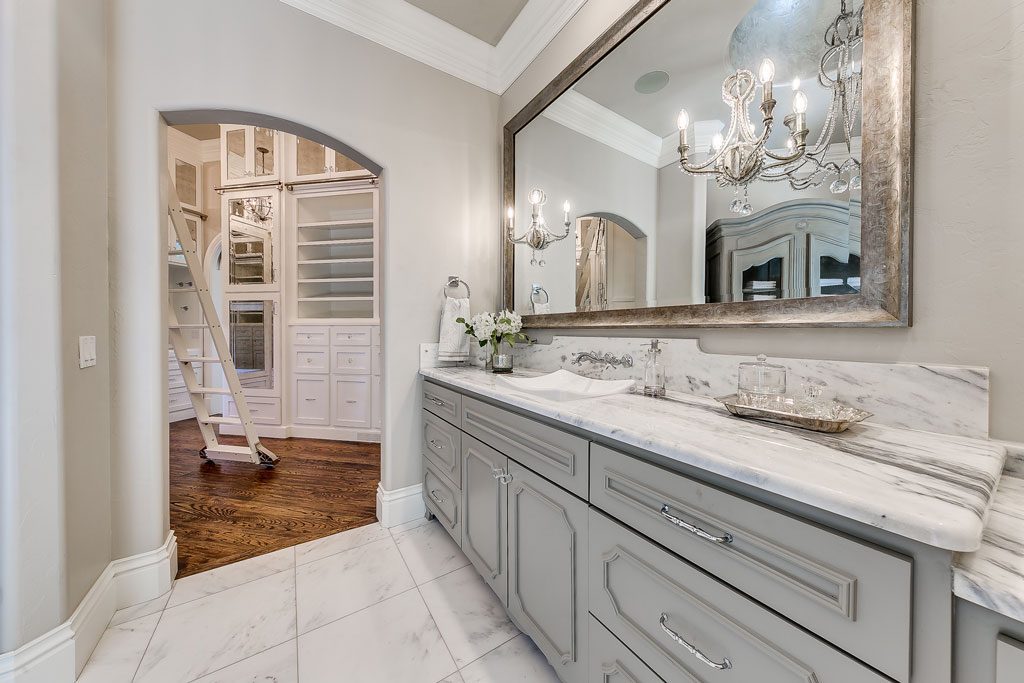
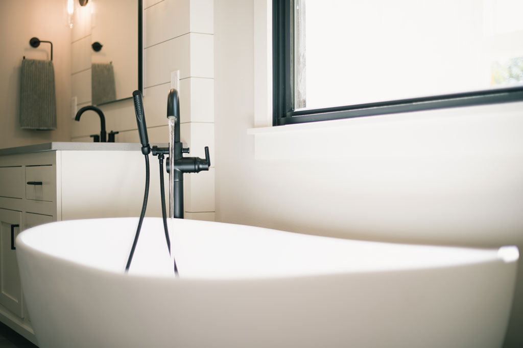
Sheller calls the master bath “absolutely stunning. It has a free-standing tub, recessed into its own private alcove, with a beautiful tile surround.”
The master suite includes his and her custom closets. In her closet, ladders on rollers make it easy to reach clothing and accessories.
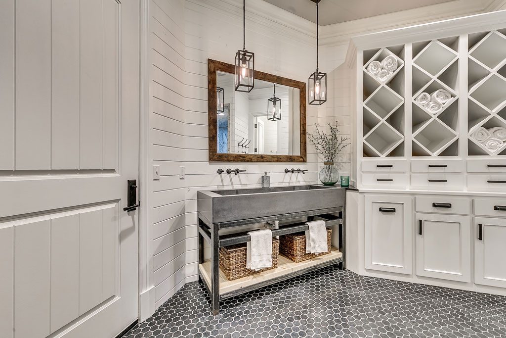
Another design element of the home is the pool bathroom, nestled between the patio and workout room.
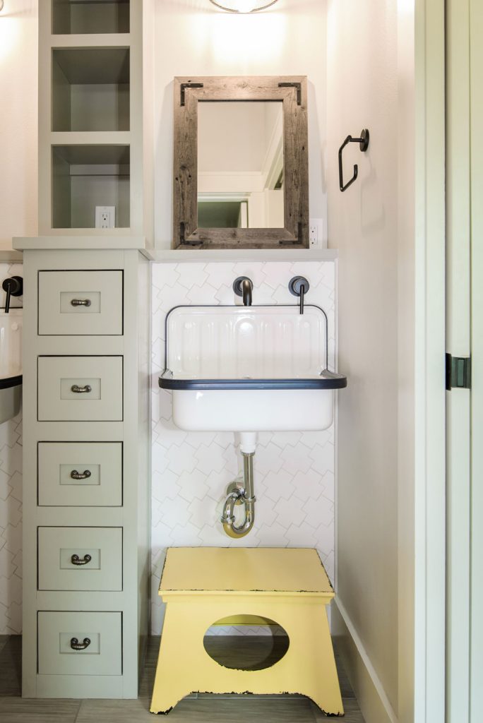
“The client really wanted an industrial, concrete sink vanity which was custom made here in Oklahoma, and millwork that would be classy and efficient for storage,” Sheller says. “The large walk-in shower has a stone tile running floor to ceiling to highlight the veining in the stone. That pattern floor tile was a playful design decision to make the pool bath pop.”
To tear down or restore – that was the challenge Tim Yardy faced when he was commissioned to rehabilitate a 1940s-style home in midtown Tulsa.
“It was a difficult decision,” says Yardy, who went with demolishing the neighboring property and saving the small home to make room for a magnificent renovation where the kitchen is the queen.
Yardy often has the foresight to look at a difficult property, envision the possibilities and restore it to a level of functional elegance.
“The homeowners wanted a new, transitional space,” Yardy says. “They wanted to double the size of the home to 7,000 square feet, including a master and guest suite. The original home, resembling a bungalow, had lots of small, chopped-up, impractical rooms. The dining room had old plaster detailing we restored. I felt the existing home had enough redeeming qualities to make the project worthwhile.”
One of those endearing details was the home’s original dark-stained floor.
“This was a bloody big project,” says the London native, who saw it as a worthwhile endeavor for the homeowners and their three young children. “I could see certain elements of the home that were similar to the house where I grew up in England.”
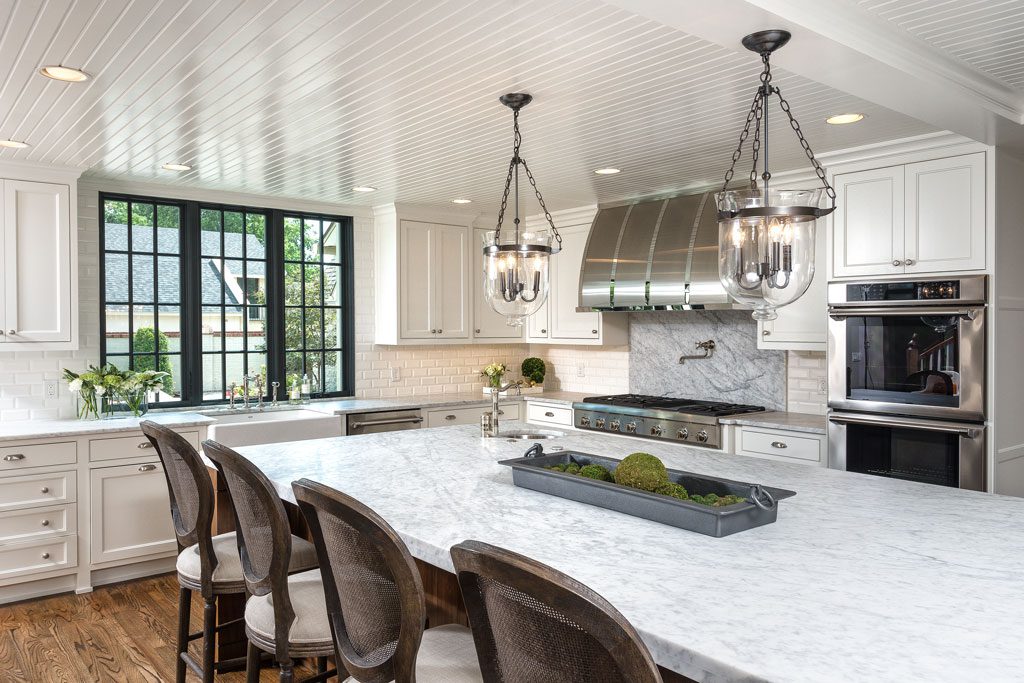
Working with Tulsa architect Mark Nelson, Yardy raised the ceiling to create a kitchen that has become the central living area for this family. The walls were painted light gray, a hot color for 2018. Working with Woodstock Cabinet Co., Yardy chose white walnut cabinetry that was warmer than what had existed in the small, cramped kitchen.
Yardy then designed a Carrara marble center island that is 18 feet long. A special seating area was designed for the children.
A Re-Purposing Renovation
“It was one of the biggest islands we’ve ever built,” Yardy says.
The centerpiece of the kitchen is the custom vent hood, fabricated by a Tulsa shop. From the kitchen, the family also has an ideal view of the outdoor living area and swimming pool.
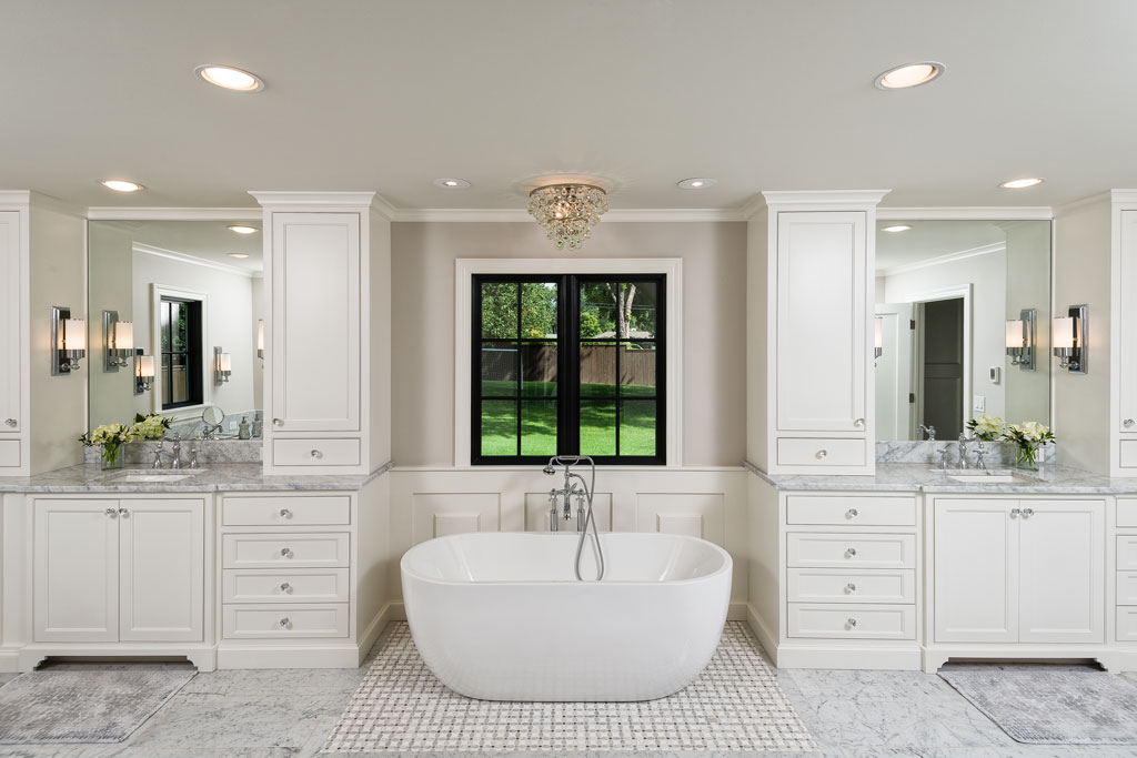
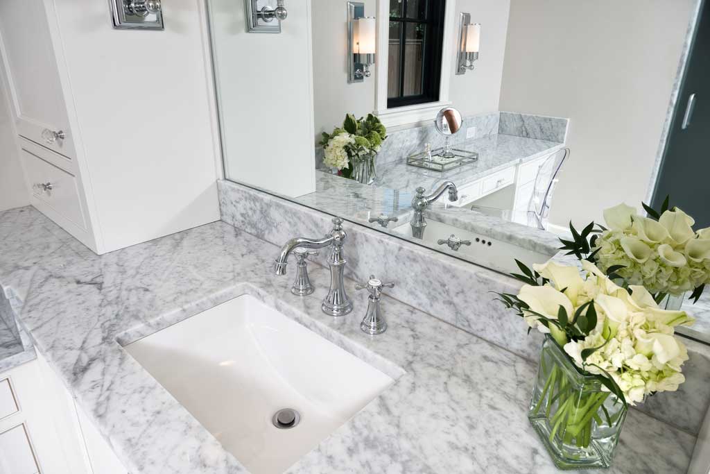
In the master bath, Yardy repeated the Carrara marble as the major material. The spa-like bathroom opens to the master suite and luxurious closets. The renovation of two powder rooms – one for guests, another in the husband’s study – are other examples of massive renovation.
“We created comfortable living spaces for the family to grow,” Yardy says. “We re-purposed spaces for the way people live in 2018.”
A Gathering Spot
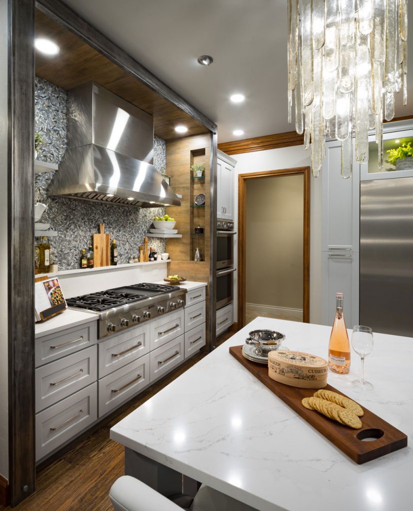
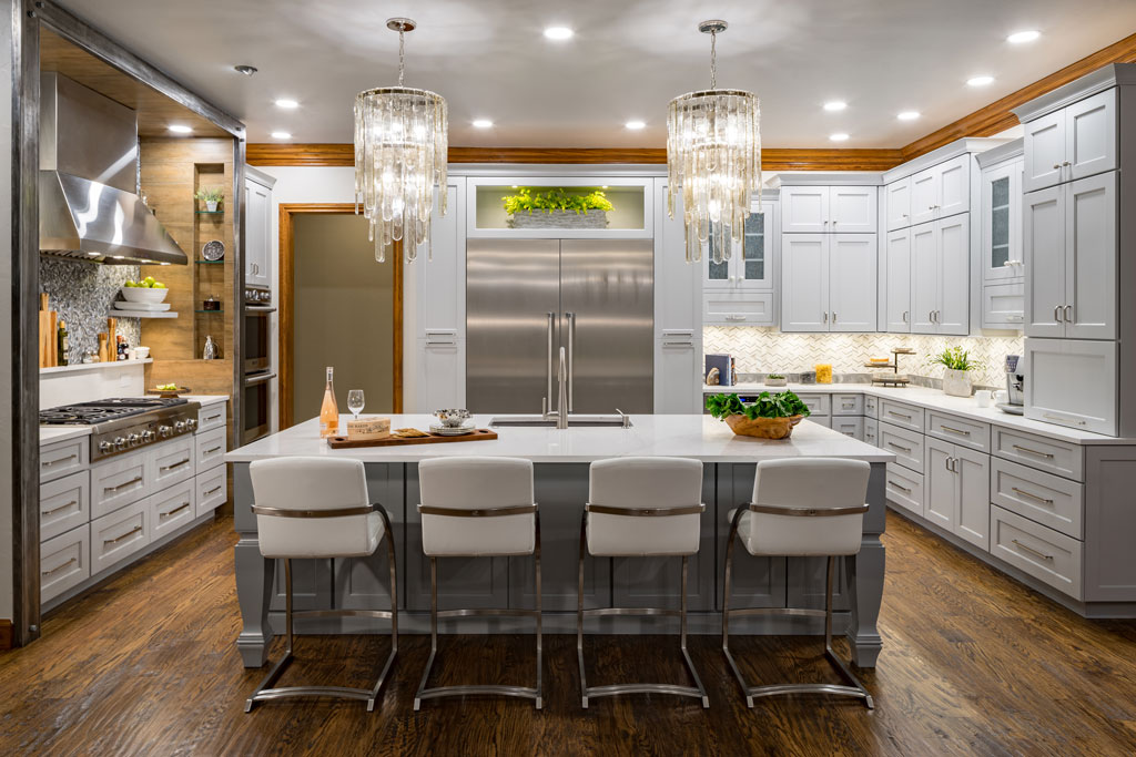
It was dreary and dated in this 15-year-old Edmond kitchen. The woods were dark; the space was crowded. The work island – a mere 2 feet by 3½ feet – begged for more space.
So, the homeowners sought the expertise of Brenda Helms at Edmond Kitchen and Bath.
“They needed a more open plan with a better flow, to avoid the frequent traffic jams that hindered kitchen entertaining,” Helms says. “A beautiful, functional space that suited the needs of a couple who truly cook was the order on this project.
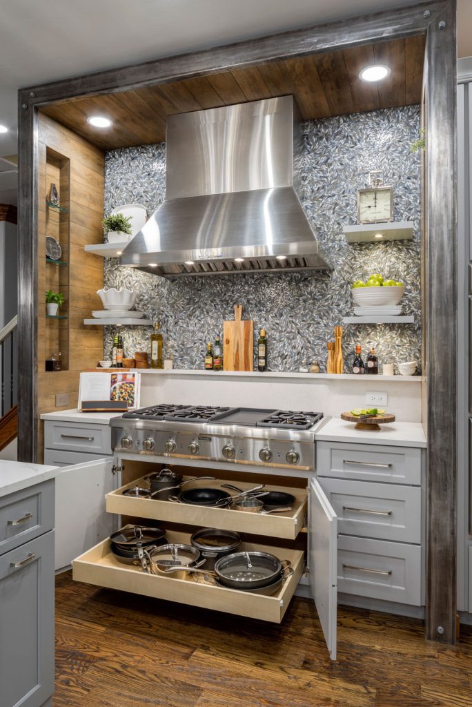
“There also was the challenge of bringing their styles together. She desired a classic, more timeless kitchen look; he favored a modern, transitional look. Neither wanted a cookie-cutter-style kitchen. We combined their preferences, proposing an unusual design at the rangetop’s focal point.”
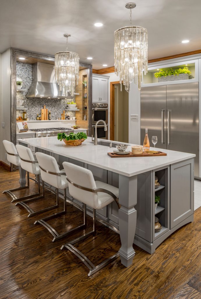
A full suite of Thermador appliances highlights the project. Tower refrigeration at 60 inches provides enviable storage while double dishwashers keep pace with the workload in the expanded 10-foot island.
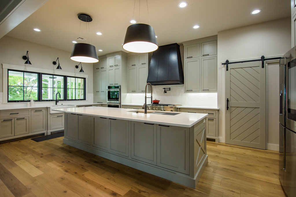
The renovation took eight months. Helms used a light blue-gray on the cabinets with white countertops to brighten the space. Contemporary lighting creates a transitional design mix that overlooks the back lawn and pool.
Helms made several other significant changes.
“There are fewer cabinets,” she says. “We don’t have to line every wall with cabinets any more. People are paring down to a more casual cooking lifestyle. Breathing room in a kitchen is now more important than an excess of cabinets.”
The color palette is subtle.
“Kitchens are now featuring a lot of neutrals,” Helms says. “Whites and grays complement the warm wood floor tones.”
The greatest change is additional room for everyone. Family and friends gather around – you guessed it – the center island.
Sleek, Modern, Timeless
Jodie DeArmon believes the sleek, industrial look is the future for kitchen and bath design.
That’s the style the homeowners chose for their new 18-room, 4,700-square-foot, two-story farmhouse.
The home’s exterior – white painted brick with black window trim – contrasts the interior’s color story. An unusual glass-and-steel garage door, leading to the wife’s photography studio, adds to an overall first impression.
DeArmon, of Tulsa’s Heatwave Supply Co., and Marcia Richards, managing partner of Upside Interiors, created a kitchen and master bath that they describe as “clean, architectural and timeless.” The black-and-white color scheme complements the charm of the kitchen. Art, fabrics and accessories add dashes of color to the calm setting.
The kitchen, large and rectangular, has an oversized island seating six. It anchors the room, which flows easily into the adjacent dining and living areas. The kitchen’s striking visual appeal is enhanced by a bank of windows over the kitchen’s apron sink and provides a grand view of the patio.
Lighting is as contemporary as the color palette – LEDs illuminate the kitchen with a sliding sconce near the double sink. Modern, drum pendant lights enhance the island.
Quartz countertops define the work spaces. A Jenn-Air range with double ovens is another high-end amenity.
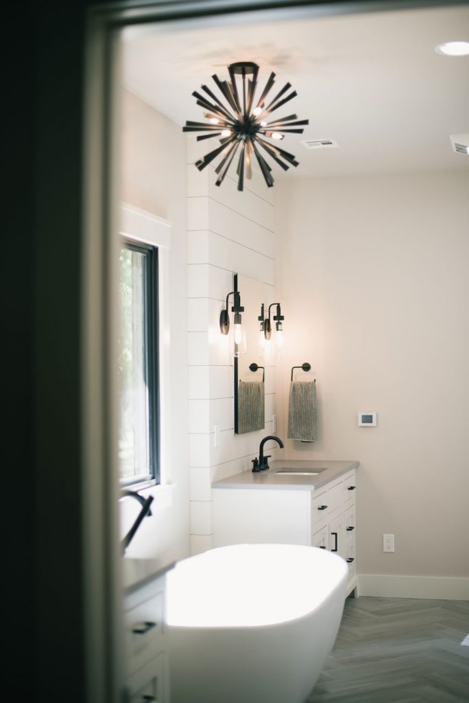
The master bathroom is a study in serenity. The herringbone, porcelain tile floor accents a free-standing tub and twin vanities. The vanity walls are accented with a horizontal shiplap paneling.
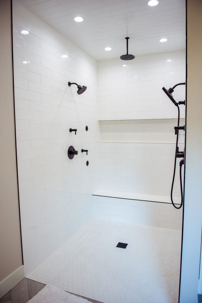
The spacious walk-in shower has two shower heads, a rain head and body sprays. Countertops in this area are also quartz, and plumbing fixtures are black matte, which Richards and DeArmon say “look amazing.”
“The homeowners had a clear direction for their dream home,” Richards says. “With a cohesive design, we created a timeless, modern home.”
A Mobile Masterpiece
Imagine a brand new kitchen that has a trendy, large center island on wheels. And no, it’s not controlled by a robot.
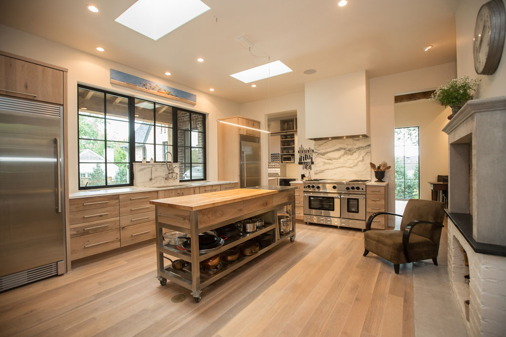
Ralph Lackner, a certified kitchen and bath designer and president of Tulsa’s Jay Rambo Co., says that’s exactly what the homeowner ordered for this kitchen, which measures 19 feet long and 17 feet wide in her family’s new 4,000-square-foot home in midtown Tulsa.
Working with Mike Anderson of Insight Homes, J. Collins & Associates Architects and certified interior designer Carolyn Nierenberg, Lackner created a kitchen fulfilling all the homeowner’s functional and aesthetic needs.
“She loves to cook,” Lackner says. “She enjoys the flexibility the movable island provides. She knew exactly what she wanted in her new kitchen. When the client has specific wishes, that’s a dream job for me.”
The “must haves” included all stainless steel, commercial appliances. That mobile island, set on sturdy rollers, features a counter top of stainless steel with butcher block inserts, which the homeowner uses for food preparation. The center island is both a heavy duty work station and the kitchen’s casual dining center. It includes storage, especially for cooking utensils or serving dishes for counter top entertaining.
“Because she enjoys cooking, a completely modern kitchen was a necessity, where entertaining is a frequent occasion,” Lackner says.
The kitchen’s appliances are complemented by rustic white oak cabinets with a feather glaze. The floor is also a reclaimed rustic white oak. Contrasting the steel and wood is a Mont Claire, 3-centimeter marble countertop and backsplash.
The soft color palette of off-white and pale gray is popular in kitchen design. This allows for accessories to make the boldest color statement. Heavy wood beams and a painted brick and stone fireplace provide contrasting textures.
Lackner notes the homeowner also had specific needs regarding the kitchen cabinets, the firm’s specialty. She wanted drawers on the lower cabinets to house utilitarian items and the open, upper cabinets to provide complementary accents for colorful accessories.
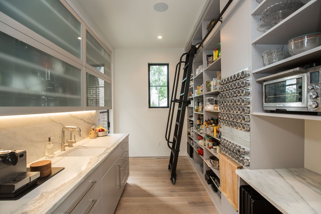
Another feature is a secondary kitchen, doubling as a full-service pantry.
“This is where she keeps spices, and other kitchen condiments. It has a rolling ladder to help her access kitchen necessities,” Lackner says.
Midwest Modern
For Tulsa architect Brian Freese of Freese Architecture, this kitchen and bath project was a true first.
This is the inaugural project of a series he dubs “Midwest Modern,” in Tulsa’s burgeoning midtown. Each home will be designed with sizes and amenities appropriate to the neighborhood and current market trends.
“This home was designed for singles, smaller families or empty-nesters,” Freese says.
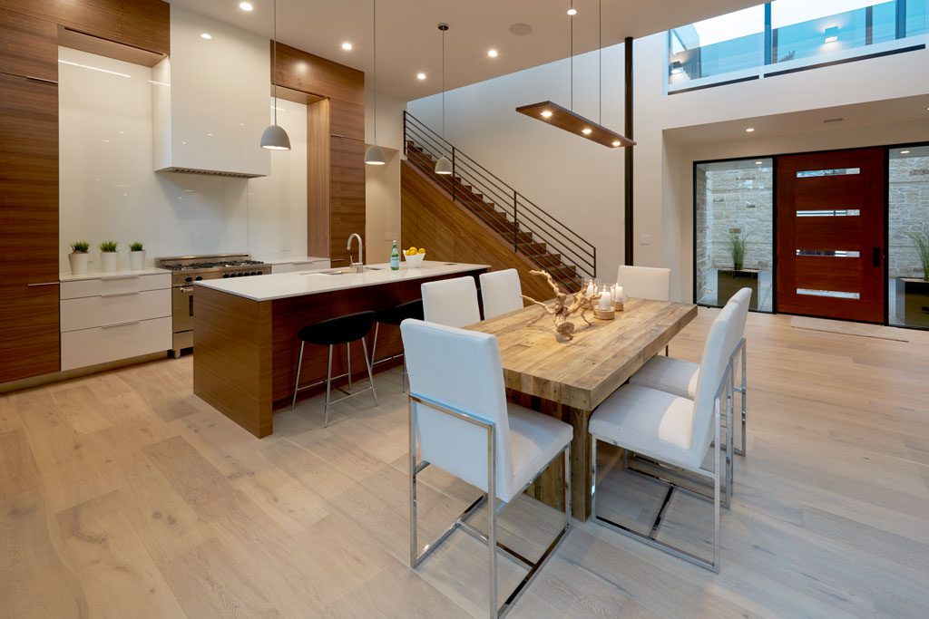
So, maximizing the square footage – making every inch functional and visually pleasing – was crucial to the overall design aesthetics. Throughout the home, a light, neutral color palette creates an expansive impression.
Freese had 3,750 square feet in a two-story space to design. The biggest challenge was to create a modern home that was appropriate to the neighborhood in terms of scale, proportion and materials, yet striking and unique.
“Because of the space available, the kitchen needed to be highly efficient, yet give the impression of being roomy and spacious,” Freese says. “We accomplished that by designing the north cabinets so the refrigerator and freezer didn’t protrude into the kitchen space but faced outward, becoming an interesting design feature.”
He also took the wasted space under the stairway and used every available inch for hidden cabinet storage.
“That was the first time I’ve done that,” Freese says. “Challenges are opportunities.”
The focal element of the kitchen is its center island, featuring a generous working and entertaining area with ample seating. Another challenge was the range hood – an issue Freese met head-on.
“We disguised the range vent by incorporating it within a simple rectangle and cladding it with the same solid surface backsplash material. So often, the range hood takes center stage. It shouldn’t,” he says.
Ceiling lighting is a stellar kitchen feature, punctuated for drama with modernistic pendant lights over the center island.
“I wanted to make sure the kitchen was well lit,” Freese says. “The lighting is consistent from the kitchen area into the public space.”
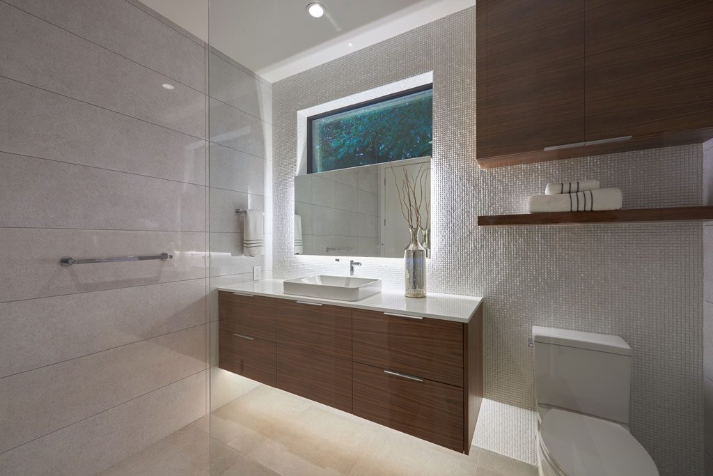
In the master bath, Freese used LED strip lighting, emphasizing the sculptural quality of the sinks and cabinetry. The roomy yet functional bathroom is a haven for relaxation.
Overall, Freese credits the entire team’s work for a stellar renovation.
“The contractor did an excellent job of execution,” Freese says. “The new owner has had many large group events. It has provided a wonderful entertainment space.”
Worthy of a Wow
The mission for this kitchen renovation was to increase space and cabinetry and give it a fresh, modern look.
During the three-month process, Brenda Helms of Edmond Kitchen and Bath created an environment that the family and friends call worthy of a wow.
“This home had a very common, dated and restrictive layout,” Helms says. “The sink was in a corner with a high bar on the back side. We called it the ‘Edmond swing.’”
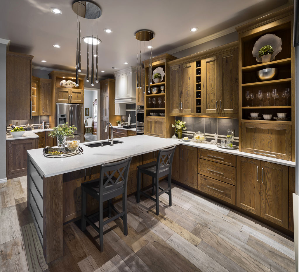
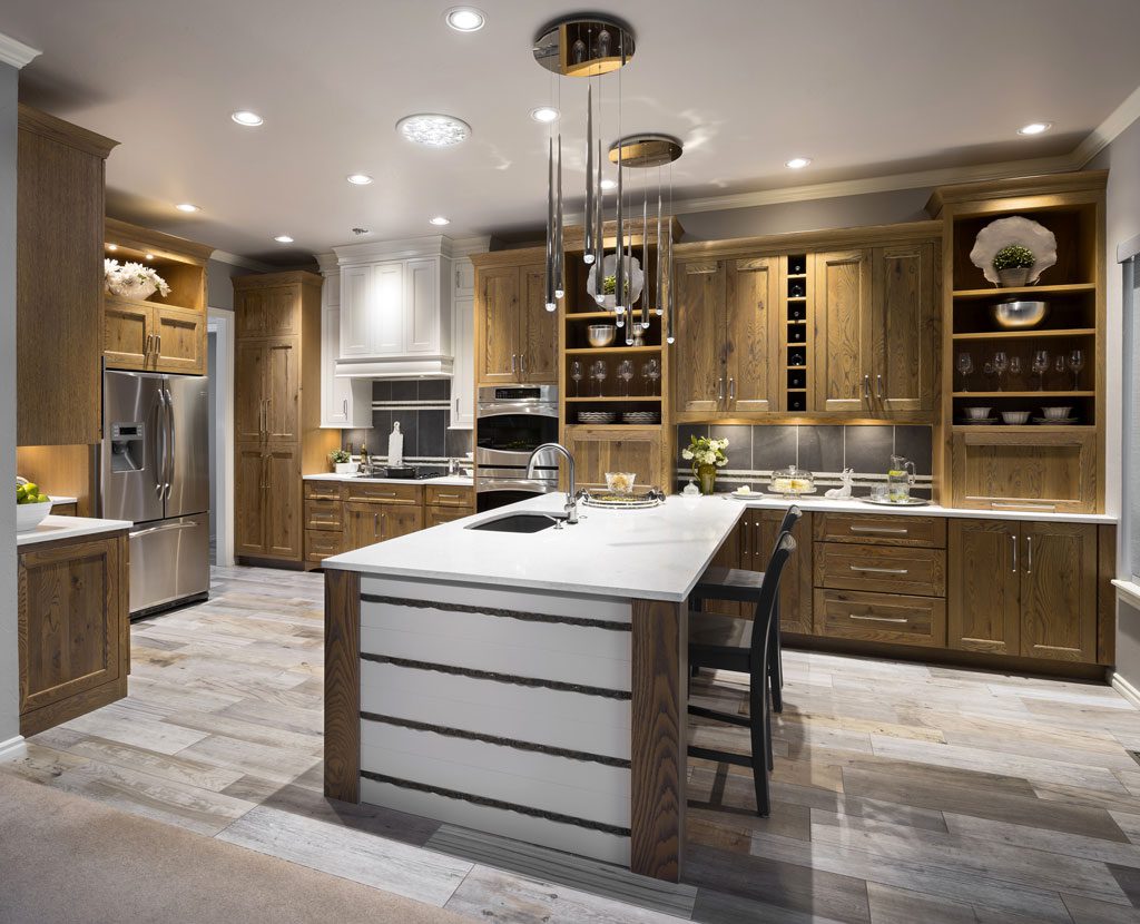
In the transformation, the sink, ovens and refrigerator were moved. Kitchen space doubled. The breakfast nook gained a new purpose, and the expanded U-shaped kitchen now looks into the home’s beautiful den and dining area.
The kitchen has a new face and greatly improved work and storage areas, but it retains a traditional look.
Two different styles of tower cabinetry, reaching to the ceiling, feature a mix of inset and overlay doors with transitional-style hardware. The cabinets are fashioned of rustic, knotty oak with impressive grain. White accent cabinets provide contrast. The different door treatments add visual interest and help with space allotment, Helms says.
The bottom area of the peninsula contains what Helms calls “an appliance garage.” These shelves house a variety of implements, like a toaster and coffee maker. The door lifts to reveal easy countertop access to these items.
A vintage barnwood tile graces the floor. A creative tile pattern in the backsplash enhances the cabinets and counter surfaces.
A 10-foot peninsula, a great gathering place for the family and friends, includes a large granite-composite sink. The area serves as the heartbeat of this revamped kitchen, the centerpiece of the home.


