[dropcap]Sarah[/dropcap] McPhail was envisioning her dream home long before she and her husband found their ideal location to build in Tulsa.
“I always knew I wanted to design my dream home, even while I was majoring in interior design at the University of Oklahoma,” Sarah says. “Our first ‘starter home’ was an exercise in restraint. I knew then I would have to design our home to be satisfied. The south Tulsa area we found is family-friendly. I wanted to build a home that could grow with our family.”
The two-story home is characterized by the simplicity of design, which includes repetitive architectural themes, a neutral color palette and a pleasing mix of antique woods, sparked by contemporary chrome and glass.
“I researched a lot of design elements through the years. I wanted a home that had clean lines, would be transitional and very functional. Durability was also important with children at home,” Sarah notes.
Sarah wanted her family’s home to be a showcase for found objects, ranging from art and sculpture to family treasures. Various settings in the home serve as a stage for the collection of design accessories Sarah has acquired during her career.
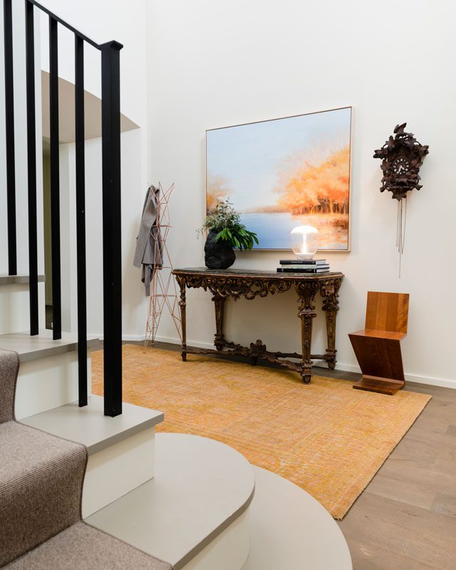
She particularly enjoys the juxtaposition of old world traditional and contemporary architectural details, furnishings and accessories. The spacious entry foyer in the 4,500-square-foot home reveals her artistry with mixing design periods.
A contemporary landscape painting, “Golden Moments” by Jamie Kirkland, complements an heirloom cuckoo wall clock carved from Germany’s Black Forest wood. It belonged to her paternal grandmother and is priceless to Sarah. A contemporary Z-shaped chair adds a modern touch, as does a metal coat rack by designer Tom Dickson.
“It’s an architectural feature when not serving as a coat rack,” Sarah says.
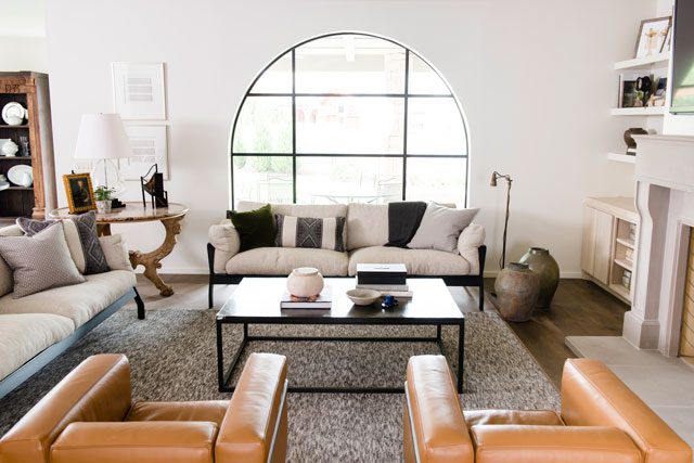
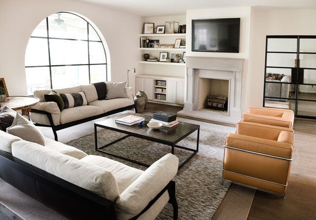
An arched opening leads from the entry hall into the open living room, kitchen and dining area, providing a feeling of cozy ambience. An arched window adds architectural drama to this room. The neutral color scheme includes an off-white sectional sofa, accented by two chestnut colored saddle leather chairs with wing frames and down-filled cushions. An adjacent den includes an office and children’s playroom.
Sarah’s love for mixing architectural periods is classic in the small dining area. A traditional round dining table is teamed with white leather chairs, laced up the back. Nearby, a dark wood cabinet made from an East Indian door frame houses family heirlooms.
“The cabinet was one of the first antique pieces we purchased for our home,” Sarah says.
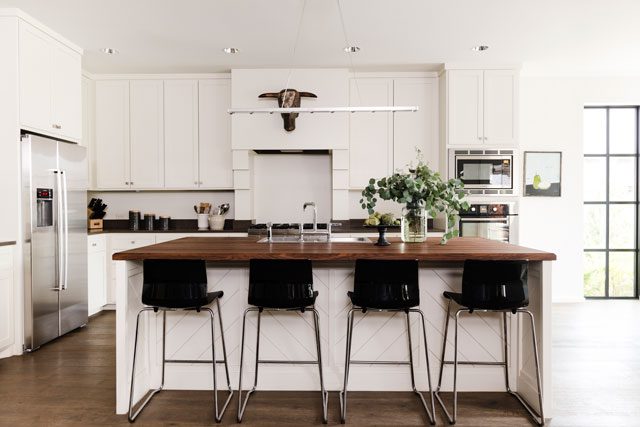
The white-and-black kitchen is a portrait of sleek efficiency. A black walnut center island is a favorite gathering place, especially for the children. The Ikea chrome and black plastic bar stools are “a durable necessity for children,” Sarah adds. Other notable features are a tiny chrome light bar created by the Ingo Maurer Company, which hangs above the kitchen’s center island. An African bull mask presides over the kitchen’s work area. Sarah found the unusual mask at SR Hughes, where she is on the design staff.
Sarah loves the warmth of the white oak floors featured throughout the home. They are complemented by white walls, achieving the crisp, pristine look Sarah hoped to achieve with her design.
“I’m really happy with this house,” Sarah says. “It’s very functional. The fabrics are durable. The rugs hide any mess. There’s nothing the children can’t touch. Everything works well. I considered the furnishings in the floor plan. I built the home from the inside out. The twin sofas dictated the size of the living room.”
As a designer, Sarah tells others planning their dream home: “Consider how you want to live inside your home. Make sure your furnishings will fit your floor plan.”


