Equipment is essential to a kitchen’s success. At the center island, loved ones watch the cook craft a party or a simple supper. The cramped, shoebox kitchen is history. Homeowners want open, fluid spaces from the living and formal dining areas into the kitchen, often designed with an outdoor view to start or end the day.
The master bath, on the other hand, is a retreat, where people can wash away the concerns of the day and feel rejuvenated. Muted color palettes and elegant materials, like marble or stone, can create a luxurious, spa-like quality. Storage is as essential here as it is in the kitchen so that everything is within reach.
Whether it’s building a new home, renovating an older residence or just looking for ideas, consider the following vignettes to help make your kitchen enticing and your bathroom relaxing.
A Tudor RENOVATION
Photography by Nathan Harmon
The redesign of the kitchen in this Tudor revival home, built in 1925, required hefty, strategic, structural moves by architect John Duvall of Duvall Atelier and general contractor Kurt Barron of Barron and McClary.
“Fortunately, no serious issues were encountered in this process,” Duvall says. “Now, the kitchen area is fresh and modern and maintains the home’s period feeling and character.”
Interior designer Sherri Duvall adds: “The idea was to freshen and modernize the kitchen while complementing the dining room. The homeowners enjoy hosting parties and dinners, and the kitchen was planned to accommodate socializing and chef interaction.”
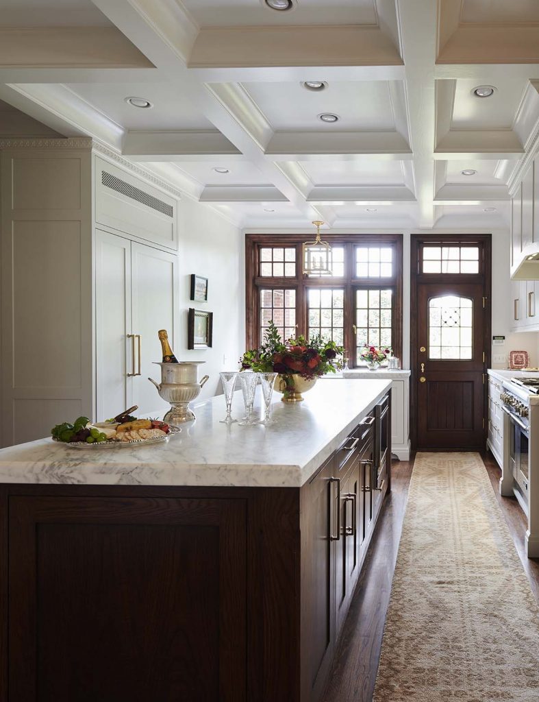
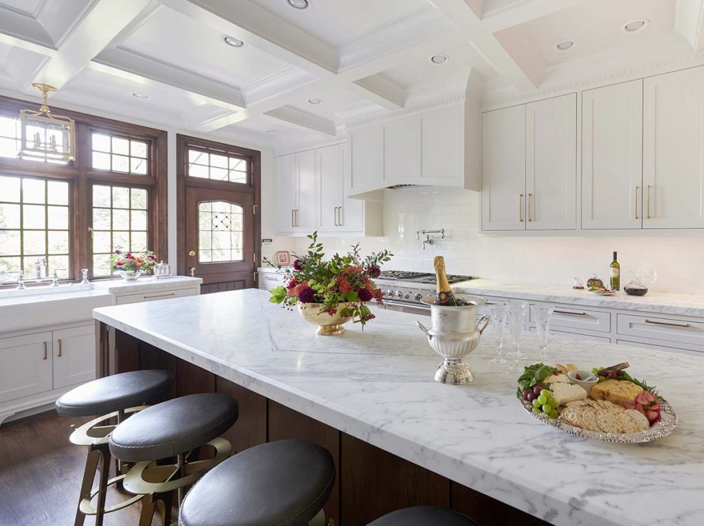
David Stevens, an English-native carpenter, designed the center island, while Barry Suderman and Anne Doty of Woodmaster’s Cabinetry and Millwork designed and built the Shaker-style cabinets, which take full advantage of the high ceilings for storage. Thoughtful additions include a charging drawer, appliance lift for the mixer, hinged side cabinets for small items, and specialized knife and spice storage.
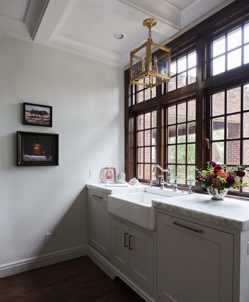
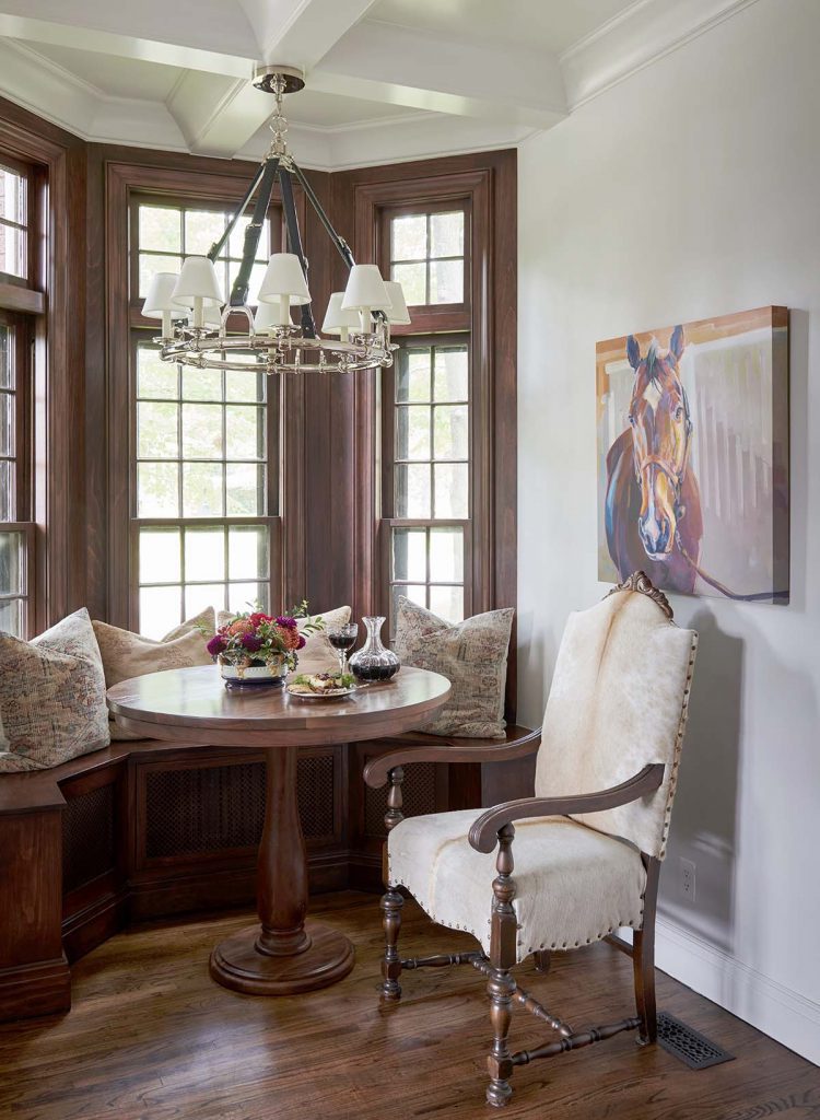
Sherri Duvall notes: “Nearly 100 years’ worth of paint was removed from the double-hung bay windows, now restored with new ropes and weights to their original function. Their dark stain matches the dining room, island, new door and window. The focal point of the kitchen is the new custom casement wood window above the apron sink.
“We tried to use the same materials you would find in English Tudor homes and at other Tulsa architectural icons of this period.”
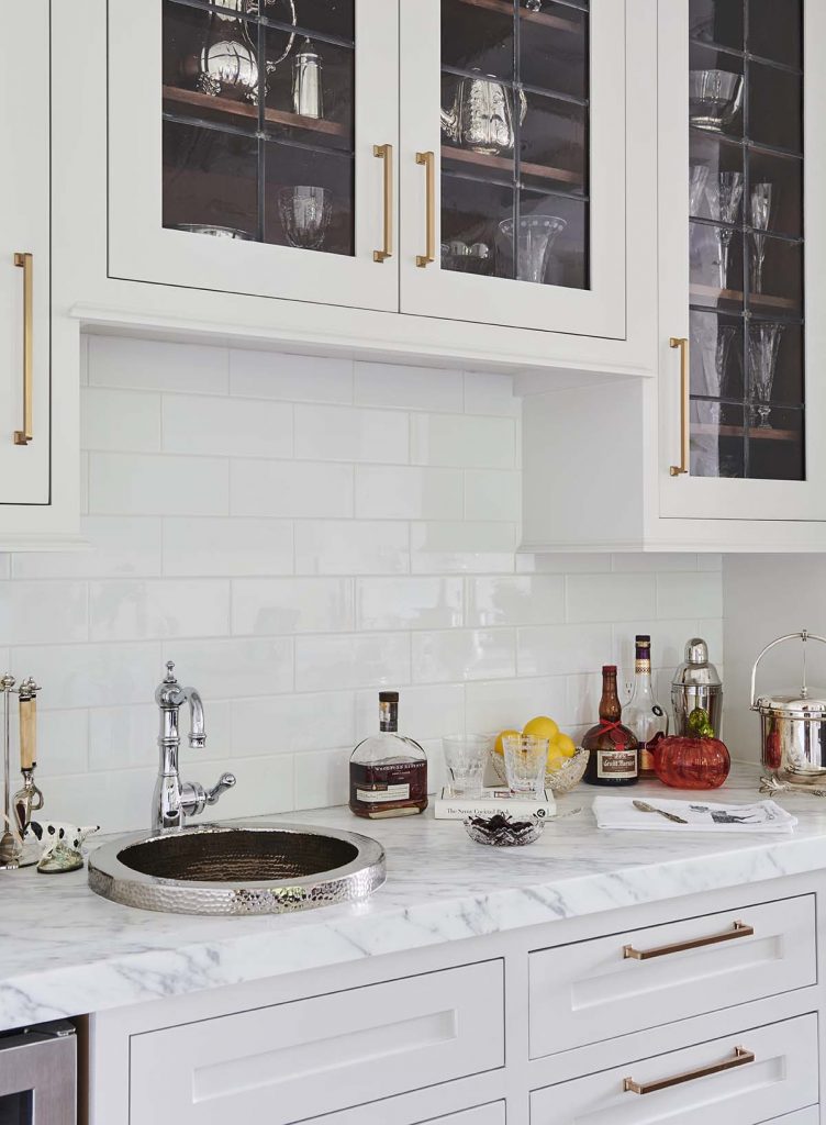
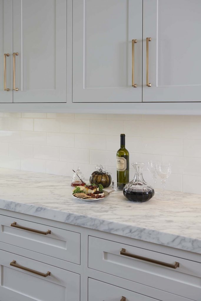
The thick, honed Danby marble counters give a substantial feeling without distracting from the star of the room – the coffered ceiling with quatrefoil trim. The crown molding is replicated in wood. The bar now resembles an English butler’s pantry. The area’s furnishings reflect a comfortable British feeling.
TURKISH FLAVOR
Photography by Scott Johnson, Hawks Photography
There’s nothing this homeowner loves more than cooking for friends and family in her well-appointed kitchen. Plus, her food has what she considers the spice of life – a definite Turkish flavor.
However, the kitchen of this home in a gated, south Tulsa community didn’t work for her; it was too small and cramped. There was no room to visit with guests while she cooked and barely enough space for a buffet dinner.
Lesley Shollmier, of Tulsa’s Kitchen Ideas, stepped in to sweeten the palate for this homeowner, known for her continental cuisine. Shollmier incorporated a dining room, breakfast room and kitchen into one expansive space.
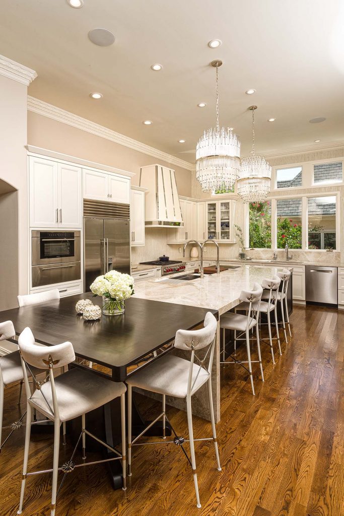
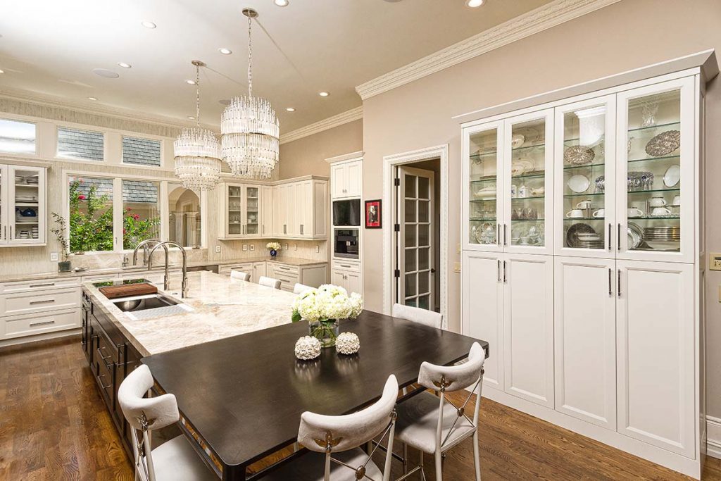
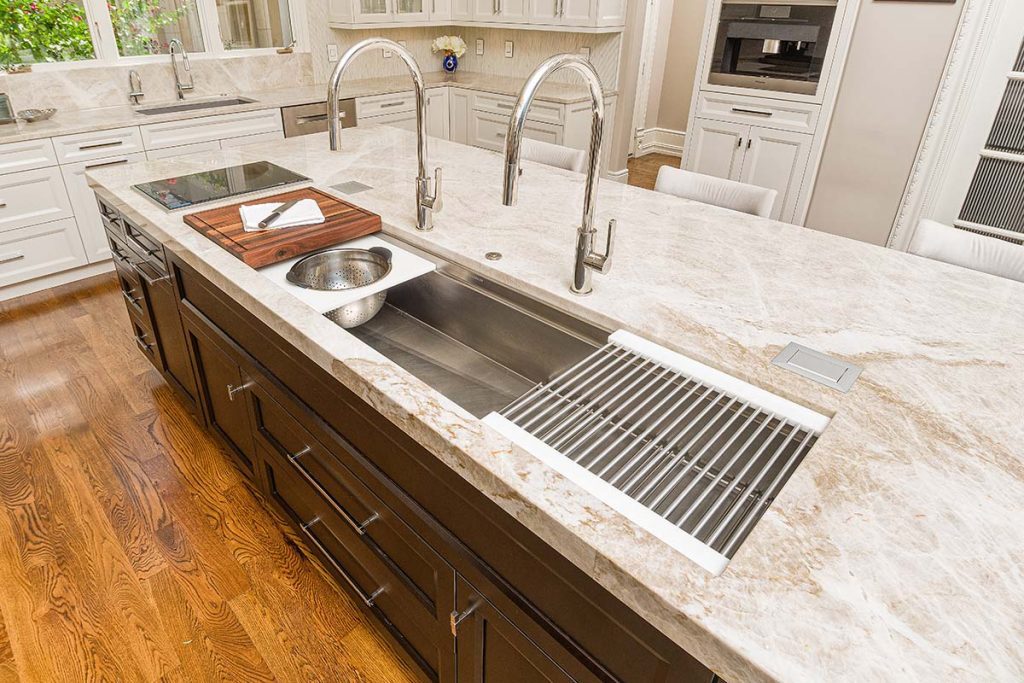
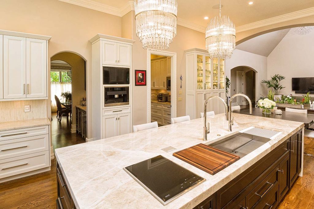
Now, the center island is almost the star of the kitchen because the incredible twin chandeliers draw rave reviews from guests. Then they notice the 6-foot-long island, covered in Quartzite. With ample seating, the island is perfect for watching this hostess bring a dinner party to life.
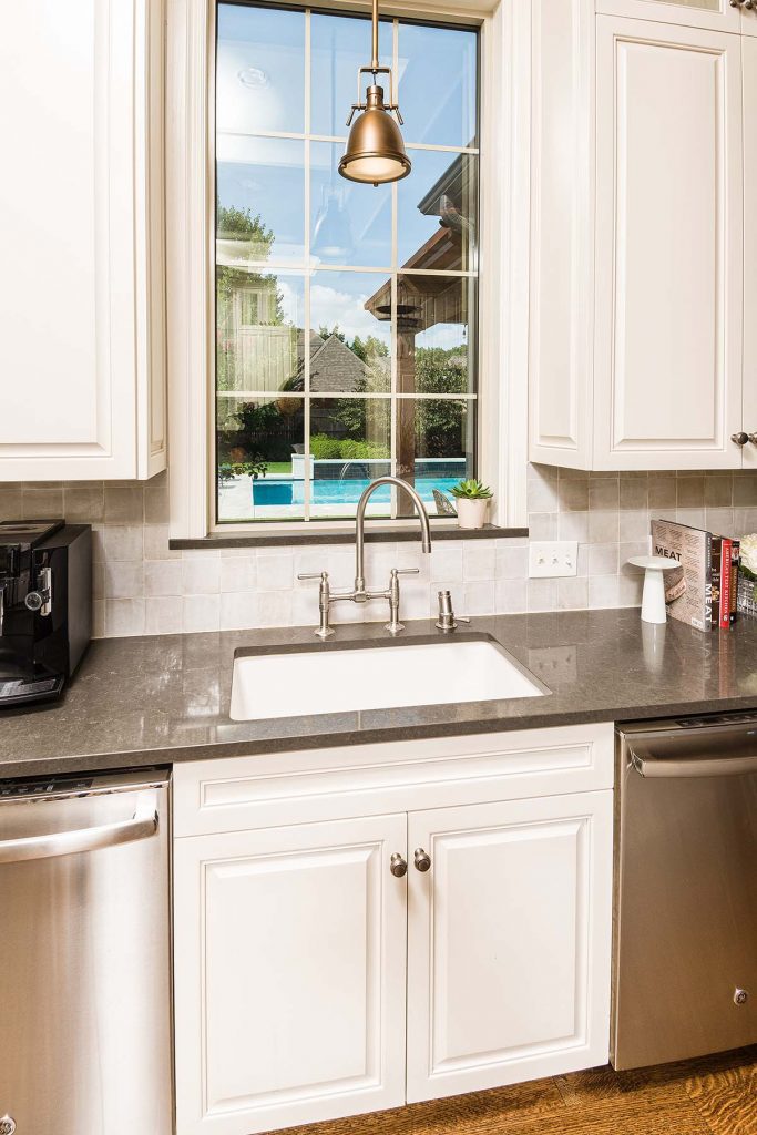
The island is more than a stage for dining; it has two sinks and is close to the refrigerator, stove and cabinets. The Wolf range hood has a custom chrome inlay. It is as much a work of art as the view to her garden from the kitchen sink.
“The homeowner wanted ‘a bit of bling,’” Shollmier says. “All along the back wall is a polished marble mosaic. It has a shimmer and a sparkle” – just what the homeowner’s kitchen renovation recipe called for.
Equally as convenient is the kitchen’s walk-in pantry, a once-wasted space that Shollmier redesigned to accommodate cooking and entertaining.
REFLECTIONS
OF TRAVEL
Photography by Scott Johnson, Hawks Photography
When the homeowners bought this south Tulsa residence, it had a strong, French, country flair. Having lived abroad for several years, they wanted to put their personal stamp on the home to commemorate their travels.
“The challenge was how to turn this home into one that was a reflection of their design style and meet their needs as a family,” says Jack Martin, owner of Sullivan’s Custom Cabinetry in Tulsa.
The approximately 4,000-square-foot, two-story home was purchased by a couple Martin had known for a few years. He understood the family’s tastes and appreciation of Asian culture, so working on this project was a joy for him. Asian influences are seen in extensive, vivid décor brought home from their journeys.
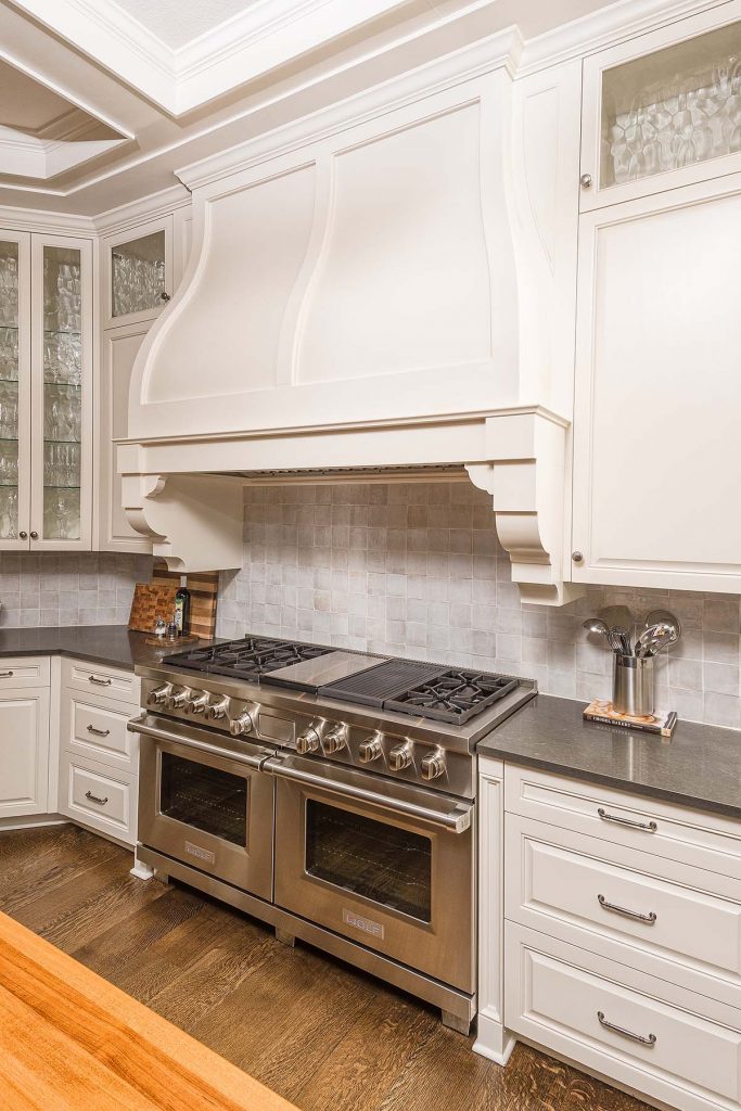
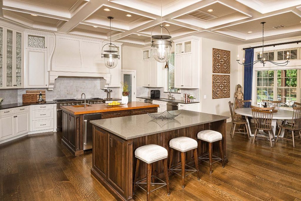
The kitchen features several eye-catching details. The coffered ceiling was constructed by Richard Selsor of Selsor Building and Remodeling in Tulsa. The nearly 6-foot-tall vent hood, with its distinct shape, is a conversation piece. Two wall cabinets, with glass windows at the top, flank the hood, which has curves mimicked in the arched doorway leading to the laundry room.
“While the vent hood is unusually large,” Martin says, “the 10-foot-tall ceilings and open kitchen make it work well in this space.”
Also notable are the kitchen’s two center islands.
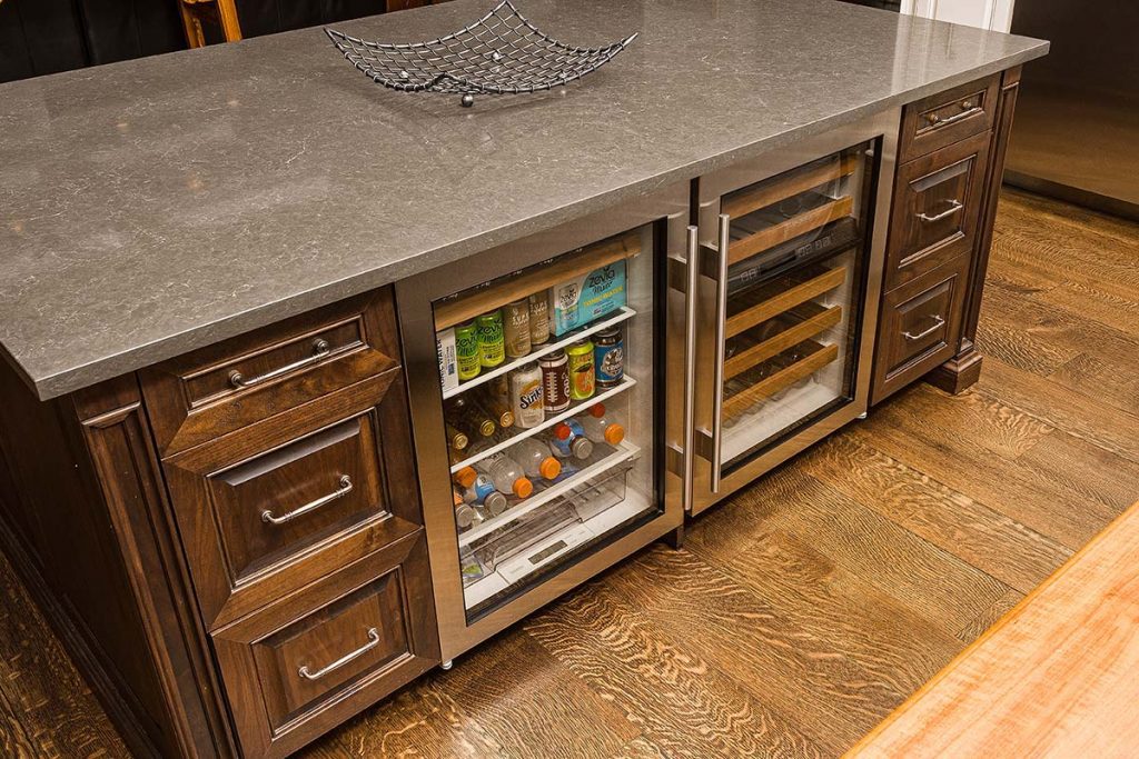
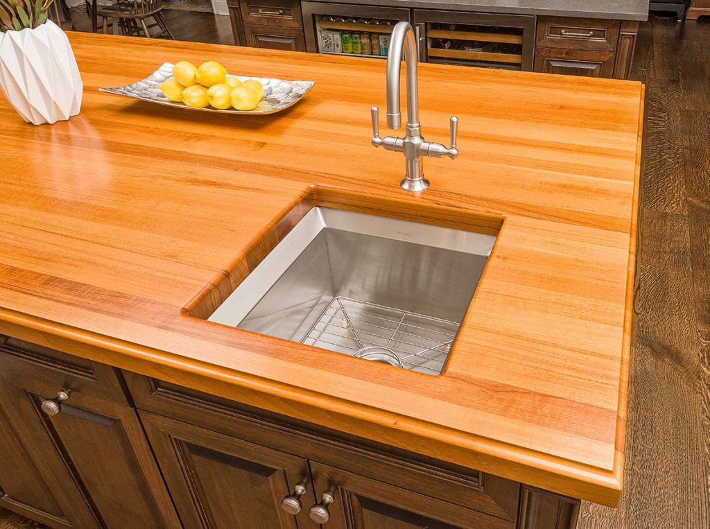
“Each one has a different function,“ Martin says. “Both are constructed of walnut. One is used for food preparation … and has a stone countertop. The other has a walnut top and is used for dining and … entertainment. It even has a built-in wine fridge.”
Leather-topped bar stools provide comfortable seating for informal dining and conversation.
“The kitchen has a good flow for work spaces as well as family entertainment,” Martin says.
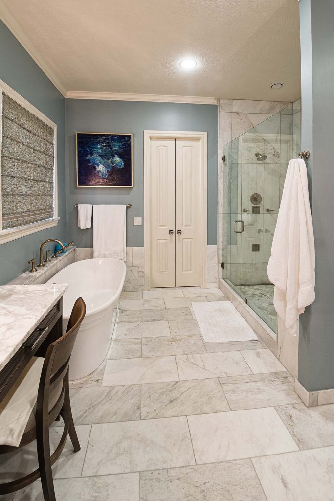
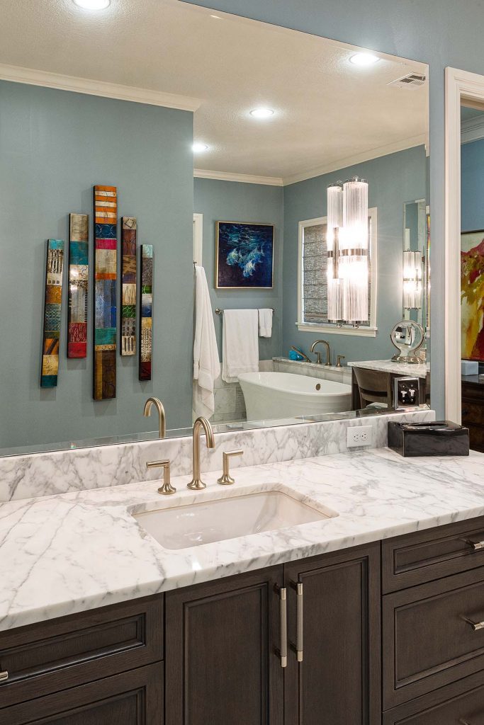
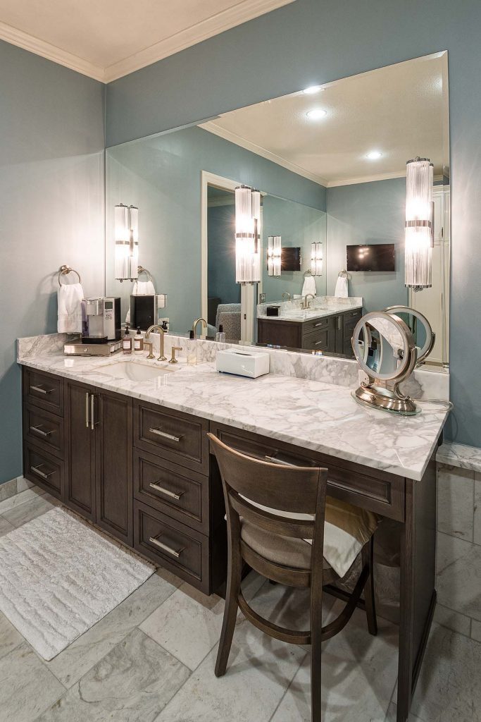
He calls the master bath “a dream bathroom with abundant storage.” The homeowners’ interior designer, Julia Kirkendall, helped them choose the stone floors and countertops and the soft blue-gray color scheme, which makes this a relaxing setting in which to unwind. Unusual lighting and art complement this well-appointed space, which has ample, pantry-style storage. The glass shower stands in the middle of the room.
The walk-in master closet is equally as beautiful, functional and luxurious. The stunning wardrobe is its focal point with storage space along both sides. The homeowners share the closet, although she uses about two-thirds of it.
“Not to worry,” Martin says. “The next project is the ultimate man cave/wine storage for him.”


