In his career as an architect, Cecil E. Ricks, president of MATRIX Architects, Engineers, Planners, Inc., has designed a variety of renovation and remodeling projects. But a venture for First National Bank Broken Arrow ranks as “one of the most fun” he’s been involved with over the years.
The challenge of renovating the bank, located in the popular Rose District, and giving it a fresh, updated look appealed to Ricks.
“The bank had a historic element, having been established when Oklahoma was still Indian Territory before its 1907 landmark admission to statehood,” he says. That pioneer heritage makes it one of Oklahoma’s oldest banks, established in 1902 and its current location since 1912.
A 1980 graduate of Kansas State University, Ricks describes his firm as one “that has a very diverse practice; we do a little bit of everything,” he says. “We apply good design practices to all our projects. We do, however, have a special fondness for remodeling and the renovation of existing spaces.”
The bank’s redesign and enhancement project began in 2014 and was completed in 2017. Bringing this bank, which encompassed three storefronts of various façade heights, into contemporary times required intense, strategic planning.
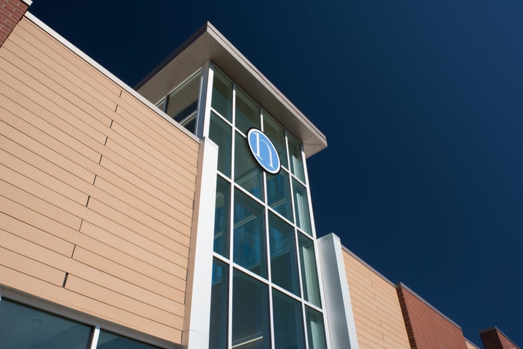
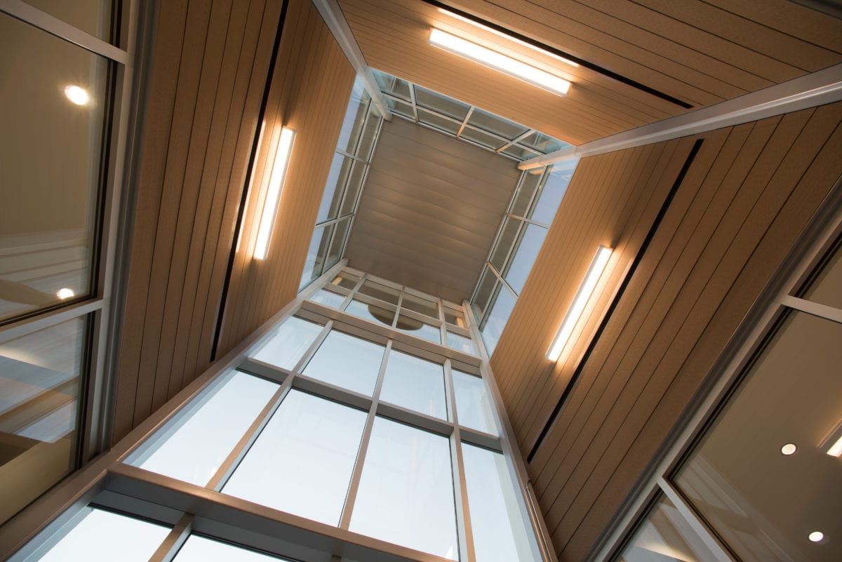
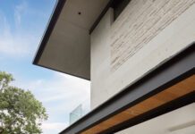
The Rose District features an abundance of brick, masonry and wood in its storefronts, so the team at MATRIX designed the bank’s exterior and interior in keeping with those specific materials. Another challenge was to create a more cohesive first impression; this was accomplished by combining that trio of façades into a more uniform look and constructing an impressive glass tower in the entry, which serves as a welcoming beacon for the bank’s clientele.
“It’s now a very striking front entry,” says Ricks.
The renovation – really a major building revival – was not without issues. While the varied storefronts were obviously problematic, the building’s support systems had weakened through the years.
“Many of the trusses that supported the trio of roofs had to be reinforced,” which is no small undertaking, says Ricks.

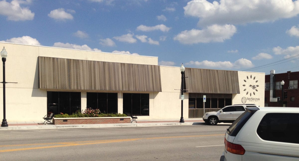
The sprawling First National Bank Broken Arrow has been in its current location since 1912. 
Combining three different facades into a cohesive unit was challenge No. 1 in this renovation. 
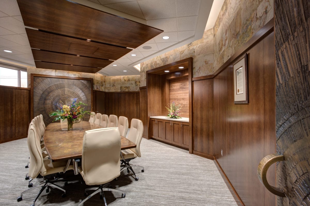
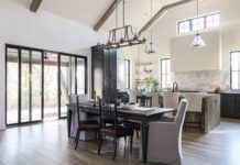
Open, airy and inviting is the design theme for the conference room at this bank. Small group meetings are staged in a glassed-in setting that provides privacy minus the stuffy closed door atmosphere. Live greenery enhances the setting. 
The interior of the glass tower provides an interesting first impression for clients. 
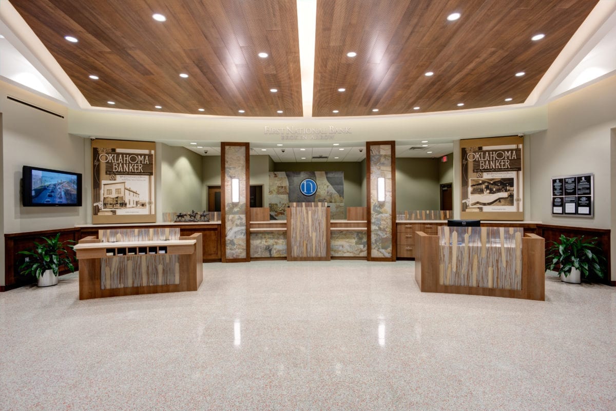
The main lobby is inviting and spacious with a neutral color palette. Unlike bank lobbies of the 20th century, there are no caged tellers in this pleasant setting. 
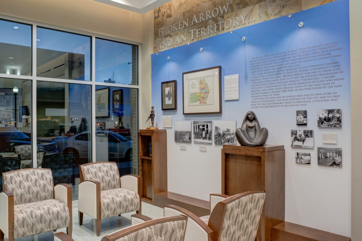
A unique addition to the bank is this small art collection for clients to enjoy.
While the exterior is now much more inviting, the interior shines, too. Ricks was surprised to find tile terrazzo floors from the early 1900s in the lobby of the main banking center; they were hidden by well-worn and outdated tile and carpet. This particular discovery was like uncovering a goldmine for Ricks and his crew. Now cleaned and polished, they are a handsome addition to the main area.
A soft, neutral color scheme of warm beige and soft brown was chosen for the lobby. Another new feature is a small art collection on either side of the tower. The gallery includes several donated artifacts that tell a unique story related to Broken Arrow’s history and the formation of the bank. This area adds to the warm, welcoming and interactive ambiance.
The revitalized bank is an impressive symbol of Broken Arrow’s renewal.
“The bank wanted to be a part of this Rose District renaissance,” says Ricks. “In keeping with the Rose District’s theme of streetside planters and roses, the bank is following that exterior design theme, too. Greg Graham, the bank’s CEO, had a clear vision of what he wanted the bank to achieve to improve their customer base and provide better service.”
It’s no surprise the customers are pleased with the space’s newer, more inviting appearance, both inside and out.
“Now, the bank is more user-friendly, a design theme more banks are featuring,” says Ricks. “It’s more intimate. It’s like walking into the living room in a friend’s home.”


