A Rousing Remodel
Photography by Nathan Harmon
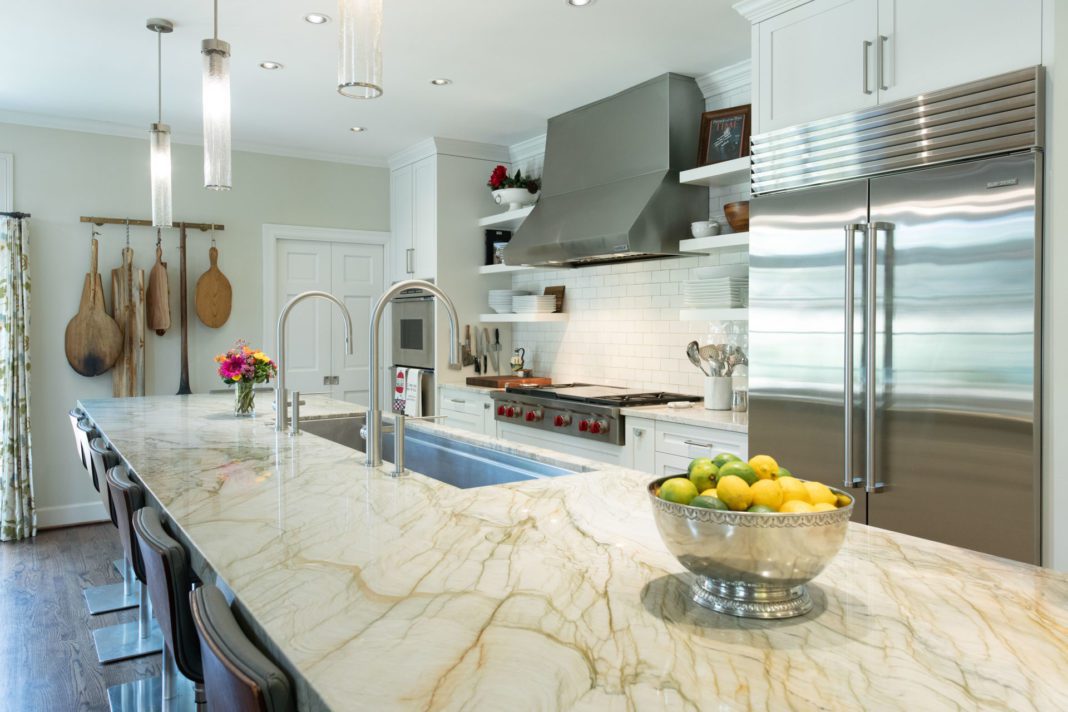
Located in Tulsa’s historic Maple Ridge neighborhood, this alluring home received a brand new kitchen. Prior to the remodel, the galley kitchen was small and dark, but a few strategic moves let in the light. The main goal of the remodel was to lean into the historical aura of the home.
“The house looks historic even though it was built in 1988,” says Carolyn Fielder Nierenberg, an interior designer and president of Tulsa-based Campbell Design Associates. Certified by the American Society of Interior Designers (ASID) and an Oklahoma Registered Interior Designer, Nierenberg has been president and owner of the company for over six years. However, she’s been with the business since its start over 40 years ago.
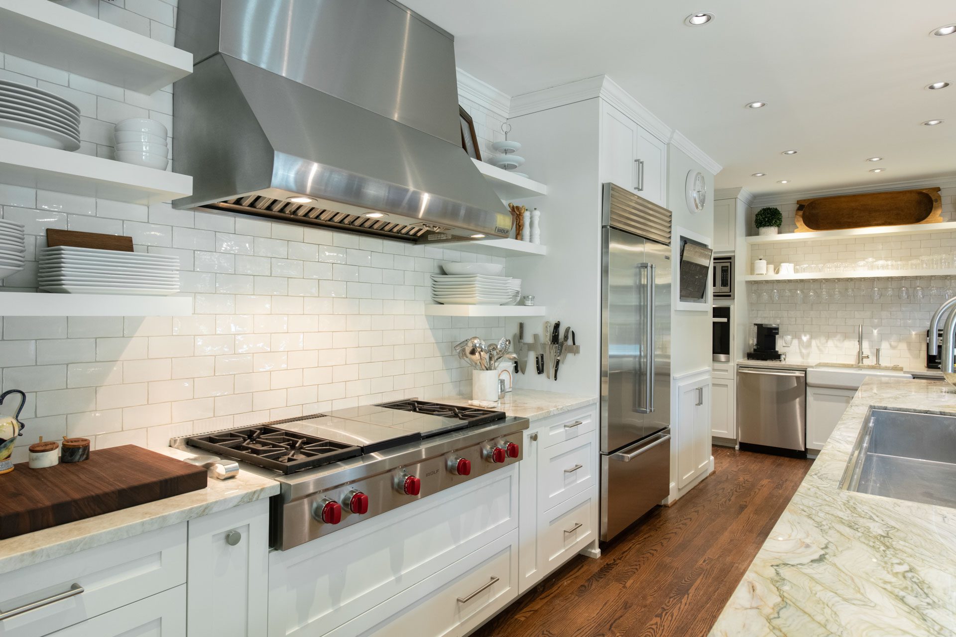
One focus of the remodel was to create a more usable space “for people who love to cook,” she says. The galley kitchen was opened to make one large area, which in turn exposed existing windows on two sides, bringing nature inside.
Inspirations
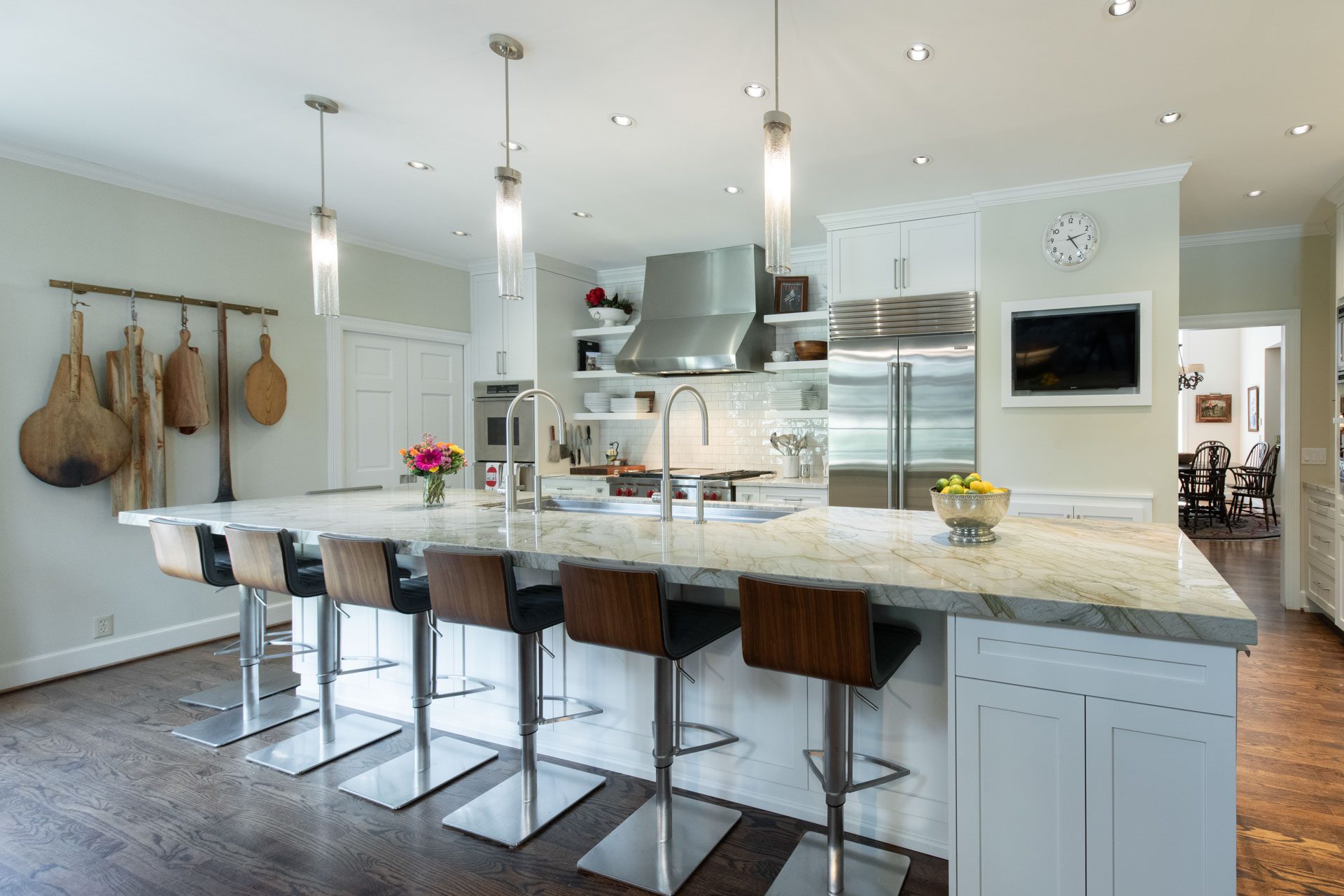
The client chose a quartzite countertop for the island. This countertop, called ‘Taj Mahal,’ is ivory and light sage green, and was the inspiration for the remodel’s total color scheme. The island seats ten and is one of Nierenberg’s favorite spaces in the home.
“I like the island,” she says. “It is the gathering place; they entertain a lot.”
Highlights
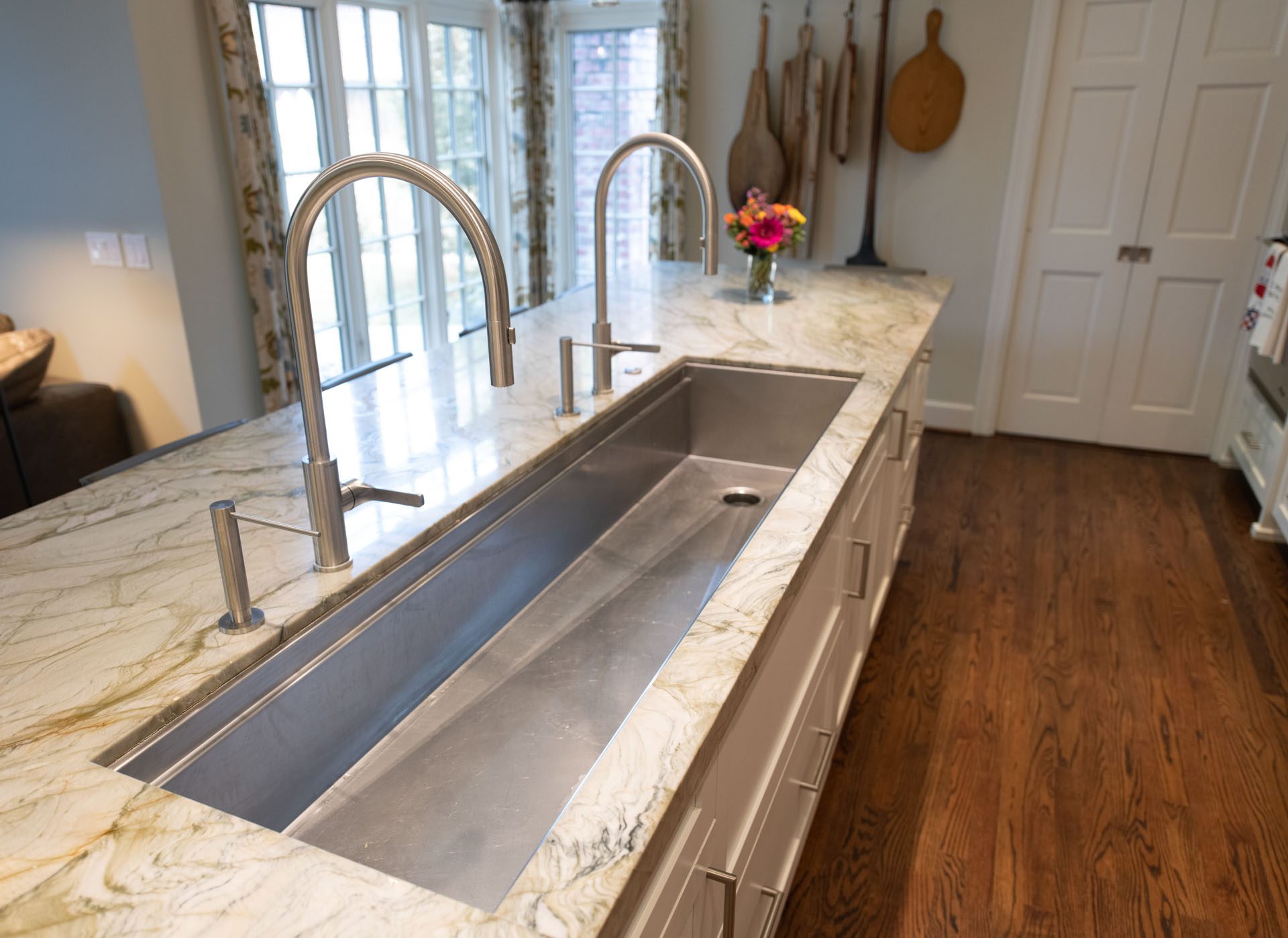
Must-sees in this kitchen renovation include a large sink with two faucets, color-coordinated countertops and a beverage center.
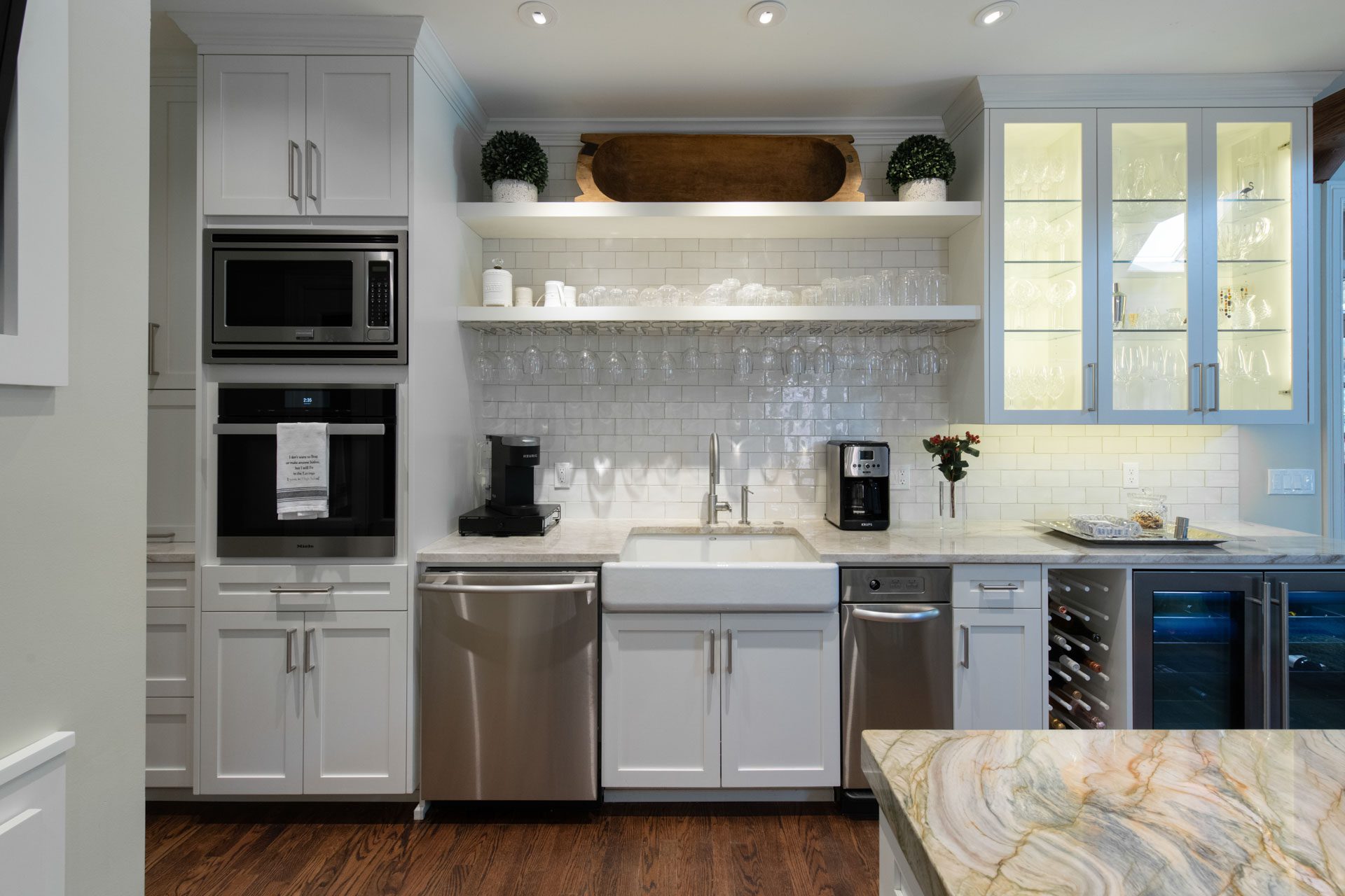
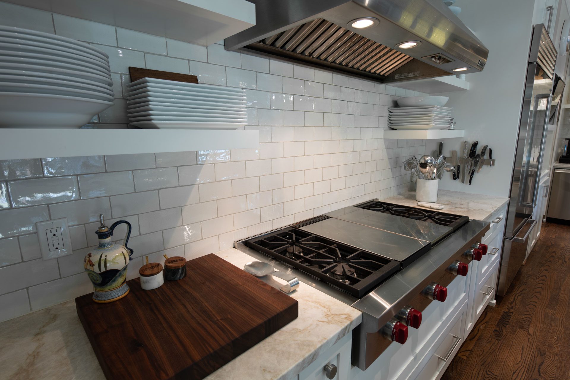
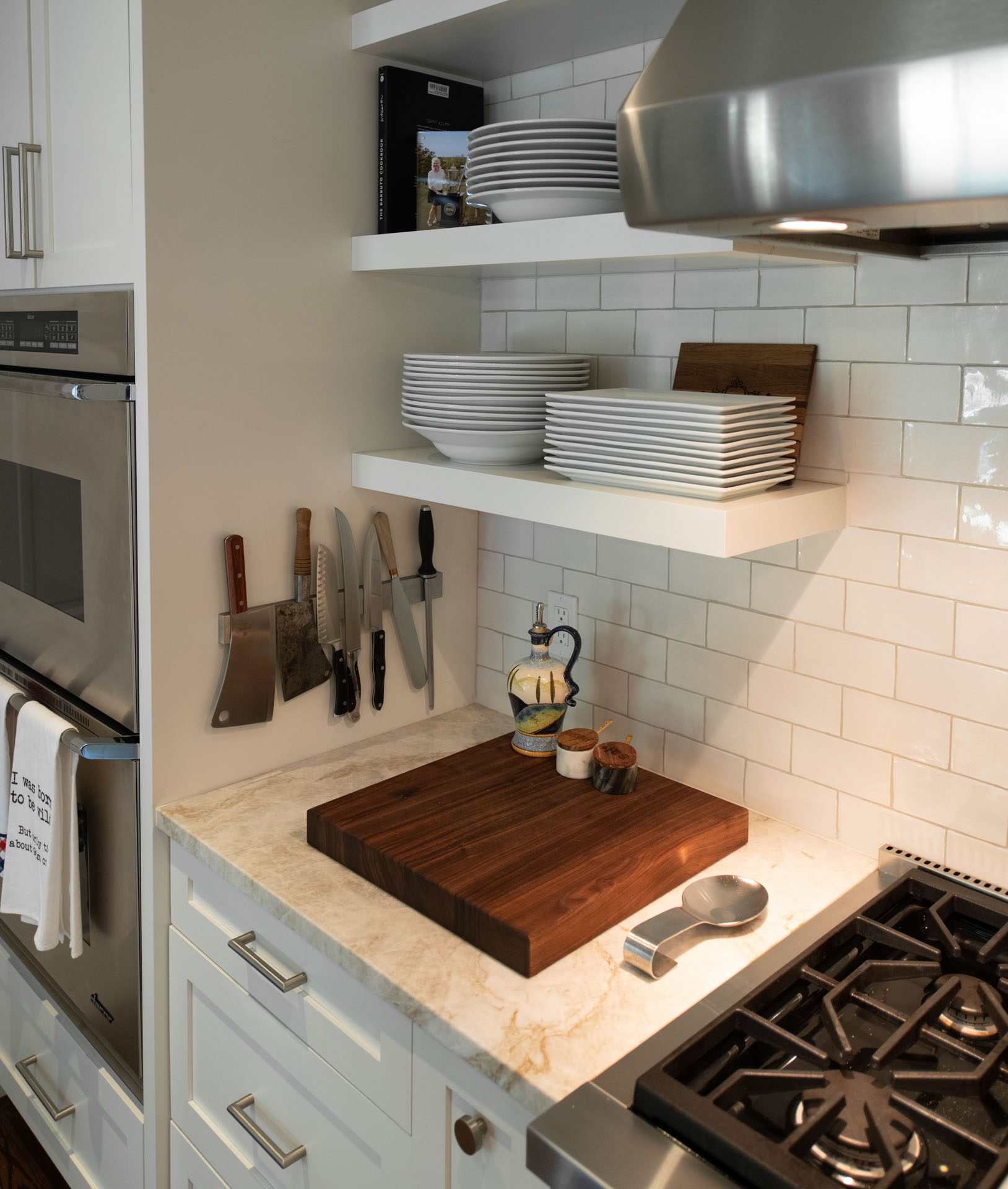
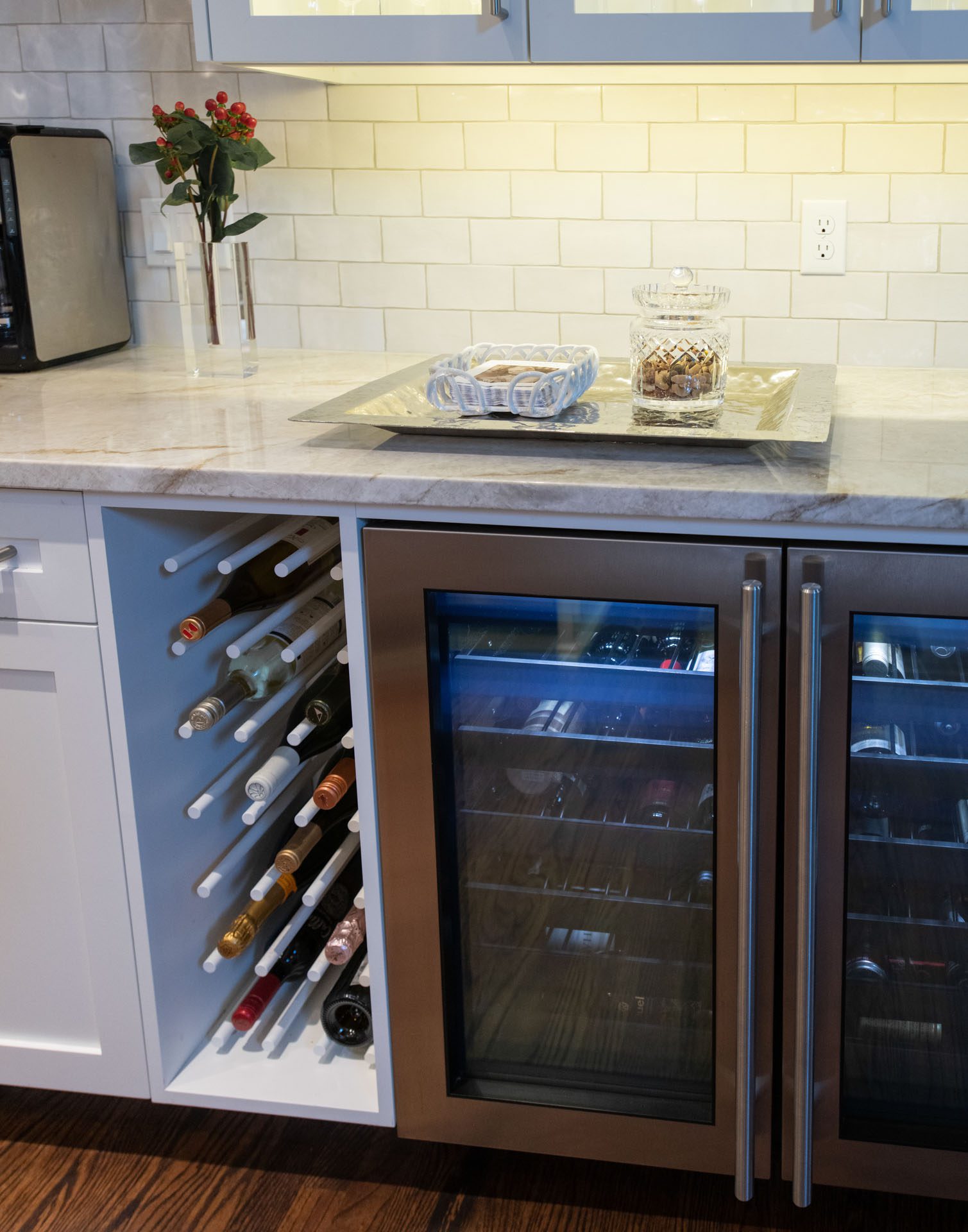
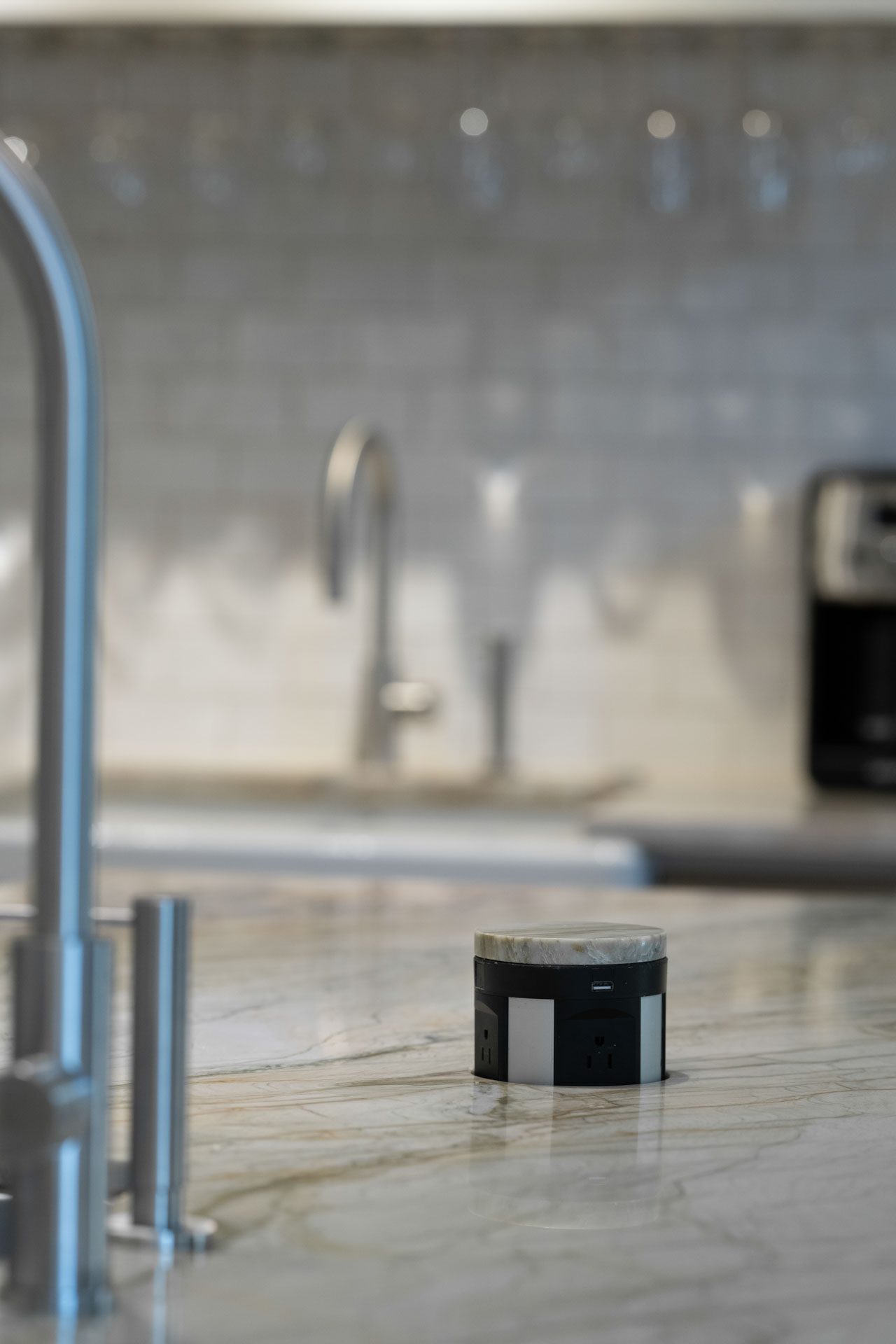
The sink, from Gallery Sink, has cutting board and drying rack inserts that provide flexibility. The perimeter quartz countertops are off-white with flecks of green. The island countertop is quartzite, which Nierenberg describes as “stronger than granite” and “real stone.” The beverage center has an ice machine and a sink, and one of Nierenberg’s favorite details is the LED lighting within the glass-front cabinet that displays barware like Waterford crystal glasses.
“The crystal sparkles so beautifully,” she says.
Other highlights include hardwood floors by Chris Edwards Wood Flooring; appliances from Metro Appliances; and lighting from Ferguson Supply.
With no wall between the kitchen and den, the new hardwood floors were refinished to match the rest of the home’s flooring. A stack of ovens includes a steam oven – used for cooking veggies, ribs and fish. Perched above the island are glass cylinder pendants.
Noted features are the built-in pantry, another favorite of Nierenberg, and a custom-made iron bar that displays the client’s collection of pizza paddles.
“It’s wonderful and interesting,” says Nierenberg. “People are drawn to it.”
The Process
Nierenberg and her clients decided on myriad aspects of the kitchen remodel together, including the floor plan and kitchen cabinets. Nierenberg enjoys the creative process and loves when clients “participate and brainstorm.”
“They were wonderful to work with,” she says. “They were friends before, but even better friends now.”



A Collaborative Effort
Photography by Sarah Baker Photos
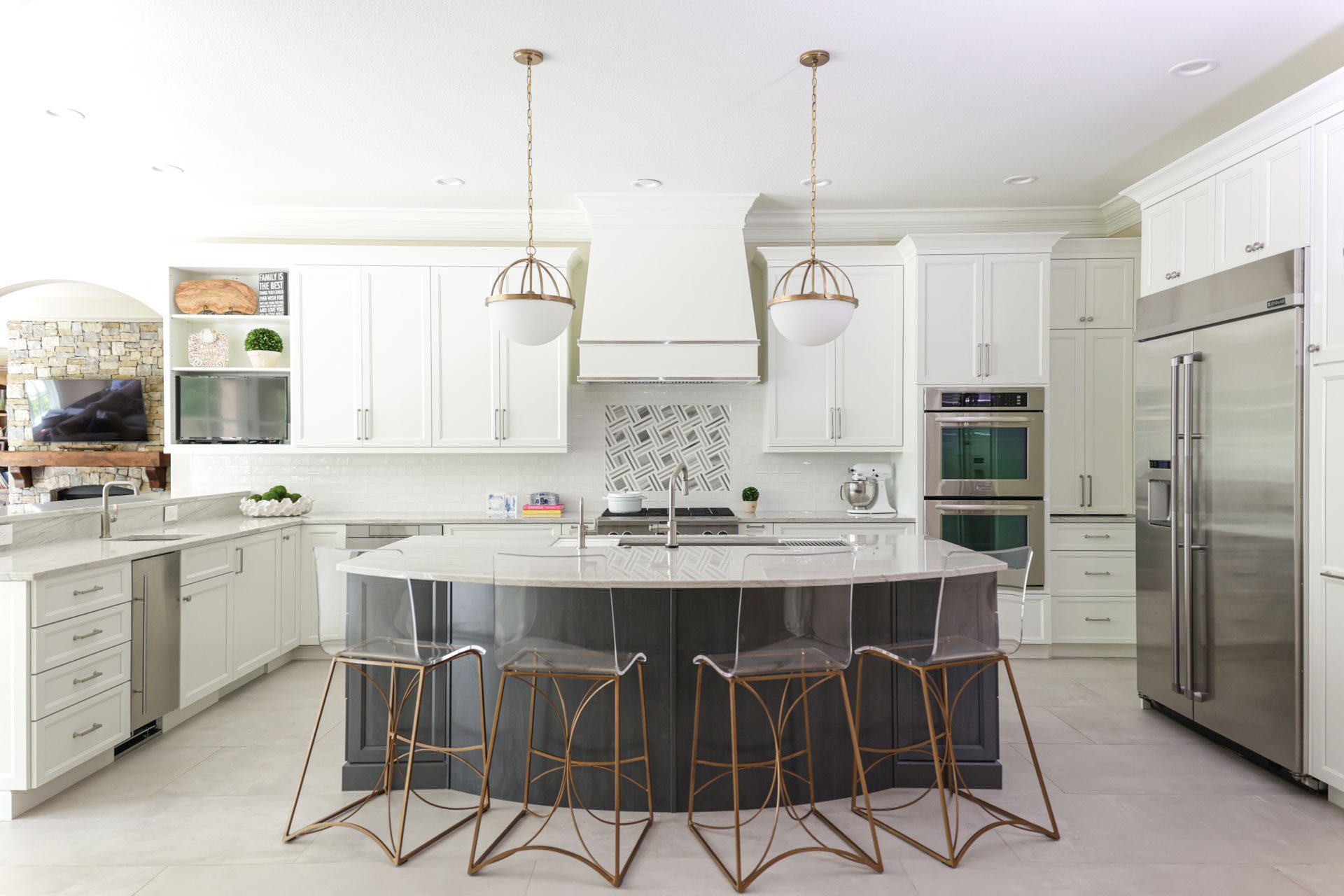
A new kitchen was the goal for this traditional-style home built in 2010. Even though there were no structural changes for this remodel, the kitchen was a complete tear-out.
“This was a renovation in midtown Tulsa,” says designer Janae Dixon of Tulsa-based Kitchen Ideas. “We started fresh.”
Dixon, who helmed the project, is an interior design graduate from Oklahoma State University. She has been with Kitchen Ideas for five years and is an Oklahoma native.
For cohesion, the new kitchen maintained the home’s traditional design elements while still modernizing the space. The kitchen, which is open to two other areas of the home – the main and formal living areas – received design attention.
“We needed to make sure all three spaces flowed together,” says Dixon.
Inspirations
The existing traditional aspects of the home were an inspiration for the kitchen design. To ensure it flowed stylistically with the rest of the home, colors from adjoining rooms were implemented. Warm whites and grays were used, while natural light also played an integral role. The goal was to be “warm and inviting while still being bright and timeless,” says Dixon.
“We looked to the house itself for the kitchen design,” she continues. “The home has a great amount of natural light.”
Highlights
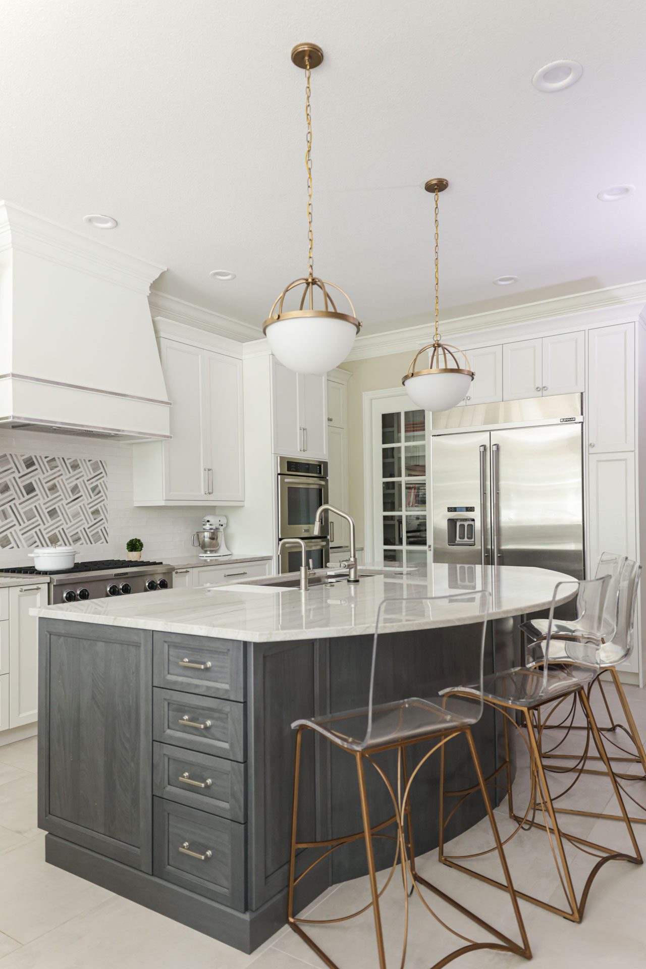
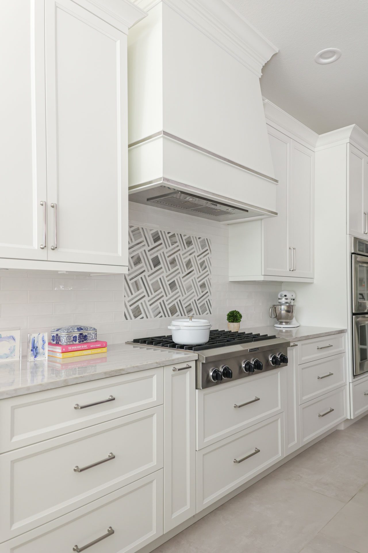
Quartzite countertops, frameless cabinets, concrete-look flooring, a multi-purpose island and a tile mosaic backsplash feature are all major stars in this kitchen renovation.
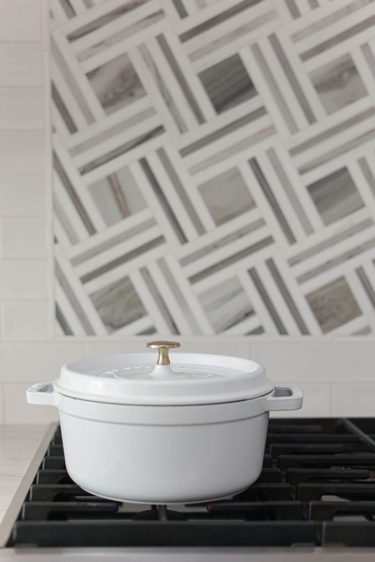
Painted a soft white, the cabinets are of European construction which “kept the lines clean,” says Dixon. For the flooring, large format tiles (48 by 24 inch) in taupe gray were chosen to “minimize the grout lines,” giving the look of solid concrete. The island’s dark gray stain on American poplar wood provides contrast to the cabinets while “mixing warm and cool tones,” supplies Dixon. A marble tile mosaic, which is above the range and below the custom-made hood vent, are Dixon’s favorite aspects of the remodel.
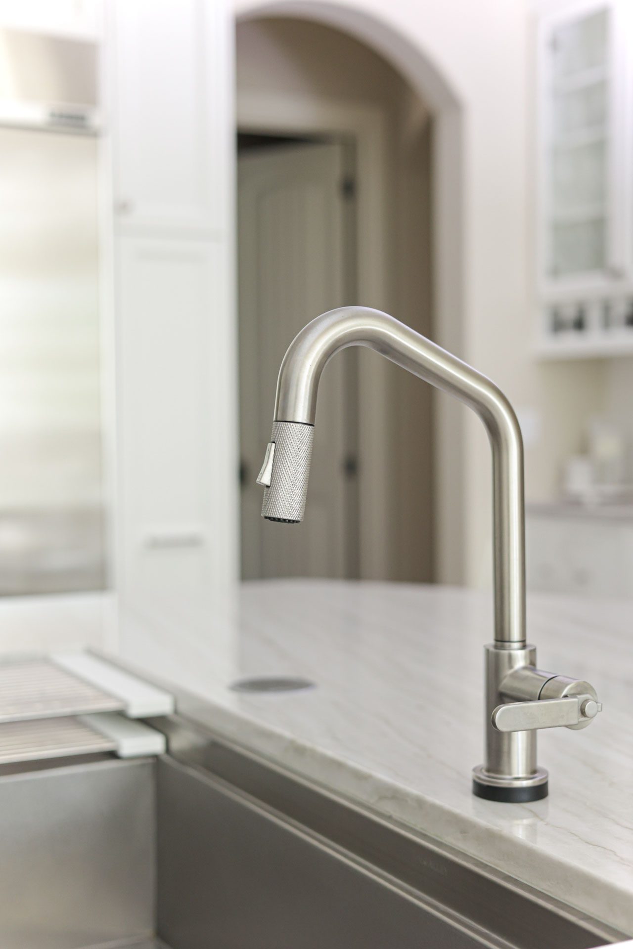
Additional gems include cohesive faucets, fixtures and lighting. The brass light pendants from Ferguson hang above the island.
“The space includes a mix of brushed nickel and brass,” she says.
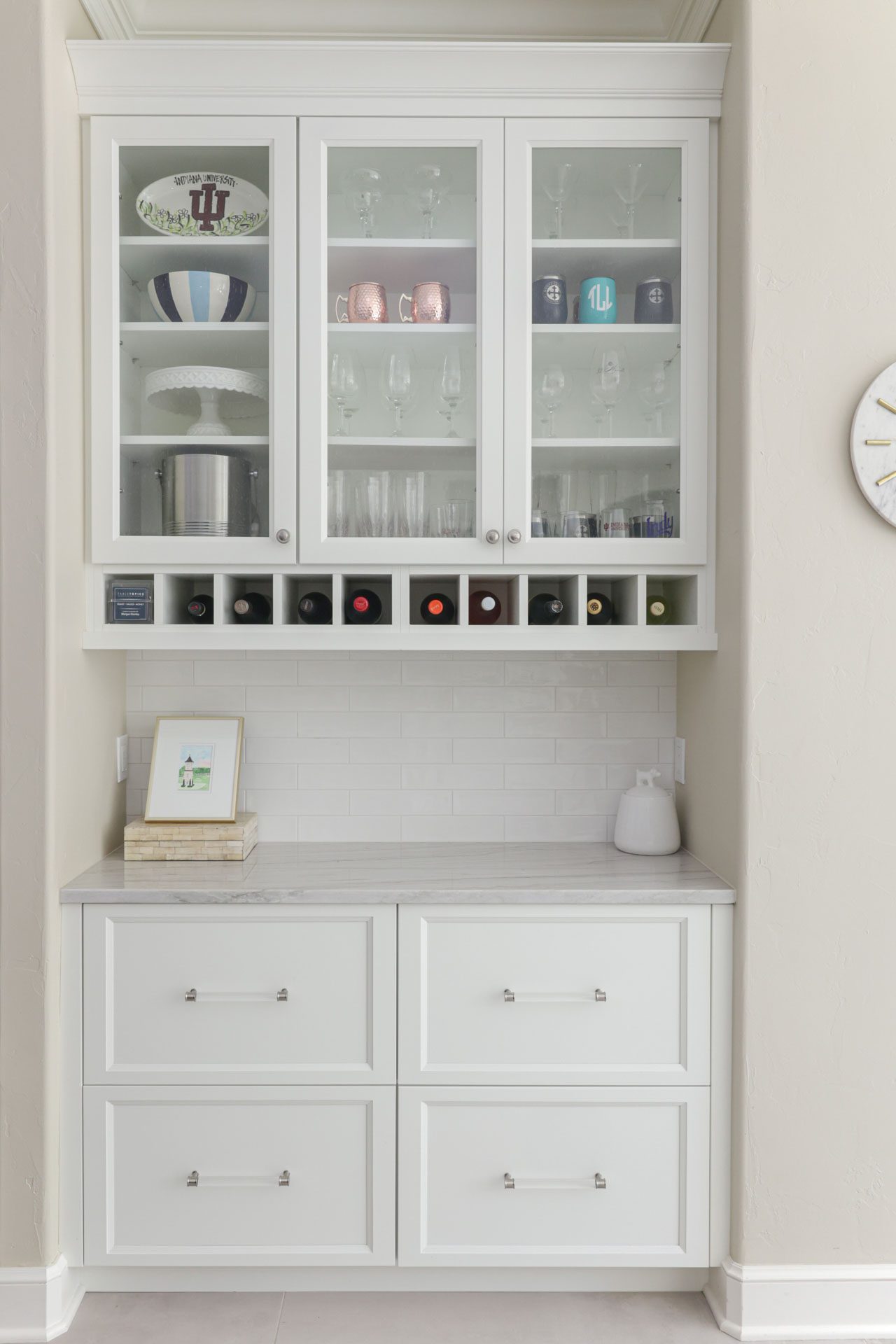
Adjoining the kitchen are built-in hutches with glass-front cabinets which “gives a nice effect” to display upscale glassware. One hutch includes wine bottle cubbies and extra storage below.
The Process
It was important that the kitchen incorporated ample area for the family to cook together, as well as space for homework and working from home. The client and Dixon worked closely together to select the kitchen finishes.
“It was a collaborative experience,” she says.
