Photography by Sarah Baker Photos
“If you look at the house on the outside, you would not expect what you see on the inside,” says builder Tim Yardy, co-owner of Astoria Properties.
In a year’s time, Yardy and his team at Astoria (formerly known as the Maison Group), alongside Align Design Group and interior designer Laura Ellis Barnes, transformed a European-inspired estate into a fresh family home.
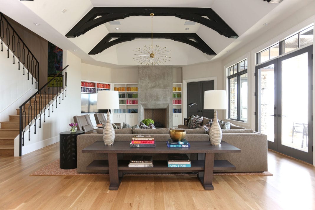
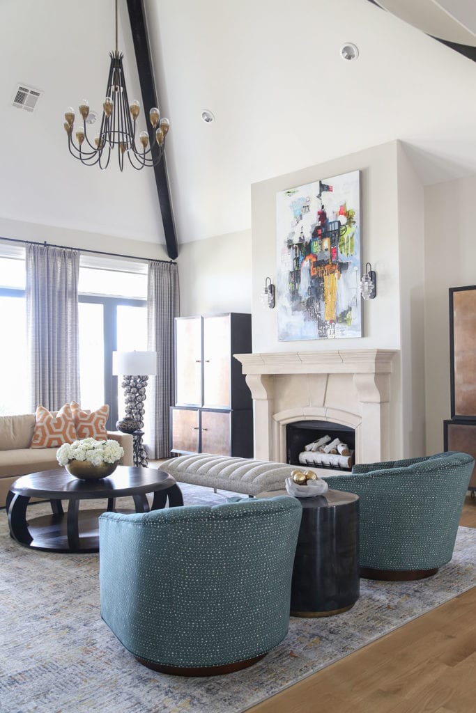
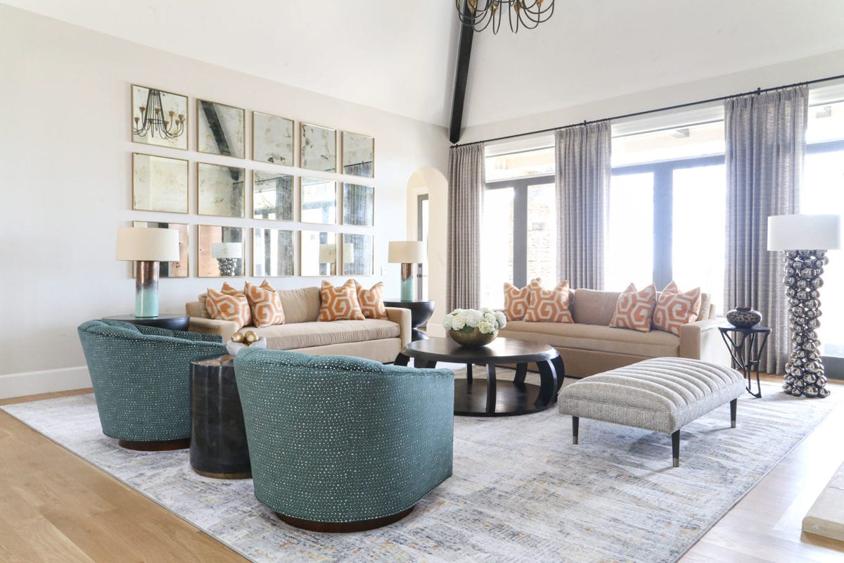
Located in Bixby, the traditional interior of the 8,000-square-foot residence felt dark and heavy, with rich colors and ornate accents. The new owners, a family with two school-aged children, wanted a cleaner, more modern look, without the cold aesthetic that sometimes comes along with contemporary design.
In all aspects of the finished interior, approachability was key. The family entertains regularly, so it was essential that the space be both functional for hosting and feel like home. They planned to preserve the existing layout while opening up the space visually, using clean design and natural light.
“I had seen their old house and saw that they leaned more modern, towards cleaner lines, and had quite a bit of color,” says Ellis Barnes. “I tried to take that and make it age-appropriate for a young, fun, entertaining family.”
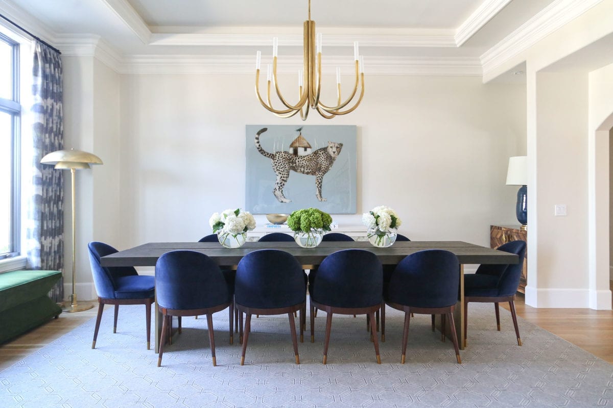
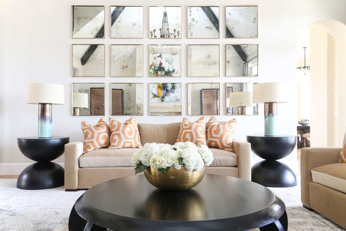
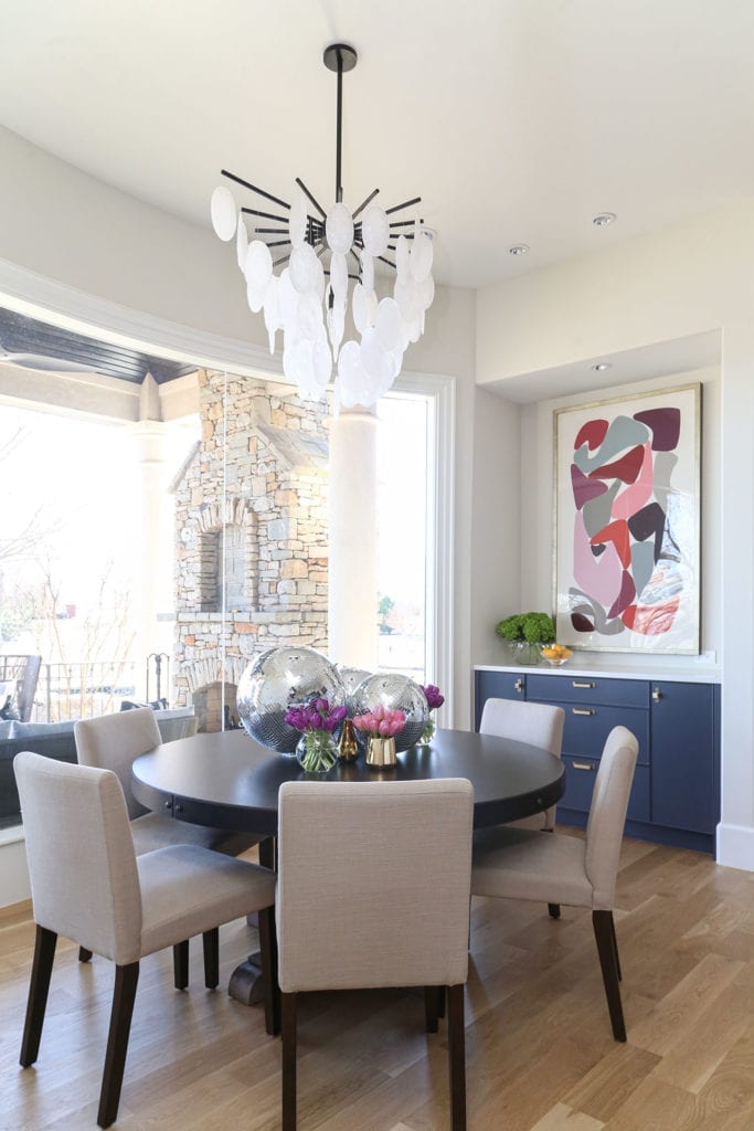
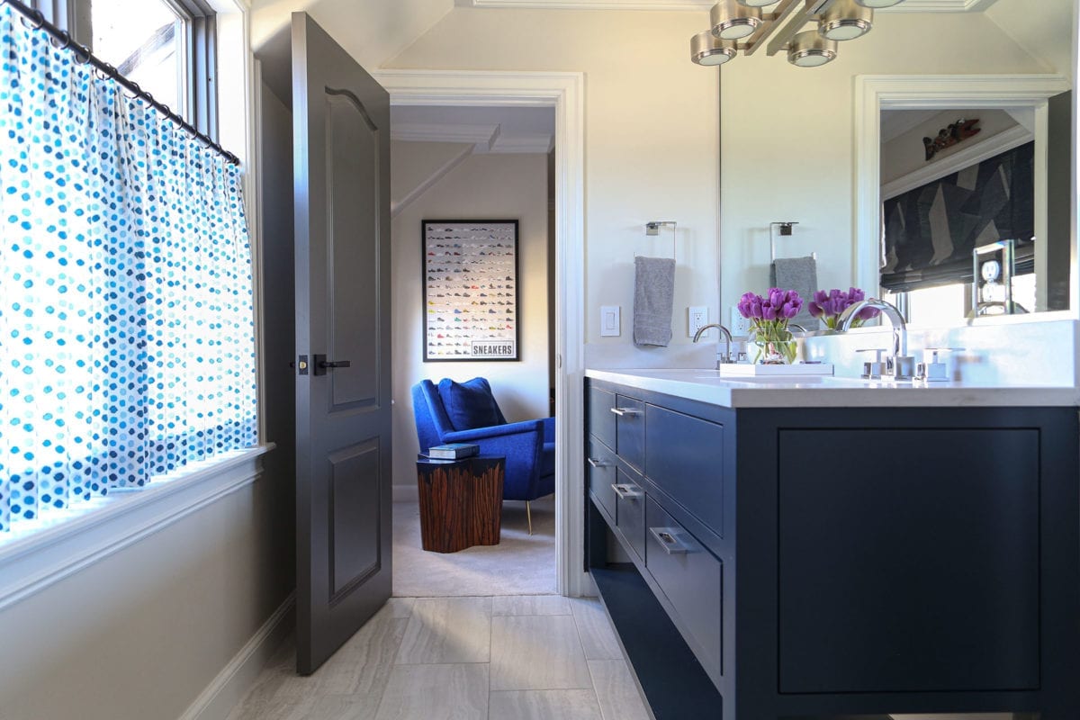
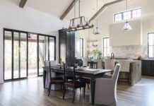
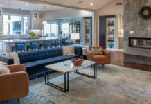
The result was a fresh, colorful and vibrant look that’s trendy and style-forward. Modern furniture and jewel-toned colors create a cohesive aesthetic across the home’s many spaces. All of the wood elements remain natural without stain. Where painted details create contrast, natural materials provide warmth.
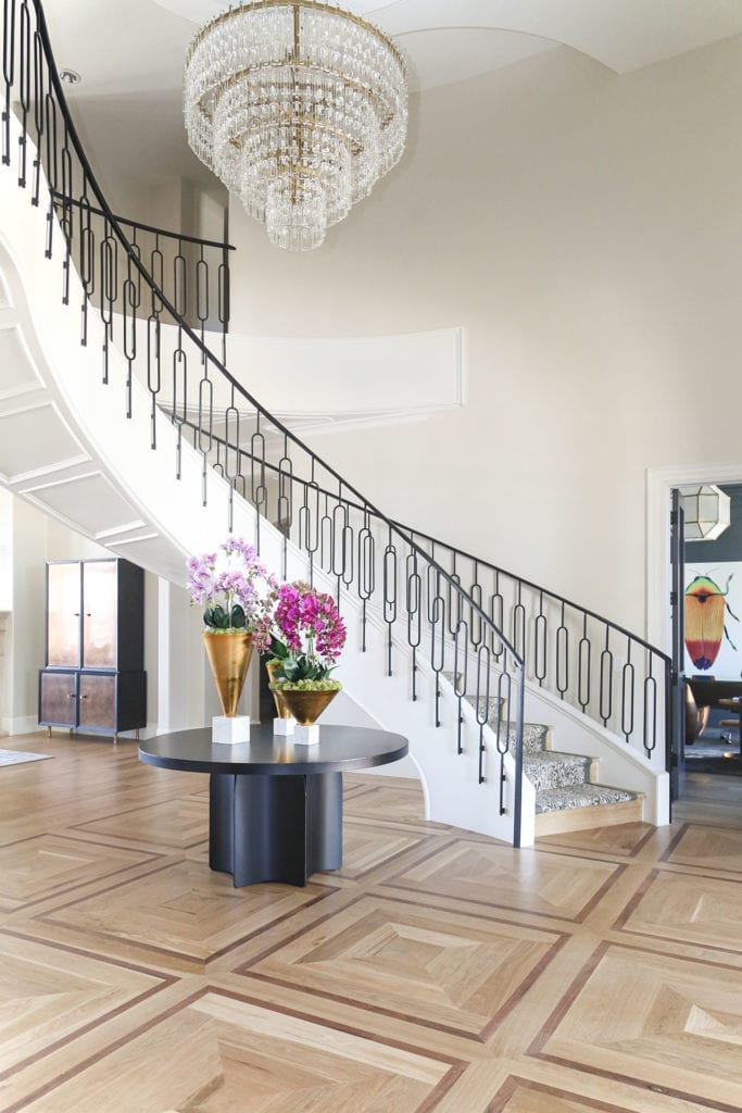
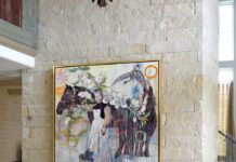
Continuing on the goal to open up the space using natural light, Yardy removed the formerly castle-esque wooden door and made the home’s entry, including the front door, entirely of glass and steel. Crossing the threshold places visitors in the midst of a glorious entryway with a grand staircase ahead, and hints of the colorful designs in the dining room and study to each side.
Yardy updated the entryway flooring with a white oak and walnut wood inlay that reflects the square details built into the bottom of the staircase. The room’s central element, the sweeping staircase, got a face-lift thanks to a contemporary railing and animal print stair runner. Together, Yardy and Ellis Barnes selected a chandelier to tie the space together and give it its show-stopping quality.
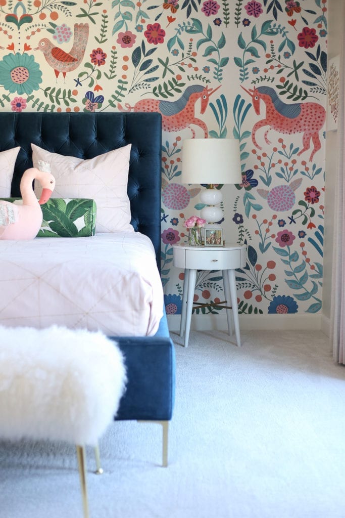
“It’s a large house, so I wanted to fill it with interesting color and patterns while still keeping it clean, so nothing felt busy or heavy,” says Ellis Barnes.
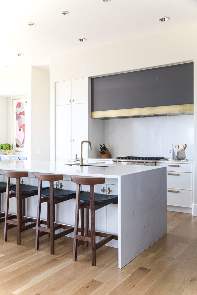
Moving through the formal living room and into the kitchen, Yardy and his team brought the space all the way down to the studs before bringing to life the vision Align Design created.
It was important for the family to have relevant items in-reach while some of the heavy lifting could be hidden away. The kitchen’s outward-facing area features a large island with lots of seating and space to stand because, as Align Design principal architect Jason Gibson puts it, that’s where everyone ends up during a party. Behind-the-scenes, on the opposite side of the range, is a galley kitchen where the other typical kitchen elements – such as the dishwasher, wet bar and oven – live. Gibson describes the dark edges and bright inner focal points of the room as a “tuxedo look.”
“The space was big enough that we could pull off a dual color scheme and call out the darker areas as more private and closed off and the brighter areas as more opened up,” he says.
The painted hood that extends the length of the range contributes to the kitchen’s clean look. Gibson says they decided to go with a flat, squared-off face, instead of a traditional hood, to avoid creating visual clutter. The kitchen’s rift-sawn white oak cabinetry faces were custom designed by Align’s cabinet maker.
“I think having free rein opened us up to bring ideas to the table that we felt were original,” says Gibson. “It gave us opportunities to do custom things that we think make spaces function better.”
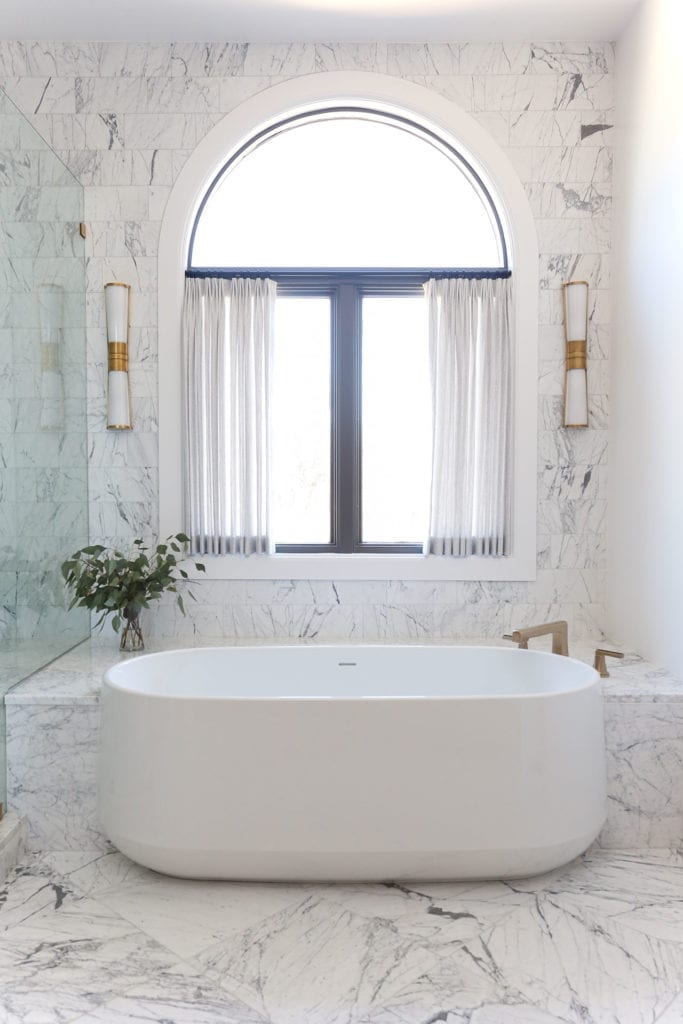
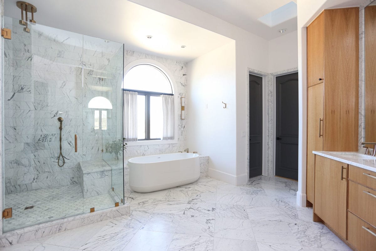
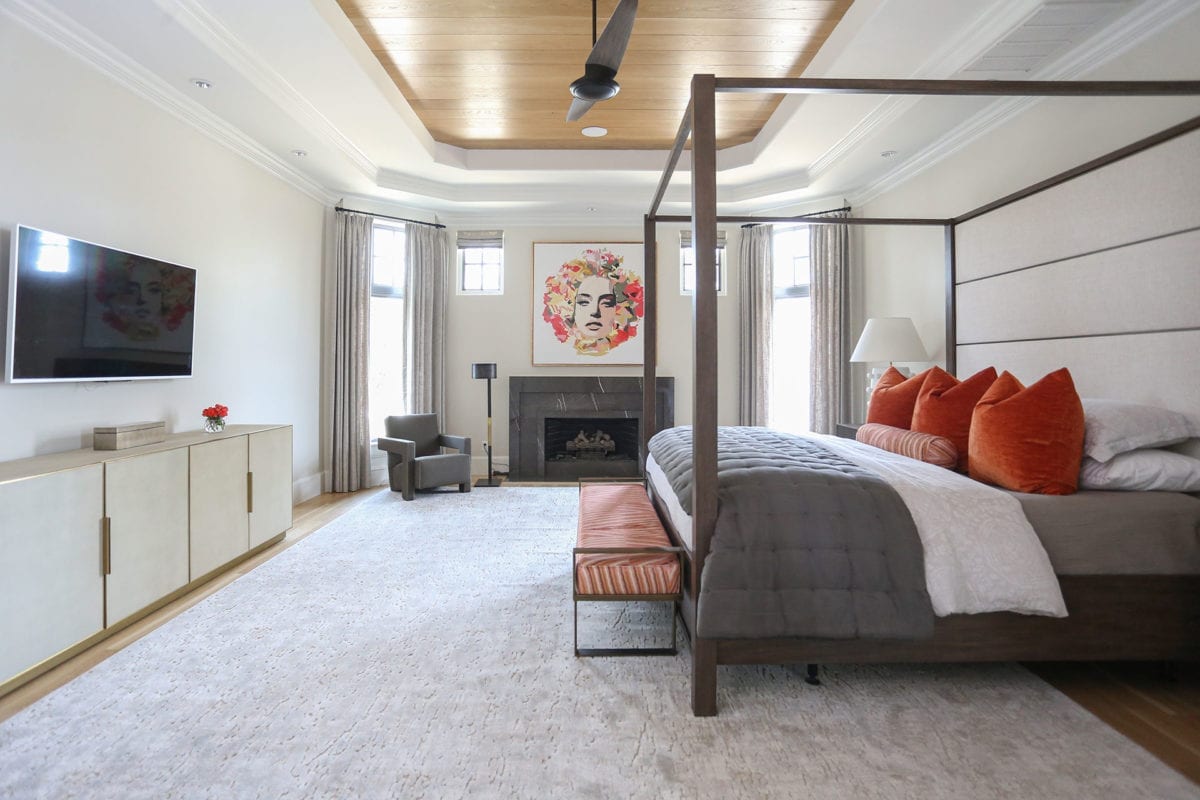
The master bedroom continue the home’s youthful ambiance. Pops of orange can be found in throw pillows, art and a stylish bedroom bench. Walking into the master bath, one finds a relaxing combination of marble, gold accents and light woods. The marble tub, designed by Gibson and purchased through Tulsa’s Heatwave Supply and Showroom, is the centerpiece of the space.
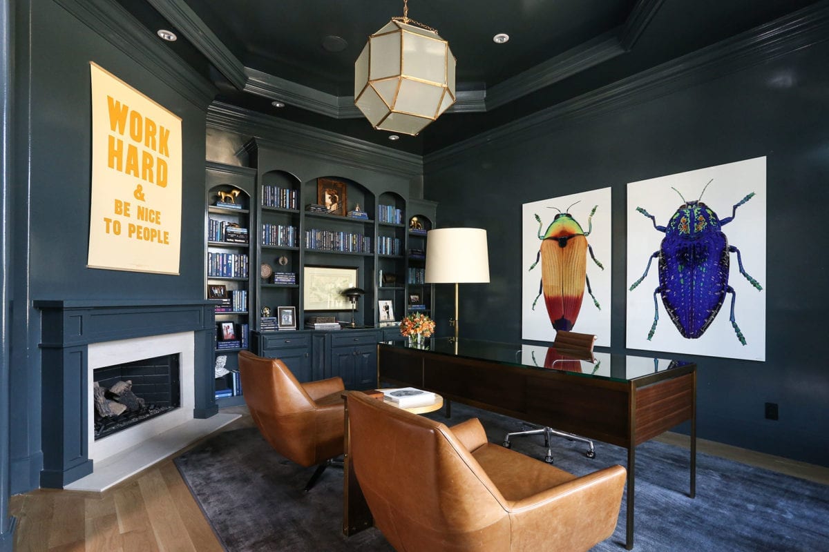
The home’s study is another hidden gem where form and function, as well as old and new, meet. Yardy says the existing room was full of cabinetry, heavy molding details and a fireplace. Rather than rip everything out, the family opted to revive it.
Ellis Barnes calls the end result a colorful jewel box because of its rich colors and reflective teal paint job. Two giant pieces by local artist Bob Sober hang over the glass-topped desk, and bold, patterned drapes flank the nearly floor-to-ceiling windows. Ellis Barnes says the family wanted the study to be a statement room that was functional for working.
“You have all this traditional detail, but we painted it all with high-gloss color,” says Yardy. “We flipped it on its head and made it feel younger and more contemporary.”


