New Beginnings In White
As designer Mel Bean, co-owner of Austin Bean Design Studio, discusses the renovation plans for this midtown Tulsa home, she gives the homeowners plenty of credit.
“We worked together for nearly six months finalizing every detail before the construction began,” says Bean.
In both the kitchen and master bathroom, the renovation was more than replacing finishes and fixtures; both areas were demolished, and the designer and homeowners focused on how the spaces worked.
As the plans took shape, Jim Harden, owner of J & H Remodeling of Broken Arrow, was added to the team. Since the homeowners intended to stay in the house during remodeling, it was important that everyone working on the project coordinate.
For the family with two active children, the long and narrow kitchen needed more width.
“We captured a screened-in back porch and incorporated it into the kitchen,” says Bean.
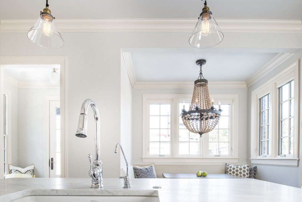
Job accomplished, the wider kitchen provides room for a central island with eating space. Flanking an oversized apron sink are a trash drawer and dishwasher with a full overlay door hiding their functions.
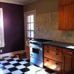
Existing dark cabinets on opposite walls were replaced with classic white cabinets designed by Bean and running the length of two contiguous walls. The countertops are Carrara marble, and the backsplash is a white beveled mini-brick tile. To create a subtle accent, the tile was installed in a herringbone pattern over the Wolfe range. New, two-inch oak flooring matches the original wood floors throughout the rest of the house.
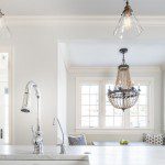
“We added ceiling beams to create architectural detail,” says Bean, “and the upper cabinets were designed around them. Replica vintage industrial glass light fixtures hang over the island and create a sparkle throughout the room.
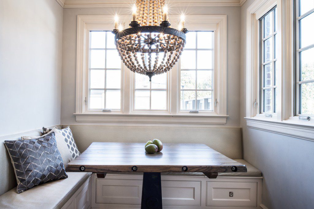
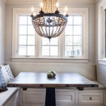
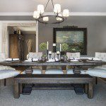
In addition to enlarging the kitchen, the additional space gained from the back porch accommodated a large, built-in banquette providing comfortable seating with storage under the built-in bench. Bean had a custom top built onto a cast iron base. Desiring a casual look, the homeowners purchased a chandelier with an aged patina on the wood and metal.
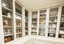
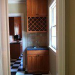
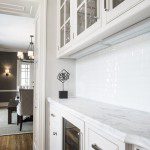
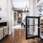
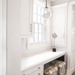
The narrow, dark pantry next to the kitchen was transformed into a smaller, more functional pantry room with a dedicated bar and desk space.
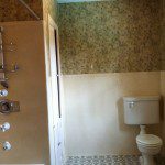
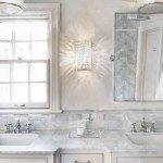
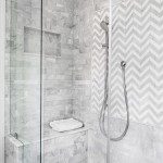
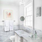
The master bathroom also went through extensive renovation. An existing bathtub was removed and replaced with an oversized shower. The toilet was relocated to another wall, allowing the countertop to be doubled in length for two sinks.
To keep the space open and light, the same white cabinetry used in the kitchen was used in the bath. The countertop is also Carrara marble.
“The original floor tile was very fun, but it just wasn’t in good shape,” says Bean. The team chose a one-inch Carrara marble hexagonal tile in a honed finish for the floors. Carrara and Thassos marble tiles also create a chevron-patterned accent wall.
“This project was truly a team effort,” says Bean.
BEFORE


